I’m so excited to finally start diving into our Coyote Hills Project! I’m starting today with the entry and what was originally a powder bathroom. Full disclosure, the entry wasn’t technically on the list of spaces for redesign, but after touching just about every inch of the house, I couldn’t help but refresh it. Forget that the entry has a fantastic view out to the mountains and pool that wholeheartedly deserves to be highlighted; the entry in any home really sets the tone for the entire house and should be given thoughtful consideration. For more on entries, check out our How to Style an Entry blog post!
Let’s start at the beginning. This house hadn’t had a real update since the 90s. You’ll see in the before pictures that there was carpet with a tile border that just didn’t do the house justice. It felt cumbersome and just brought your eye down to the floor.
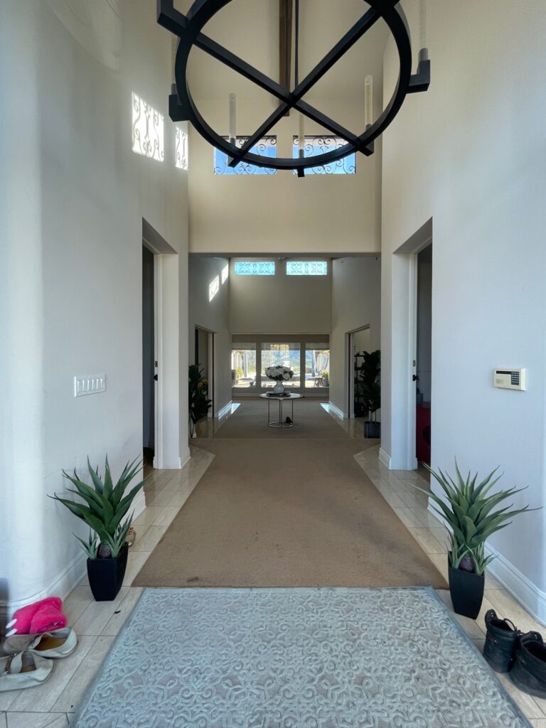
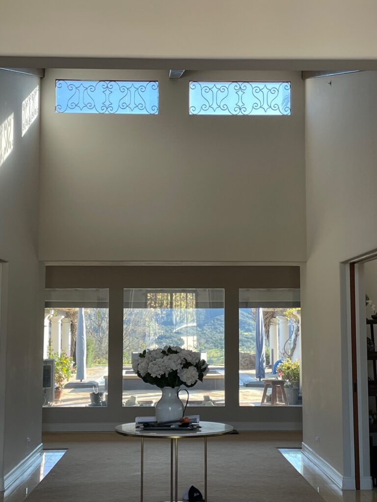
These particular clients have a true talent for finding amazing views. I checked every window in the house; they all looked out to something gorgeous: a lake, private vineyard, or mountains. Because the view is the star of the show, this space really didn’t need much. In fact, to do the space justice, I paired everything back just a little.

The first request with this redesign was new floors. Initially, there were several flooring changes that just broke up the home in an awkward way. Every space in the house is very open leading into the next, so it really called for the same flooring throughout all the main living spaces and bedrooms, reserving a flooring change only for the bathrooms. The flooring selection would only occupy about 7500+SF, so no pressure! Our clients love natural white oak, but we had some existing elements to work with, and with the style of the home, we decided to go a bit darker. The house already had beautifully finished beams, and I wanted to pick a finish that would complement those beams. By the way, this house has SO many windows! By using a darker floor, I was better able to ground the home. Installing a hybrid waterproof hardwood throughout (yes, you heard that right, waterproof hardwood!) allowed me to visually expand the space and bring a sense of continuity throughout the entire home. We have had some extreme weather this year (take the word “extreme” with a grain of salt, we’re Californians and are used to sunny 70-degree weather year-round). The floors were tested when we had a couple of instances of water backing into the house and pooling on the flooring due to high-volume rainfall. Much to my relief, the floors made it through without any damage! Luckily, the installers were talented in their craft and were able to install the flooring throughout the vast spans (not easy) and were careful to make sure everything was sealed properly, and boy, did it pay off!
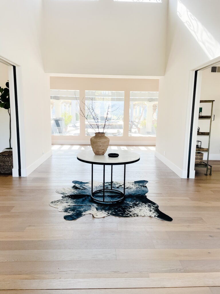
For this particular project, I was asked to do selected spaces. Furniture was not something that I was contracted to source. Luckily, the clients had great furniture throughout the house. In conjunction with some heavy editing, I kept all the large pieces and utilized some thoughtful shuffling of the furniture throughout to make more sense of each space. I gave the marble entry table a simple update by giving the frame a quick coat of paint to match the other finishes throughout the home. I switched out the vase from the before to something vintage-inspired. In every space I design, I pay careful attention to the push and pull of new and old, traditional and modern, light and dark, masculine and feminine. Thoughtful design keeps the relationship of these elements in mind throughout the entire process. The vase has a rough texture and works in juxtaposition to the smooth finish of the marble. The aged look works beautifully against the clean lines of the table. Add a small dish to drop your keys, and you have the essentials! I opted to use branches instead of a dense arrangement so that it would feel more airy and allow you to look through to the view with minimal interruption. Let’s be real, branches are never a mistake; they’re beautiful and they last so long. The addition of the cowhide rug works to ground the table, so it no longer feels like it’s just floating through the space. You will see in my next post that the two openings you see above lead to the formal and informal living spaces. Each of these spaces has a rug, and when using rugs in spaces that open up to each other, you need to be very conscious of your choices. By being very intentional, you can avoid having the rugs compete with one another. A cowhide rug is never a bad choice because of its organic shape, and the pattern of the hide brings a lot of interest and texture. These rugs work in so many different spaces, from very traditional to very modern. It’s all in how you use it!
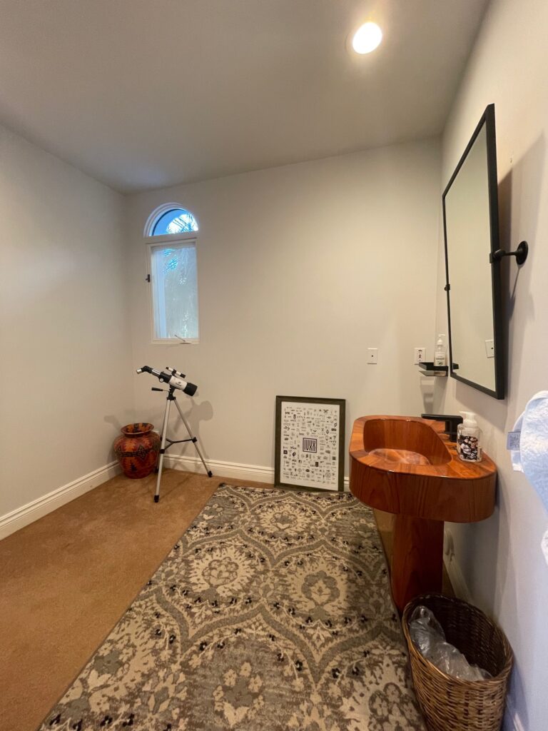
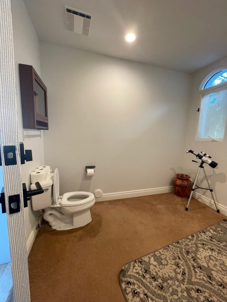
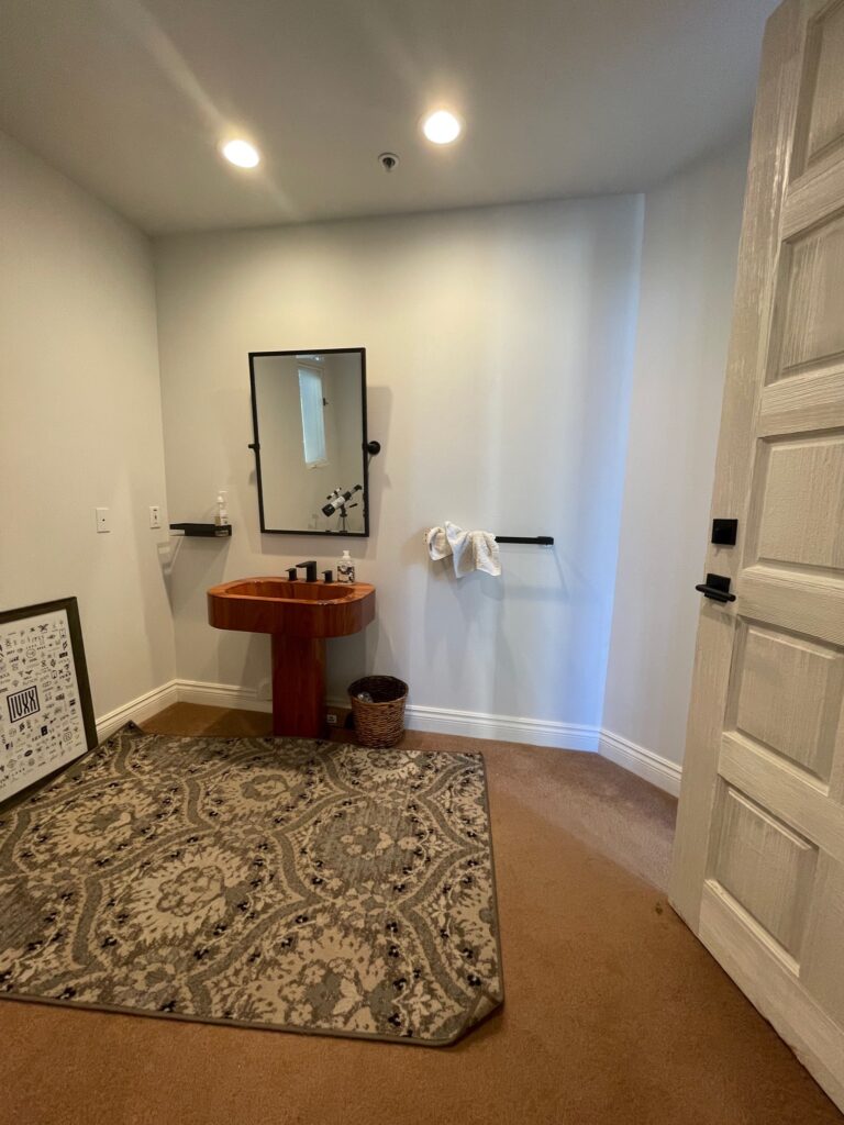
To the left of this entry is a powder bathroom. I could say a lot of things, but I think I’ll leave it at…carpet in the bathroom. Here’s the thing, life happens, and sometimes things will wind up on the floor. You get the picture. Carpet is not the most sanitary option for this application. Additionally, this space is quite large for a powder bath, and originally, the layout was just not scaled properly. The vanity felt small in such a large space. For this bathroom, the client requested the addition of a shower and the use of 3D tile for visual impact. The client wanted the tile work to be unique so that people would be “wowed” when entering. I mean, who doesn’t? So I got to work designing and went through a few iterations before the clients and I landed on the final design.
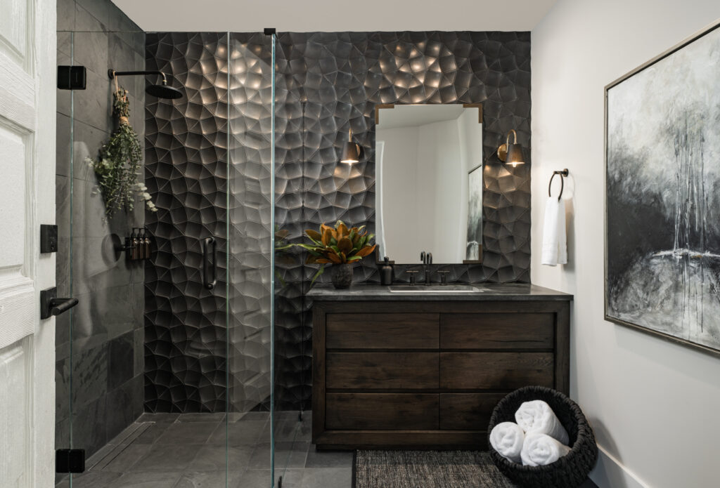
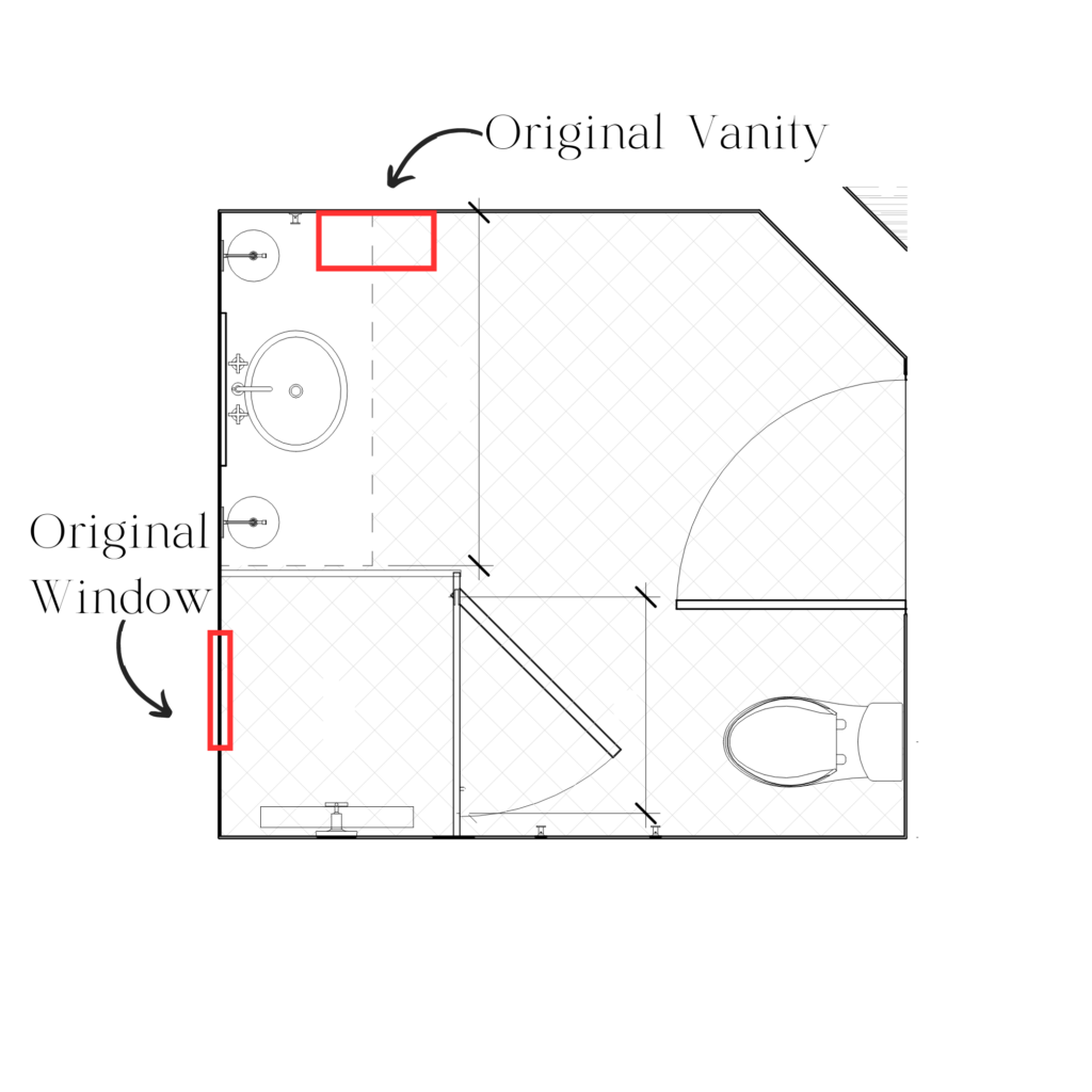
What an after, right? I know what you’re thinking, and yes, it is the same space! So first things first, as far as space planning is concerned, I moved the vanity to the wall adjacent to its original location. This allowed me to keep the focal point front and center without any competing elements, therefore, maximizing its impact. So let’s talk tile! This is a glorious handmade tile with a custom glaze that deserves all the attention. I mean, look at the way the light undulates off the surface 🤤. Because of the nature of the 3D tile, I chose to close off the existing window. I RARELY recommend losing a window, but it was the best decision for this particular space. By closing off the window, the pattern of the tile is uninterrupted. Had I left the window, it simply would not have achieved the same impact as an entire wall of tile, which is such a strong focal point for this space.
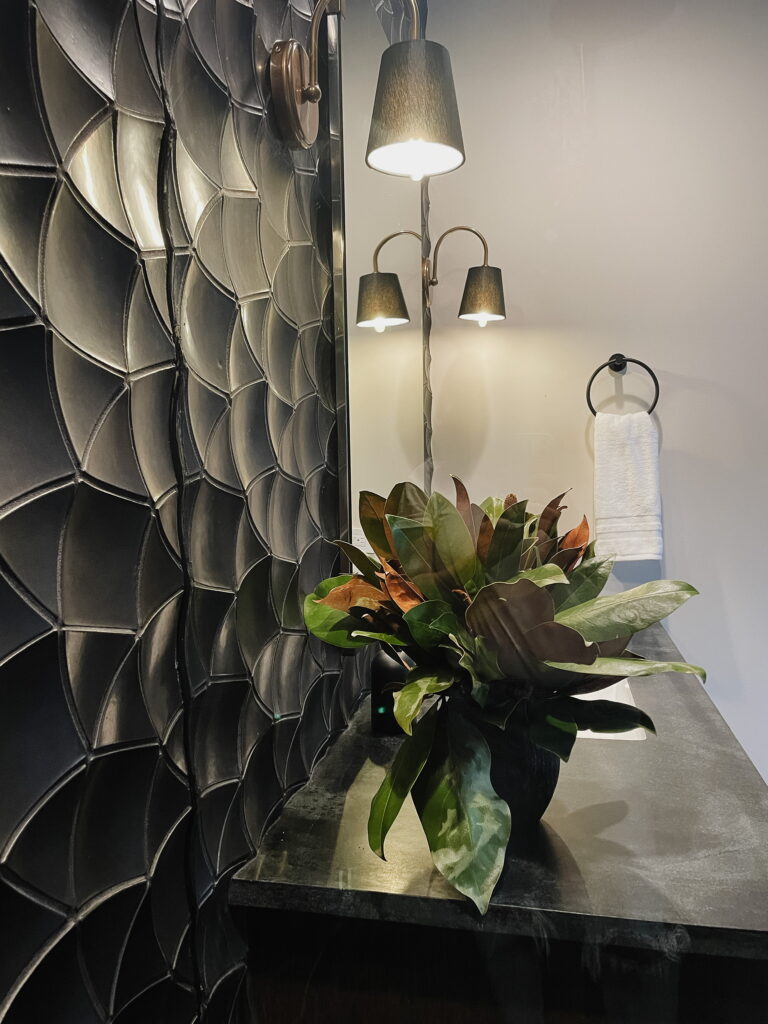
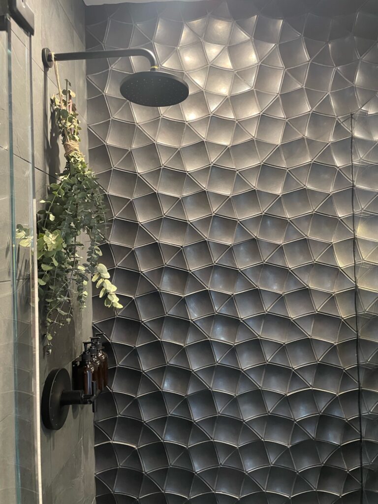
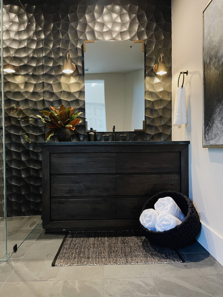
We mixed our metals here, which is something that I love to do. All of the plumbing fixtures are matte black, but by adding a hint of antique brass on the mirror brackets and sconces, the whole look feels very balanced while also feeling interesting and layered. Speaking of mixing, this space is an excellent example of mixing styles. I used a very modern tile, but I paired it with a rustic vanity and antiqued metal. It’s that push and pull again, but you can see it offers a lot to a design. Another important decision I utilized was keeping all of the finishes in the space dark. By keeping everything dark—using a dark stain on the vanity and a soapstone countertop—everything feels tone-on-tone instead of starkly contrasting, so the focus stays directed to the tile .
Have you subscribed to our email list yet? Please do so you don’t miss out on what’s ahead.
Drop me a comment down below and let me know what you think of the entry and bath at Coyote Hills. If you have a design question, ask me in the comments section!
Want more? Check out our YouTube channel to see the evolution of this space!
