read more
I am bursting with excitement because I get to introduce you to this kids’ space. POV: I have three children I love very dearly that are never kind when I design for them. They have zero trust in the process, and it’s not until we’ve reached completion that they will show any sign of satisfaction or appreciation. They’re kids. What do you expect? Plus, mine are at that age where they want to do whatever gets a (often adverse) reaction from me, their mother. Isn’t that sweet? If you’re not there yet with your children, get excited. It’s quite an adventure. Whether it’s my experience with my kids or the raw emotional response of children in general, designing for kids is scary. They tend to be super opinionated, have no filter, and will tell you EXACTLY what they think of your work.
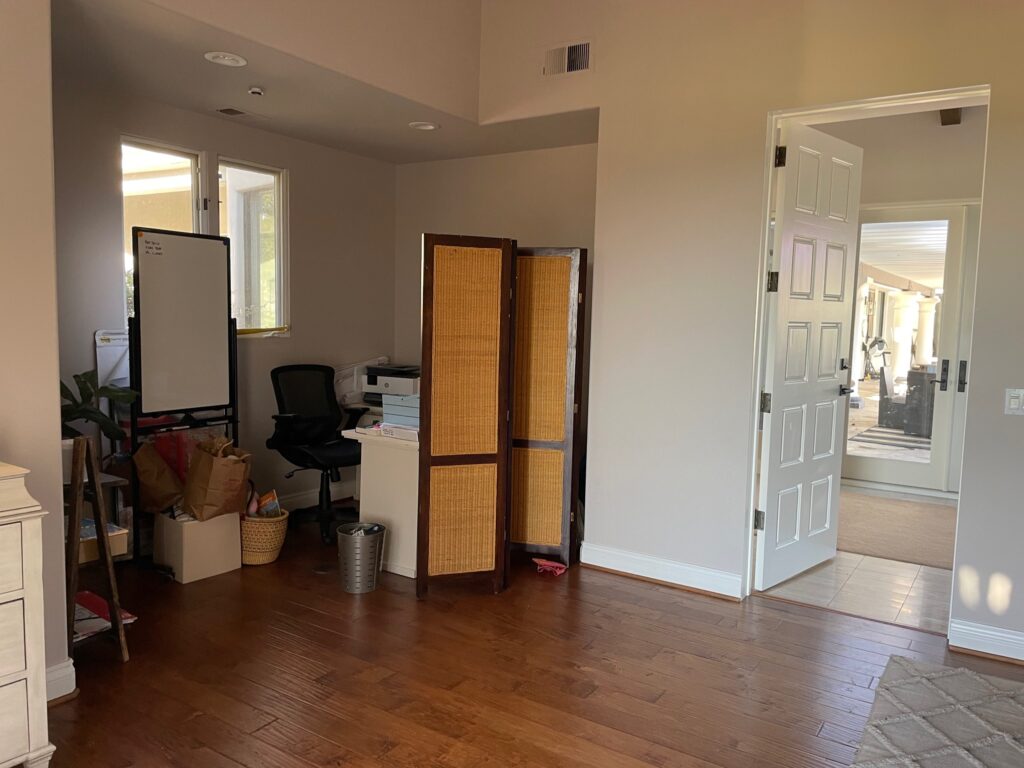
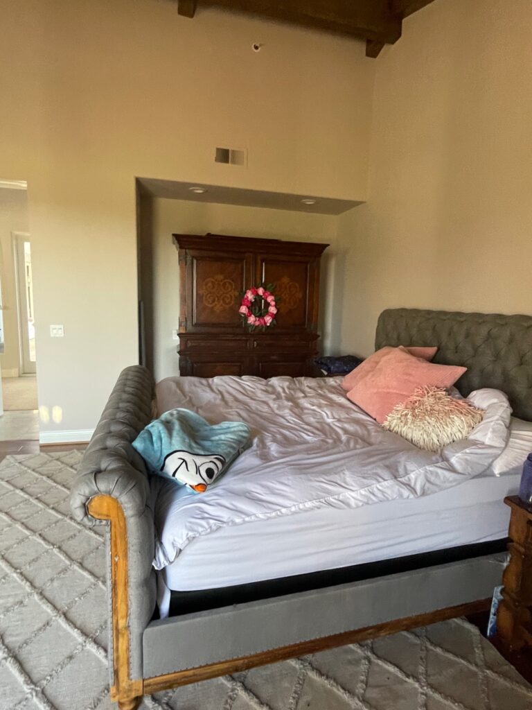
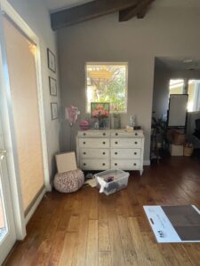
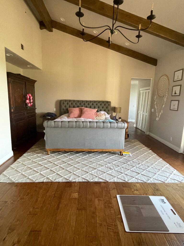
Before
The original floor plans had this space designated as a library connected to the primary bedroom. The door to the right of the bed can be locked but leads directly into the primary bedroom. The built-in units that were specified in the original plans were never built and installed. Because this is a family with young children, it’s actually the perfect setup for a bedroom. This house has a lot of square footage, and having this space as an adjoining room makes it easy for parents to get to their little one late at night. When you realize that the intention for this space was a library, some of the cutouts and angles seem a little less awkward. Fortunately, these same awkward cutouts were easily* utilized, allowing this space to transform into an ensuite bed and bath.
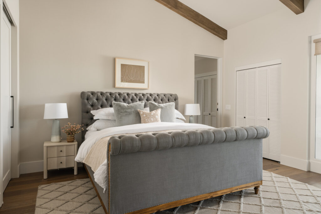
Photo: Blake Bronstad Photography
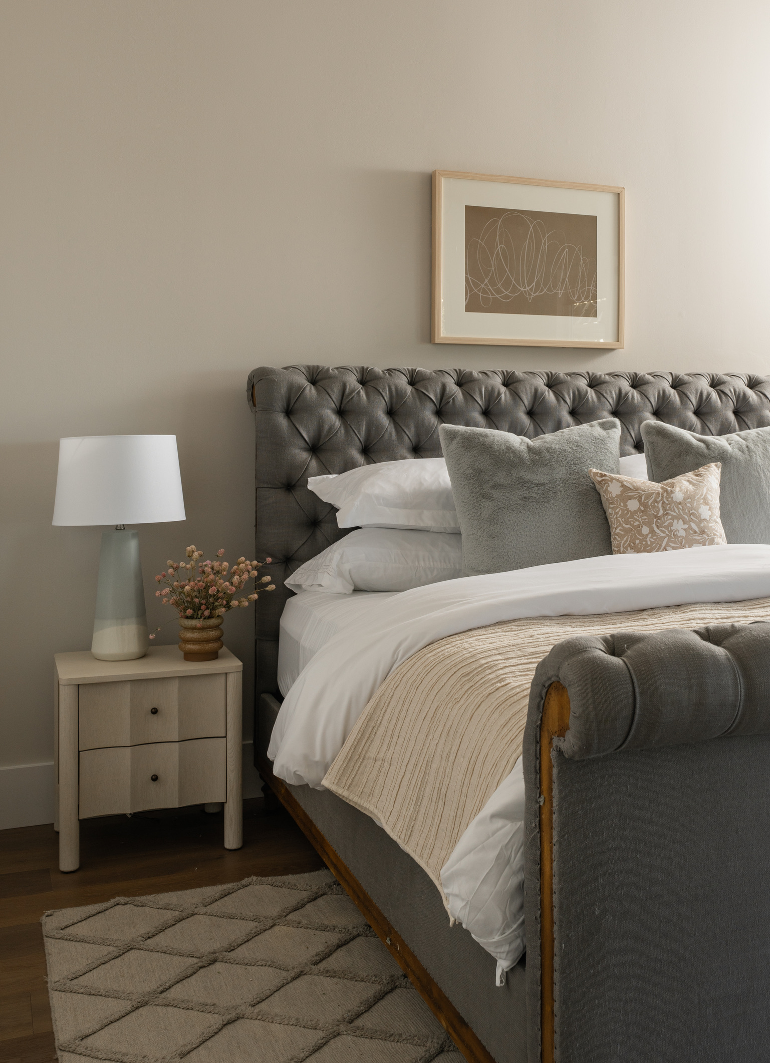
When designing, it’s always important to carefully consider the child’s growth and evolving needs. The room was designed to accommodate both her current preferences and serve as a welcoming space for adult guests. Is a king-size bed large for a child? Yes, but by repurposing existing furniture, like the king bed, we found a balance between functionality and playful elements, contributing to a youthful yet refined atmosphere. The nightstand has a great curved detail along the drawer fronts that is feminine and adds a sense of playfulness. The blue ombre lamps and faux fur throw pillows add another youthful element while maintaining an elegant maturity.
Adding some sliding doors to the cutout that previously housed an armoire created a LARGE reach-in closet. Designer tip: instead of adding the cup finger pulls often seen on closet bypass doors, opt for appliance pulls that you would use in the kitchen. It’s incredible how something so simple can make these doors look custom. These large pulls tie in beautifully with the rest of the finishes throughout the house. They are easy for a child to operate and really elevate the look of an otherwise basic closet door.
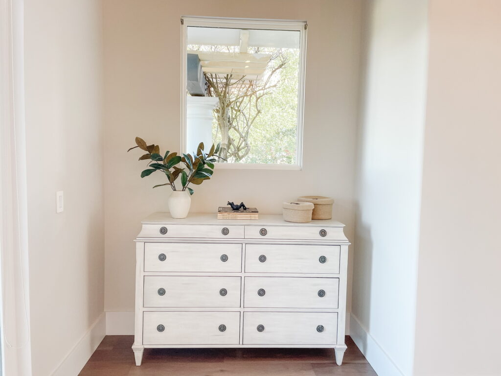
Photo: Earth and Oak Interiors
The dresser is the same as the one pictured in the before photo. It has been styled with vintage children’s books, some baskets with lids (to hold all the rocks and knick-knacks kids like to collect), a whimsical little frog, and some faux greenery. It’s simple and functional.
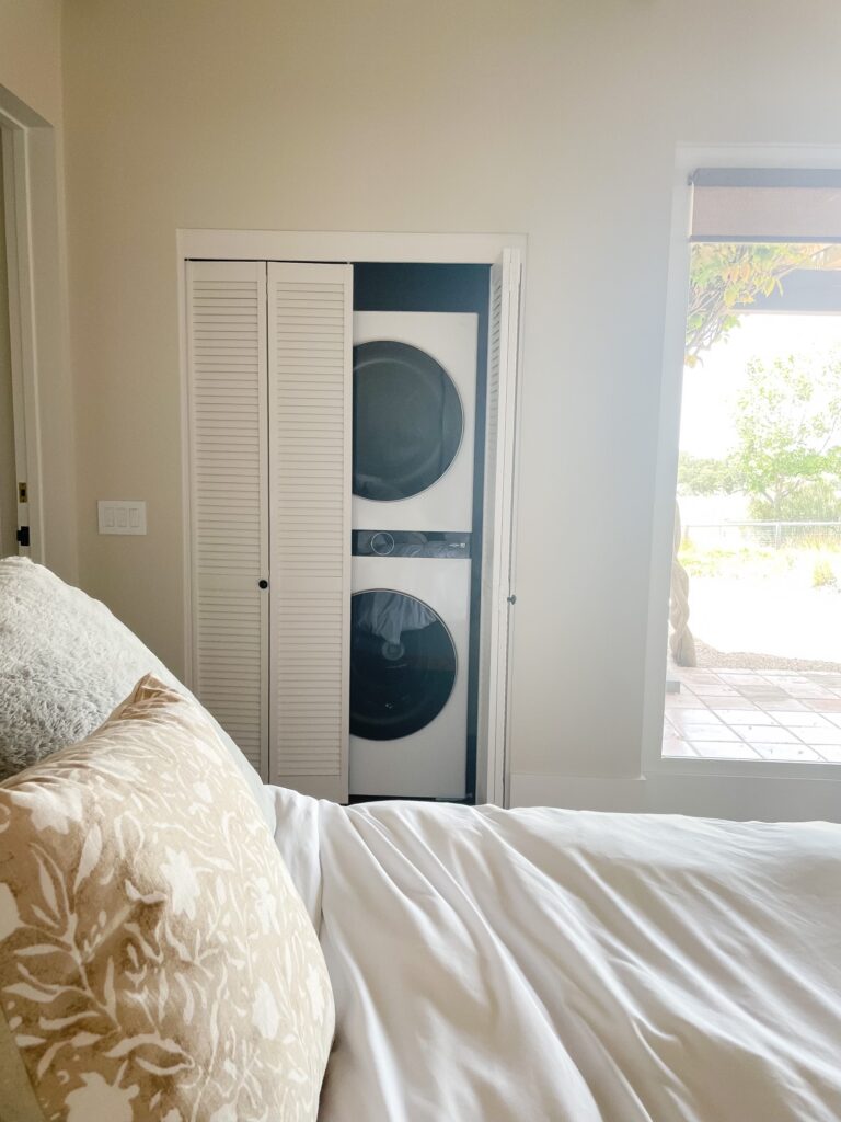
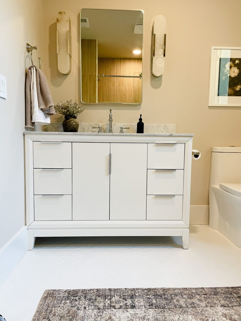
Photo: Earth and Oak Interiors
When looking at a floor plan, there’s usually an opportunity somewhere to borrow some space from one room to another. Here it was the oversized water closet that was in the primary bathroom. A laundry closet was created by adding a wall partitioning the water closet down the middle and punching out an opening in this bedroom. I may write a post about creating new plumbing in a remodel, but to get into the details now is just too much, and you would be here ALL day. In brief, the grade and run of existing plumbing dictate where and whether or not you can add additional plumbing. To gain laundry on this wing of the house, we had to be VERY creative, and the decision couldn’t be made until we knew what we had to work with. For the ensuite bathroom, flipping the layout that was drawn for the remodel solved what would have otherwise been a more significant plumbing problem; it even allowed for a bigger shower, so that was a win! This bathroom was born from the existing architecture. It sits in the niche that you see in the first “before” photo above. It just took some additional framing to separate the bathroom from the bedroom.
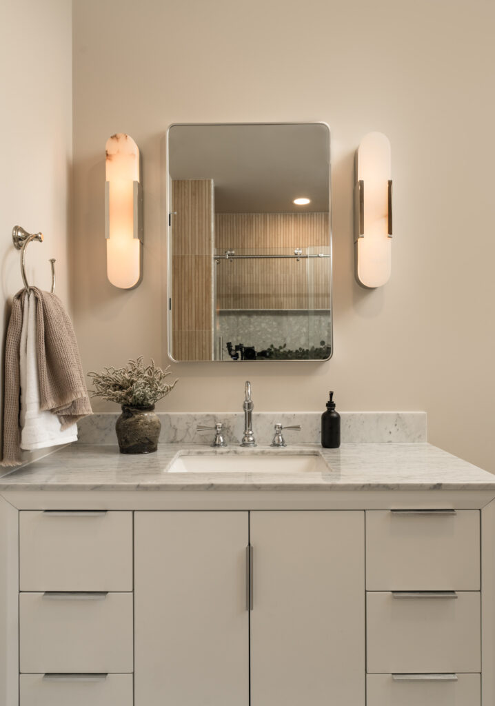
Photo: Blake Bronstad Photography
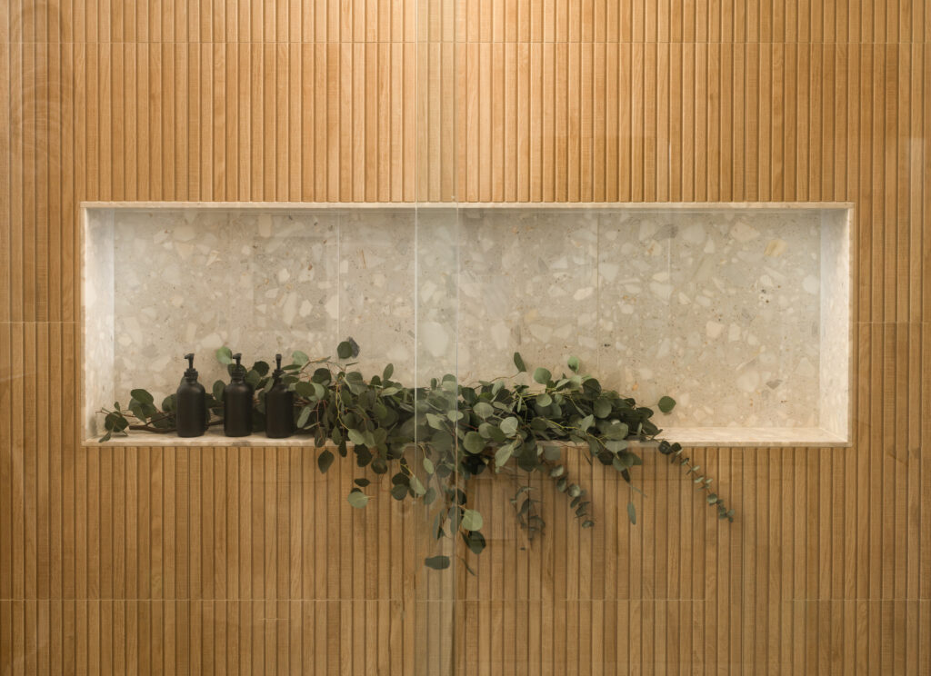
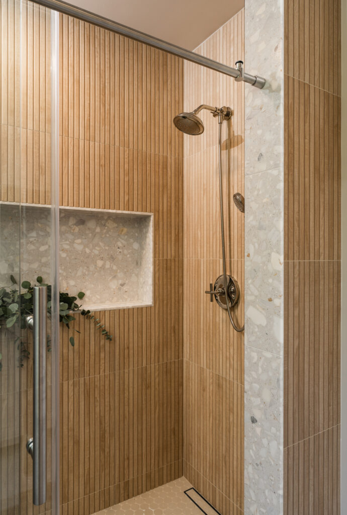
Photo: Blake Bronstad Photography
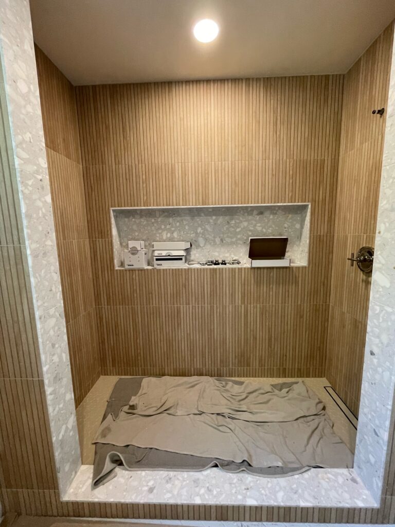
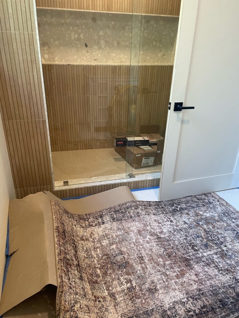
Progress Photo: Earth and Oak Interiors
I LOVE this shower. This particular bathroom is very hard to photograph. Our photographer did a phenomenal job on the entire home, including this room. I tried and tried but you cannot experience this space through a picture the same way you can in real life. I usually don’t include progress photos in my blog posts, but for this space, I’ll make an exception in the quest for the bigger picture. The scale of this shower is enormous! For reference, the niche is more than 5′ wide. I wanted a large niche for a couple of reasons: 1) This is the same gorgeous Ann Sacks Terrazzo Renata line that was used in the Ensuite Bed & Bath (creating a cohesive home through repeated materials), and this was an excellent opportunity to give it a moment to shine. In the other bathroom, we used a combination of fluted and field tiles. Here, we opted for the field tile. 2) As any parent knows, children tend to have a lot of toys in the shower. This gives the toys a place to live other than the floor and gives the child an additional place to play and expand her imagination.
The best part about designing a kids’ space? It typically offers more license for creativity. This Ribbon Maple Tile (Faux wood) gives texture and a spa-like feel. The oversized penny round tile on the shower floor complements the tile beautifully, and the matching grout color really makes the space feel refined. When you look at each material individually, it’s really quite whimsical and childlike, then pulling everything together with the right accents creates such an elegant picture. The addition of the vintage floral painting and vintage-inspired rug brings some maturity to the space allowing it to grow with the child.
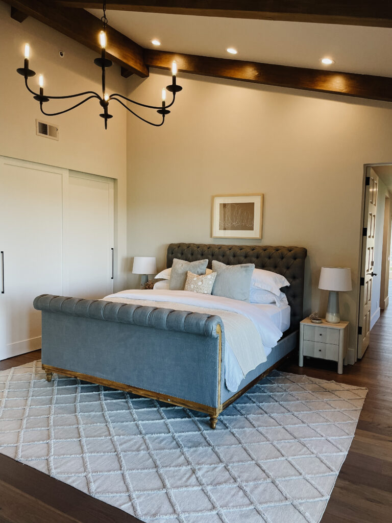
Designing for kids is a thrilling and sometimes daunting adventure. This girl’s room at Coyote Hills underwent a remarkable transformation, turning it into a space that this wonderful little lady proudly calls her “good room.”
Undoubtedly, this project presented its share of challenges, but with a proactive mindset and the expertise of a skilled contractor, we overcame obstacles and achieved outstanding results. We celebrate the collaboration and problem-solving skills required to bring this vision to life.
If you are inspired by the transformation of this girl’s room and are seeking interior design services, we invite you to fill out our inquiry form. Let us embark on a journey together to create personalized, functional, and enchanting spaces. Our expertise, creativity, and dedication will help you realize your design dreams. As always, our goal is to help you realize the beauty within your walls.
*Nothing in construction is easy. Things will never go exactly as you plan, no matter how good you are at planning. That’s why, as a designer, I call myself a professional problem solver. Before starting, we knew this room would likely have to be tweaked as we went along because there is just no way to know EXACTLY what you’re working with until you’re in it. Having this awareness in advance actually took a lot of stress out of the situation. We were prepared. This space probably took the most creative thinking out of the entire home. Did I say “probably”? I take it back; this space definitely took the most creative thinking. This is not new construction, so making laundry and an additional bathroom in an existing home (correctly) is not easy. We accomplished A LOT and saved a lot of money by flexing some brain muscles we don’t always get to use and REALLY putting our spatial skills to the test. Let this be a reminder to get a great contractor who is a great communicator and who is willing/capable of problem-solving alongside you. Being able to do math accurately is another must. 😊
Before And Afters
read more
Welcome, I’m so glad to see you in my little corner of the internet! Today we’re back at Coyote Hills. You have already seen a few bathrooms featured here and here; if you have yet to see those spaces go back and check it out, it’s definitely worth the read. Since we’re in full swing of summer, I wanted to share this bathroom next to the bedroom we featured last time. This space is primarily used by guests that are utilizing the pool. It isn’t attached to a bedroom, and it’s ideally located for easy access from the backyard. Let’s dive in (pun intended)!
Before
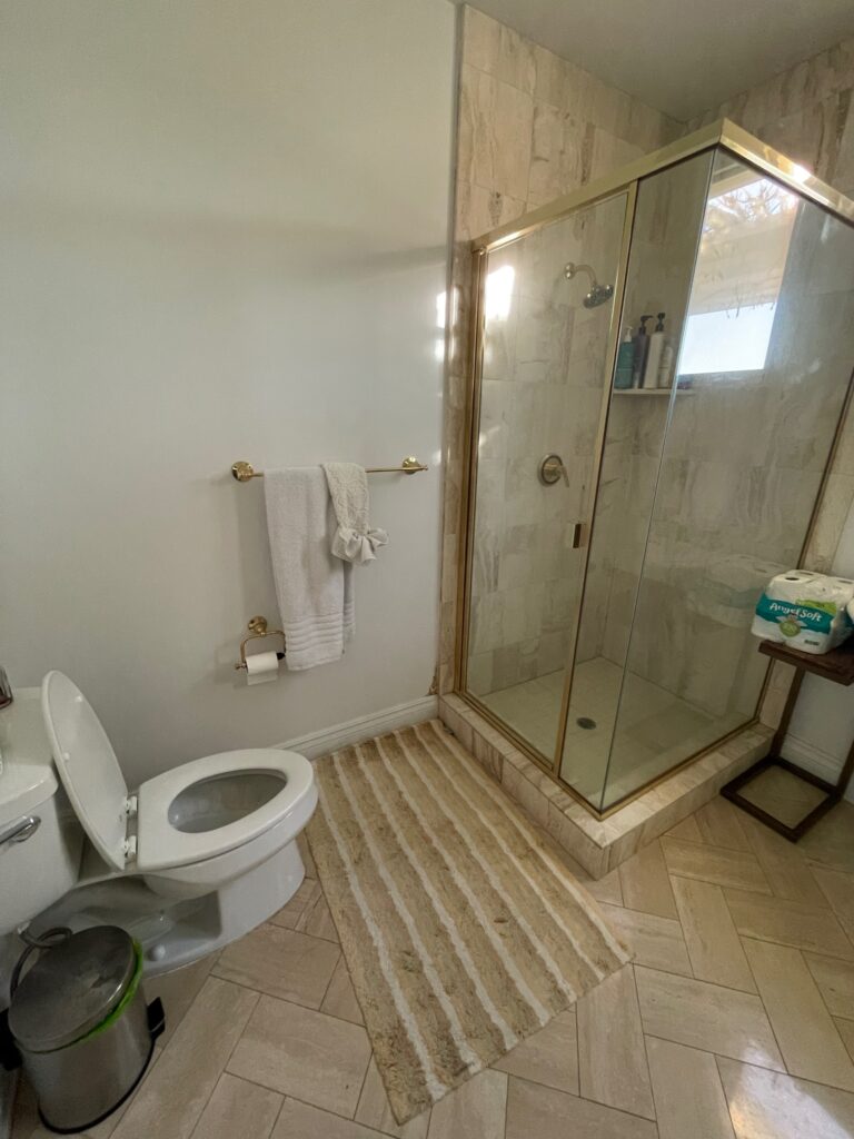
Before
In my last post, Ensuite Bed and Bath, I talked about some bathrooms having plumbing issues that needed to be resolved. This was another of those bathrooms. The shower had a leak, and after demo, we discovered that the leak must have persisted longer than realized because it had eroded much of the earth below the shower. Let this be a humble reminder to always budget more than you plan for your contingency budget because you never know what is lurking beneath the surface.
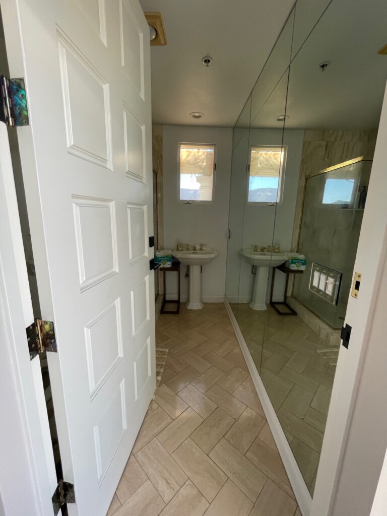
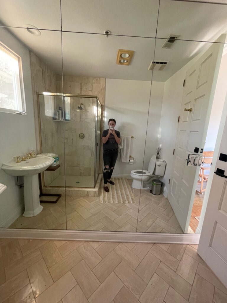
So let’s take a look at the space before renovation. Functionally, it’s alright. As a designer, I typically only use a pedestal sink for a powder bath. If you have a shower, someone is probably using this bathroom to prepare for their day. A pedestal sink simply doesn’t offer the storage needed in this space. Initial thoughts just walking into the before I knew we needed a small vanity that would offer some storage. After all, the clients had placed a small table in this space to aid with what the current situation was lacking. Aesthetically, this bathroom is similar to the rest of the house with a very 1990s design style, so we needed to do a bit of a makeover and make things a little more current. My designer brain could get into the details of what’s happening on the ceiling, toilet paper and towel bar placement, etc., that are missing the mark, but that would be a whole post in of itself. There’s an entire wall of mirrors that actually serve a couple of purposes. First and foremost, the window placement in this space does not allow for a mirror over the vanity, and the entire wall of mirrors solves that problem. This is also a modestly sized bathroom; mirrors make the space feel larger and reflect light.
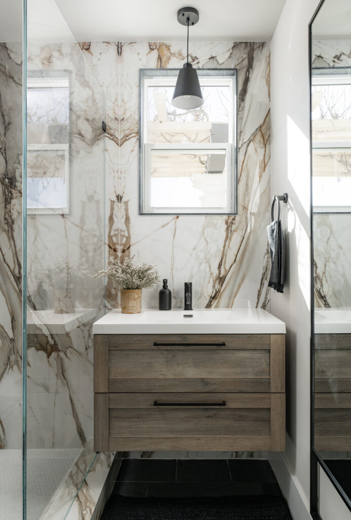
Photo: Blake Bronstad Photography
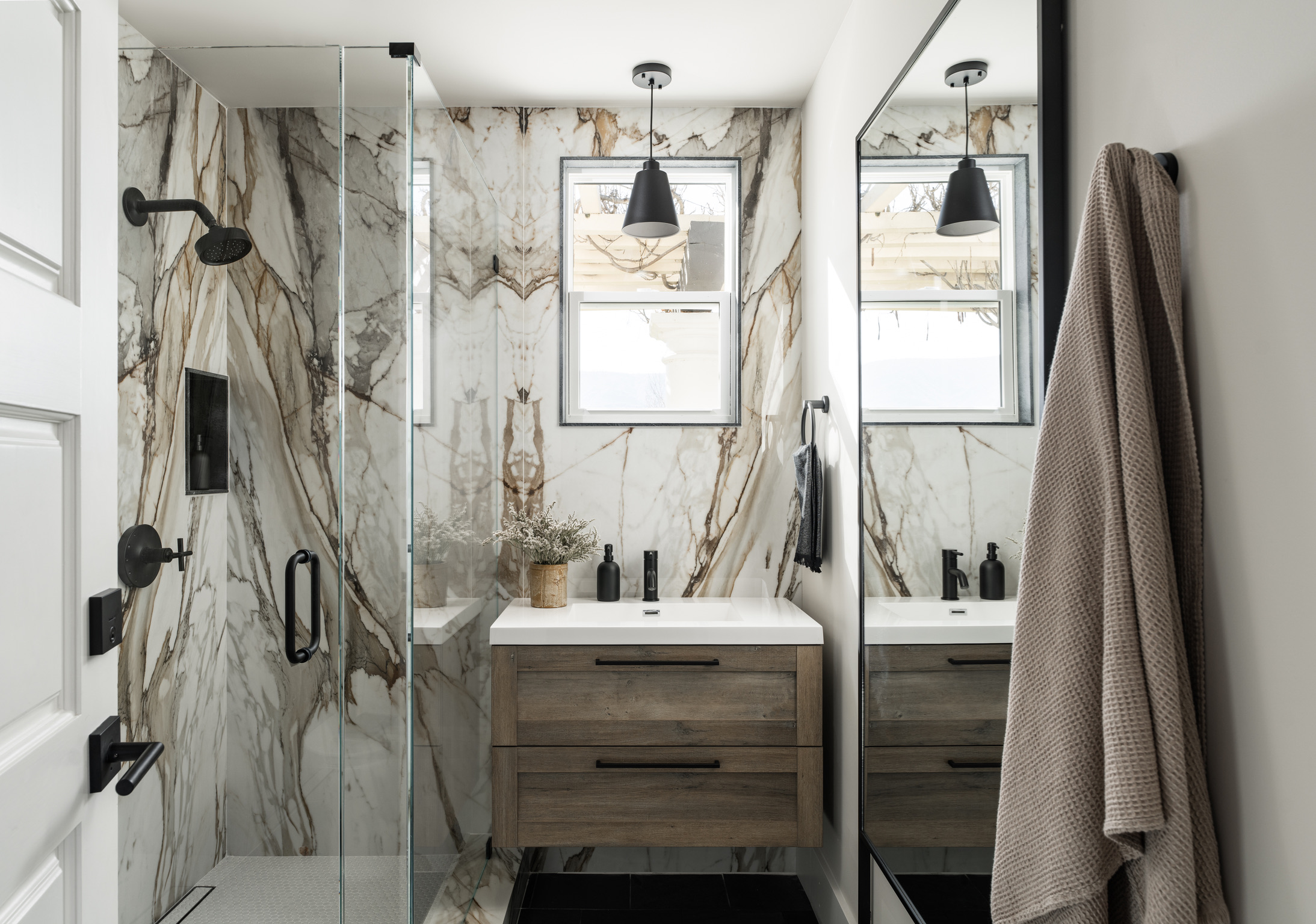
During the build process, I love to ask the clients which are their favorite and least favorite spaces after a walkthrough. It’s a risky little game that I play, but I love to hear how their opinion changes throughout the process. This space was low on the list during the process, and it wasn’t until it was fully styled that the clients fell in love. In fact, what was one of their least favorite spaces quickly became one of their favorites once everything was complete. This space started with the vanity. The client had it left over from another project and asked me to find a place for it in this project. Because it is floating, I knew it would be perfect for this bathroom because it would give me more spacial freedom without the shower curb getting in the way. It offered the allowance to capitalize on maximum surface area. One of the things that felt “off” in the before was the sink and window. I added a matte black pendant light to better anchor the vanity so everything felt intentional. The original design solved some pretty big problems this space faced but stopped short of full resolution. The vanity and light fixture are both so simple but pack a big punch functionally and aesthetically. The area now feels like it’s supposed to be there and wasn’t just thrown in to solve a functional problem.
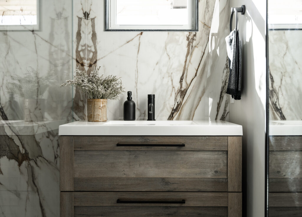
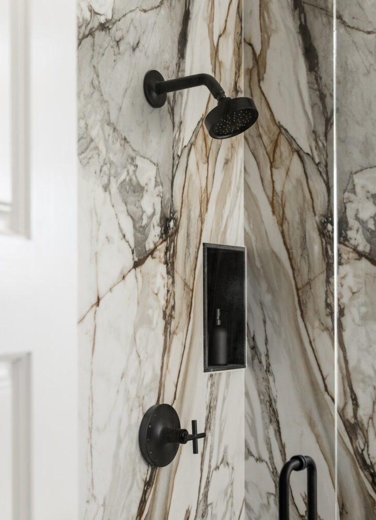
Photo: Blake Bronstad Photography
The wet walls are entirely clad in porcelain marble slabs that are both beautiful and durable. Porcelain is not porous like marble, so you don’t have to worry about staining, etching, or someone using the wrong cleaning product and ruining your beautiful stone. A downside to porcelain slab is that you get a raw edge. While the fabricator was templating and we were discussing exactly how I wanted things to be completed, I asked the fabricator how much soapstone we had left from the other spaces in the house. He got very nervous. I think it’s safe to say that the various contractors I work with know me well enough to cringe and fight the urge to run when I say, “before you say no, just listen. Can we…” because I’m about to ask them to do something unconventional. If you could be remanded to a psychiatric treatment facility based solely on the facial expressions you receive from others, I’d be long gone. Just sayin’. Anyway, we were lucky to have enough material to finish the edges of the porcelain slab. The soapstone was 3cm (1-1/4″) and just too large to make the niche and the window functional so it would have to be trimmed down. It’s always risky to go thin, but it worked! The fabricator VERY carefully, and nervously, cut the soapstone to a thinner profile, only 1/2″, and created pieces for the shower niche and the trim around the window. A simpler solution would have been to use a Schluter or pencil trim to finish the edge, but neither solution resonated with me. The black of the soapstone would help further connect the floor and the pendant light. I knew that if we could find a way to use the soapstone, it would help tie this space into the rest of the home making everything feel cohesive.

Photo: Blake Bronstad Photography
Speaking of cohesion, I used the same flooring material in this space as I did in the Entry Bath. I’ve said it before, and I’ll keep saying it: reusing the same material in different spaces helps create a cohesive home. In the entry, we did a straight lay, and here, we did a broken joint tile pattern of the same material. This creates some variety while maintaining continuity. The Kohler Purist line was used for the plumbing fixtures throughout the home, further connecting each space. I wanted a frameless shower to get as much visual real estate as possible. With all the beautiful book matching happening with the stone, I wanted to avoid any interruption. It also helps give the illusion of space in a modestly sized room.
Lastly, I spent a few site visits sitting in the middle of the floor, staring at the window and adjacent wall, contemplating how I wanted to incorporate a mirror in this space. The wall of mirrors in the before photo functionally fulfilled a purpose, but I was afraid it wouldn’t give the touch contemporary edge we were after. I considered using a mounted mirror that was on a swivel that could be adjusted by the user. I sat, and I pondered. I decided the best road forward was an oversized floor mirror mounted to the wall. This mirror accomplished all of the same benefits as the entire wall of mirrors but in a simple and beautiful way. It also had the added benefit of leaving room for a towel ring and towel hooks to be installed on the wall. It creates light, the illusion of space, and provides utility for guests to get ready and check themselves before heading out.
This guest bathroom next to the pool at Coyote Hills has been a journey filled with functional and aesthetic improvements. From the initial plumbing issues and lack of storage space, we embarked on a mission to create a more contemporary and inviting atmosphere. Through careful design choices and collaboration with the clients, we were able to turn this space into a beloved gem in their home. The floating vanity and matte black pendant light brought intentionality and style. At the same time, the porcelain marble slab offered both beauty and durability. Incorporating soapstone edges and repeating flooring materials from another space helped establish a cohesive flow throughout the home. The frameless shower and oversized floor mirror added visual spaciousness and a touch of modernity. This bathroom now stands as a testament to the transformative power of thoughtful design, turning a functional necessity into a delightful retreat for guests enjoying the pool and the summer season.
Before And Afters
read more
Welcome to the world of elevated secondary spaces! We’re back at Coyote Hills. If you’re ready to transform your bathroom into a showstopper, this blog post is for you. Picture this: a harmonious blend of stone and a touch of the timeless elegance of a herringbone tile floor. Intrigued? Let’s dive into the details!
This project has an ensuite bathroom for every bedroom. This particular ensuite bedroom and bath is not the primary, but it has always been the client’s favorite room in the house. The light that comes in through the large windows and the view looking out to the lake are just so beautiful; you cannot help but love this space.
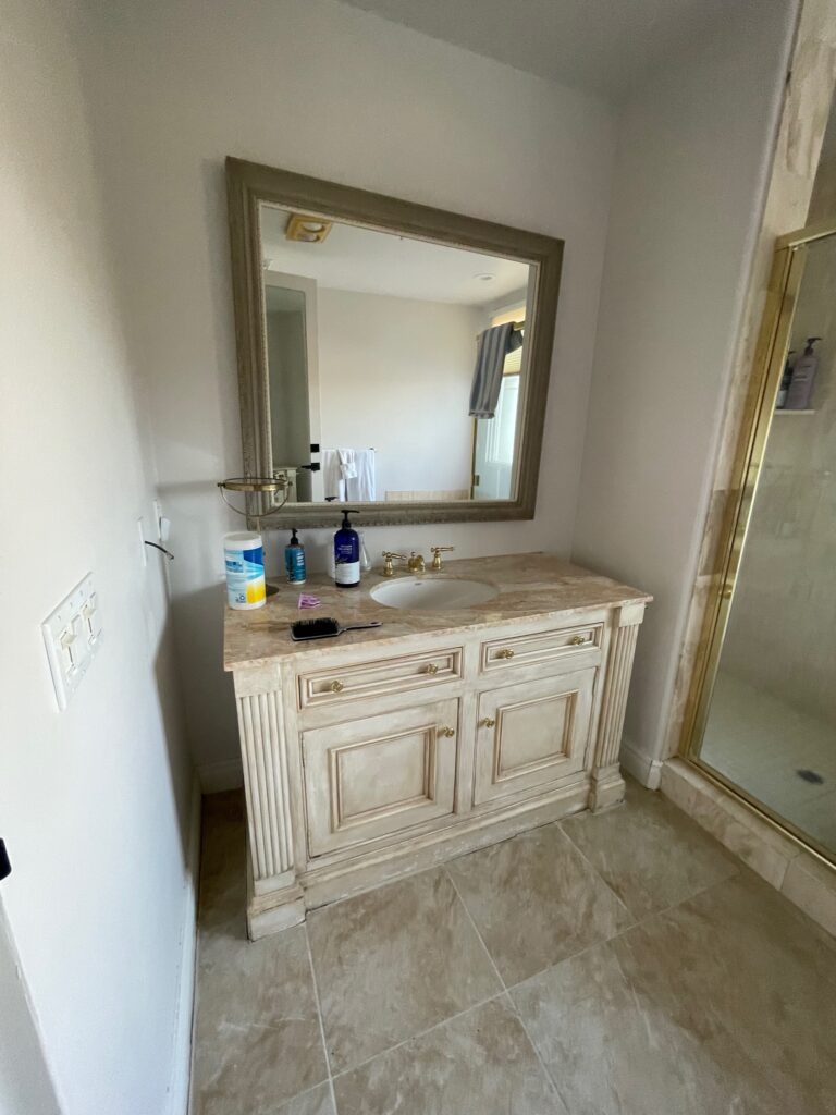
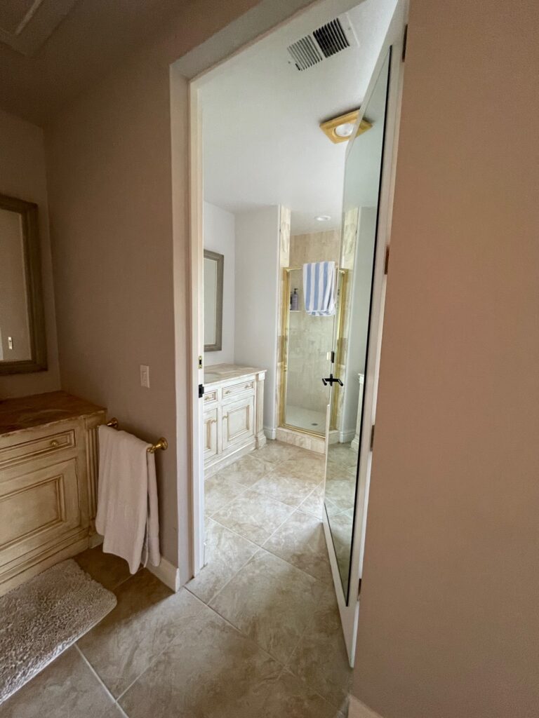
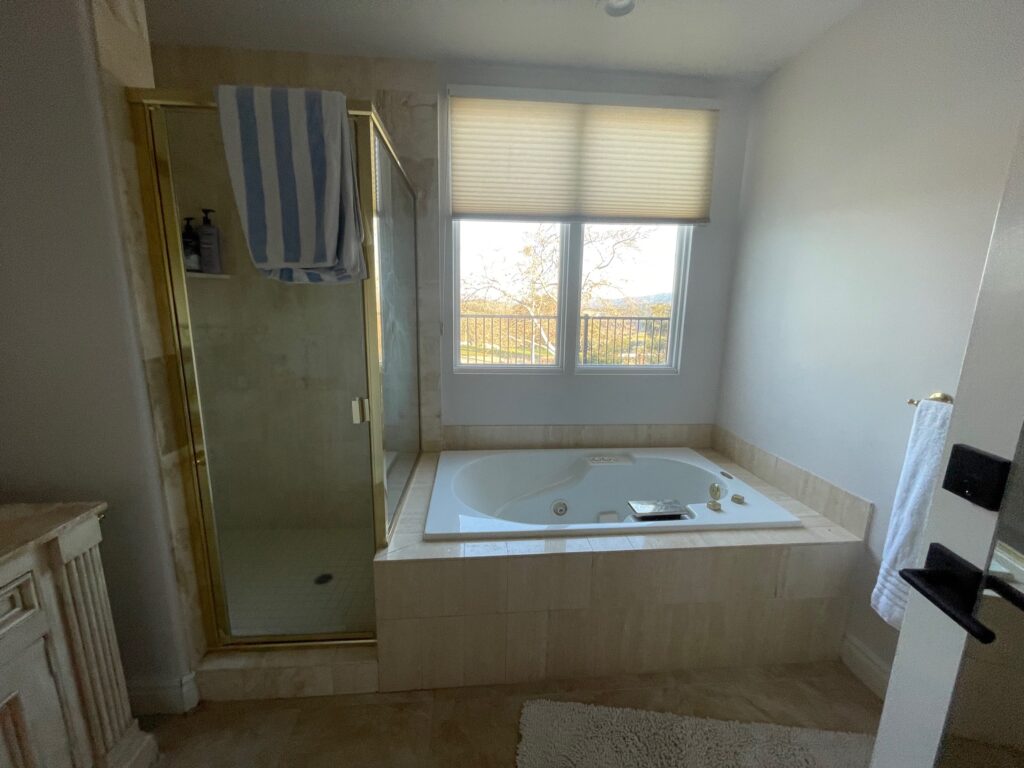
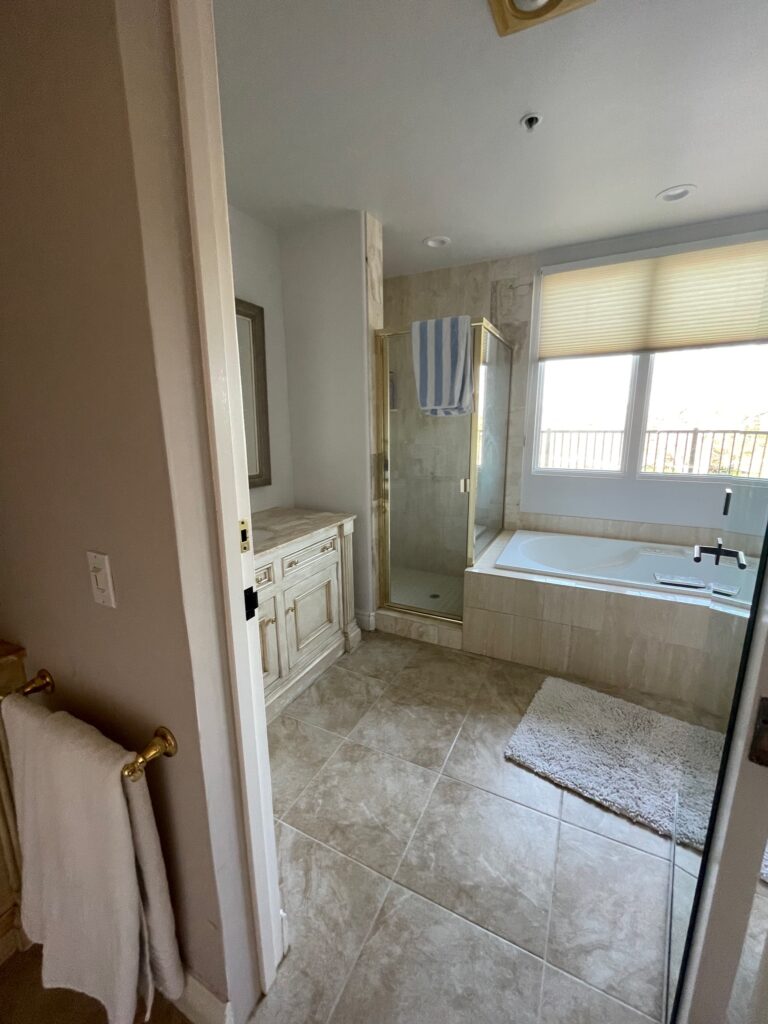
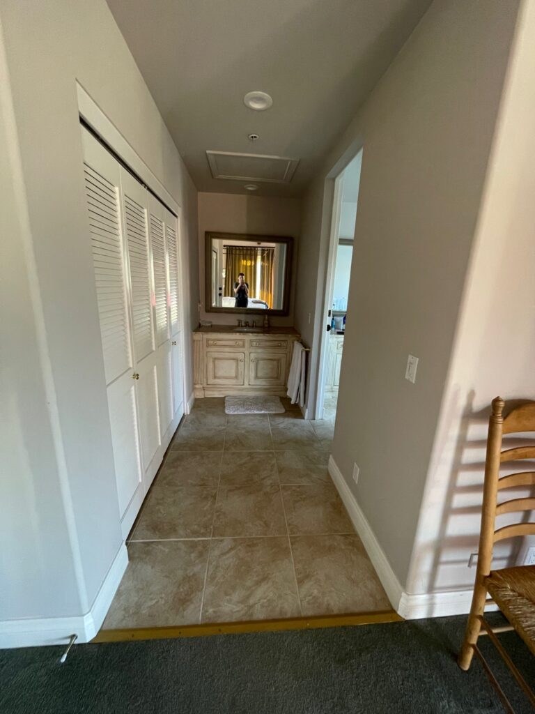
I’ve definitely seen a worse before picture, but this bathroom, and another, had some plumbing issues that needed to be fixed. It’s the Tuscan style we saw throughout the 90s with the shiny gold hardware and faux travertine. We kept the same general footprint and made some small but mighty changes. I keep saying it, but scale and proportion were an issue in this house before we came in for the renovation. The smaller hotel-style vanity and the larger vanity in the wet room were awkwardly sized for the space. Ironically, we kept that same size but incorporated a wall on either side to properly encase the vanity and added full radial arches to go with the style of the home. The shower in the “Before” was generously sized but had a tiny door (20 inches wide), and the way it was walled off made it feel smaller than it really was. To remedy that, we cut the wall back when we were adding the arch and incorporated glass panels for the shower allowing the space to feel bigger and get much-needed natural light.
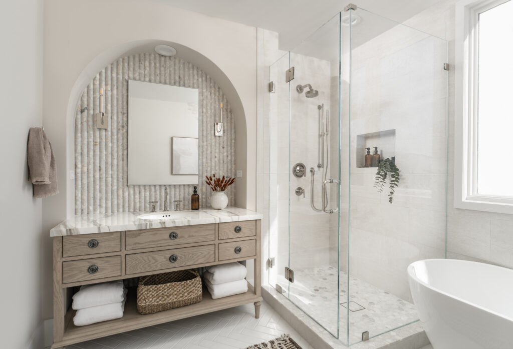
This is such an elevated secondary bath. The finishes are simply breathtaking. When I handed all the material to the tile contractor, he thought I was absolutely crazy. He pulled me aside and said, “I don’t think you realize that you have 4 different types of stone here and a white subway tile, which of these goes here”. Uh yeah, I do realize; it all goes here; it’s one of my many shades of crazy, it’s going to look phenomenal, and I’d like it installed, pretty please. In his defense, it is a little unbelievable, but the payoff is SO GOOD! When mixing materials, always, I repeat, ALWAYS get samples. Scratch that; always get samples even if you aren’t mixing materials. After you have your samples, take them to the space where they are going to live and double, triple check your samples to make sure everything works. Check them in the morning, midday, and at night. Natural light can have a very powerful hand in manipulating what your finishes will look like. Always check in the space, and do it multiple times a day.
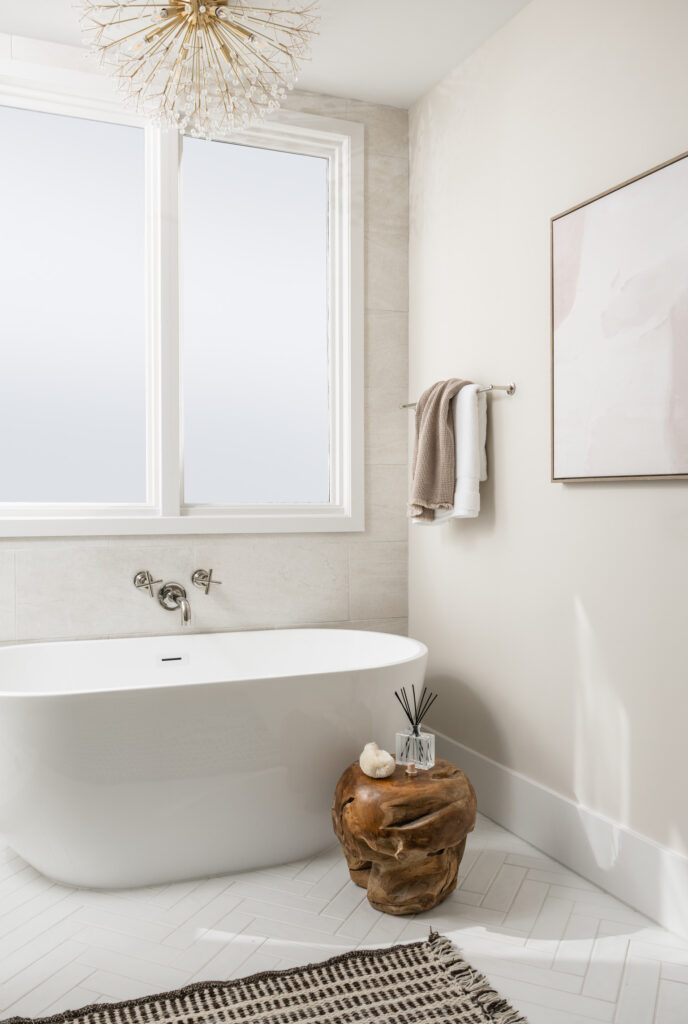
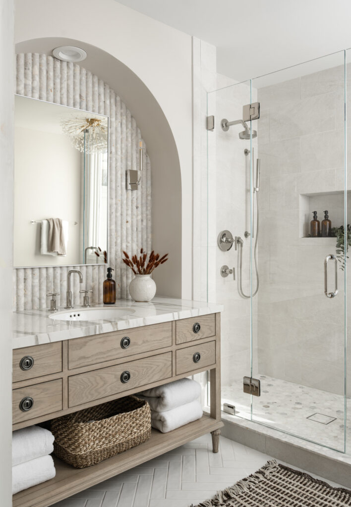
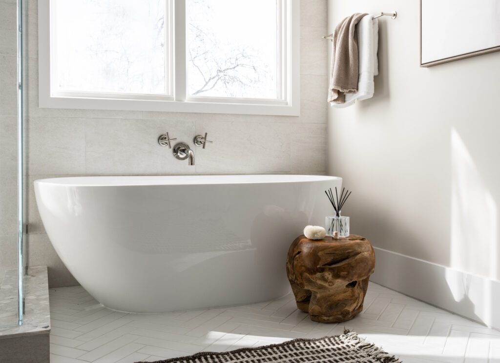
Photos: Blake Bronstad Photography
To help make the space feel larger, we got rid of the tile tub surround and replaced it with a streamlined, freestanding tub. Spoiler alert: it’s a Home Depot find and SUPER affordable. This wall-mounted tubfiller from the Kohler Purist line is one of my absolute favorites. It’s great for spacesaving and just looks so stunning. The color palette is calm and subdued to maintain a sense of relaxation. We did use some moodier colors throughout the rest of the house, so we incorporated some deep browns in the bathroom to bring in some saturation. In addition, the bedroom has some darker tones to tie everything in with the rest of the home. The backsplash at the vanity area is a beautiful tile from Ann Sacks. It’s part of the Terrazzo Renata line and is the fluted tile in Brulee. The Terrazzo tile is an excellent connecting piece because it has some deep gray running throughout but also connects to the light beige, gray, and gold tones in the Calcutta Gold porcelain slab that was used for the countertop. Something you might start to notice is our use of curves. Here, we used these beautiful arches and the gentle undulation of the fluted tile. Arches and fluting are repeated throughout the home in other spaces, and even the sensuous curve of the range hood we featured last week ties in with the curve of the arch. There are a lot of ways to make a home feel cohesive. Here we used repeated curves, and repeated materials (used in different ways), so watch out for those elements as we continue on our tour in the coming weeks.
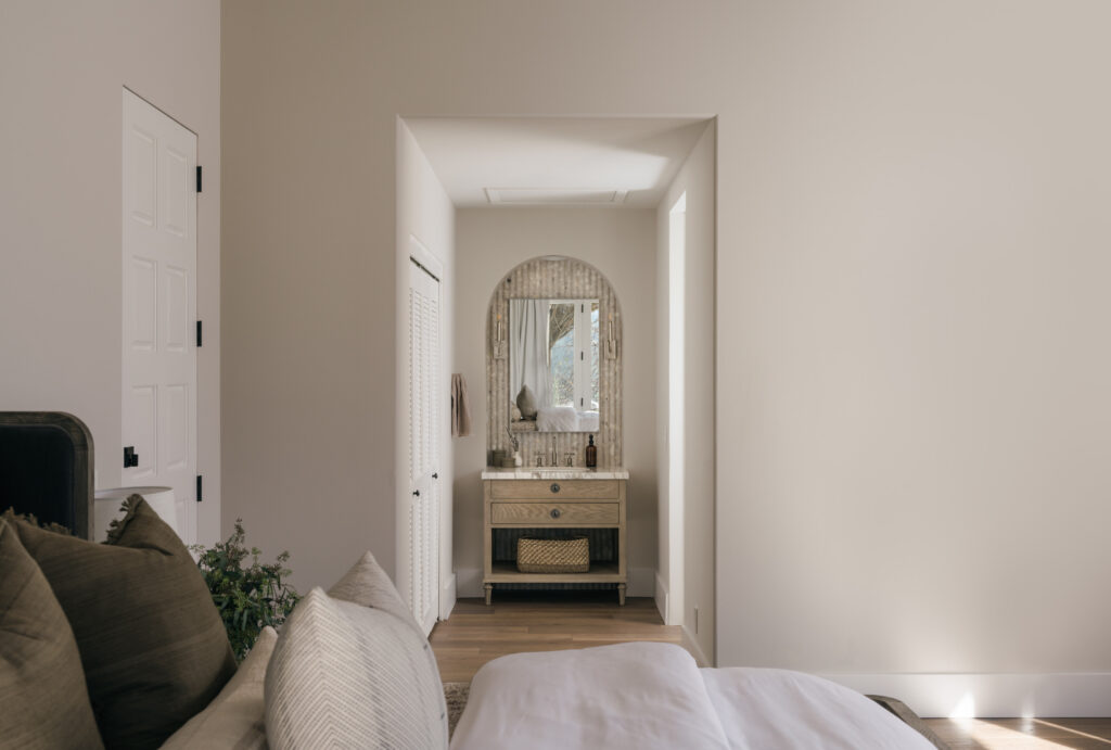
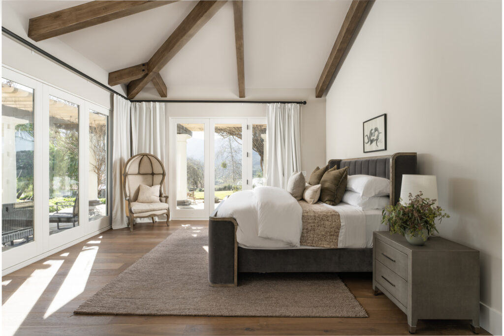
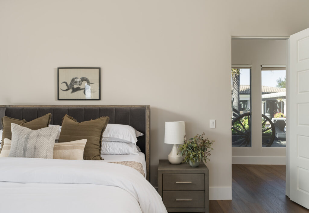
I don’t know if you noticed in the “Before” photos, but I briefly mentioned that this particular bathroom has a hotel-style vanity that is open to the bedroom and one that is inside the wet room. The bedroom was originally carpeted, and the area with the vanity had the same tile that was used in the rest of the bathroom. We decided to switch that up a bit and carried the same hardwood flooring used in the bedroom into the vanity area. We then made the switch to tile at the threshold to the wet room. You know I always like to start with the “Before” so that you have a proper starting point, but this post is ever so SLIGHTLY out of order…
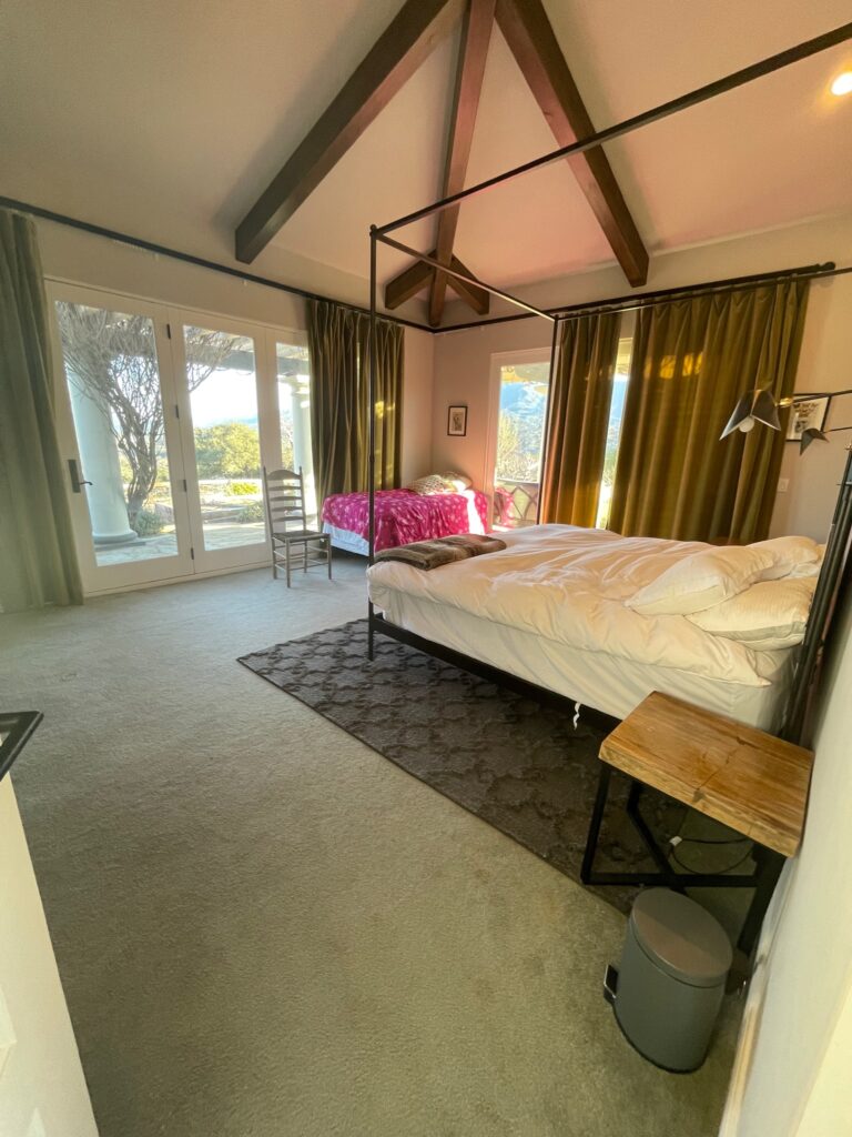
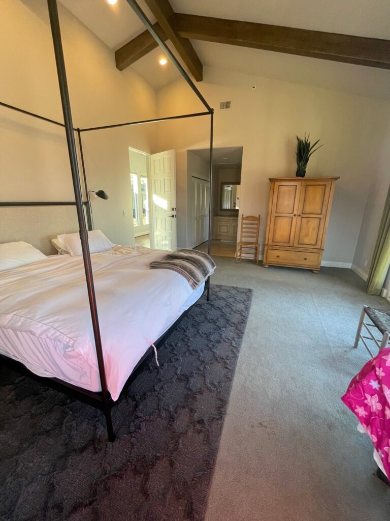
While showing you the vanity, I gave you a little sneaky, sneaky peek, but this before and after is CRAZY! Even looking back at the before photos has me completely floored. I almost can’t believe it’s the same space! Even better? We really didn’t do that much. We’ve talked about how new flooring throughout was one of the client’s top requests, so of course, that is something that got switched out. Because the flooring was replaced, baseboards had to be removed, and it was a good opportunity to replace the existing base with something a little more appropriately sized. This home has high ceilings, the lowest being at 10 feet. Originally, the base was 3-1/2″. Something people don’t realize is that baseboard really does need to be sized differently based on your ceiling height–I sound like a broken record, but it all goes back to scale and proportion. Because we were working with beautiful high ceilings, we went up to an 8″ baseboard. We also scaled back on the ornamentation and went for something very streamlined. If all we had done was flooring and base, it would have made an enormous difference. The furniture is different, but it was part of the furniture shuffle that we performed and was already owned by the client; it was just living in a different space before we came in.

Photos: Blake Bronstad Photography
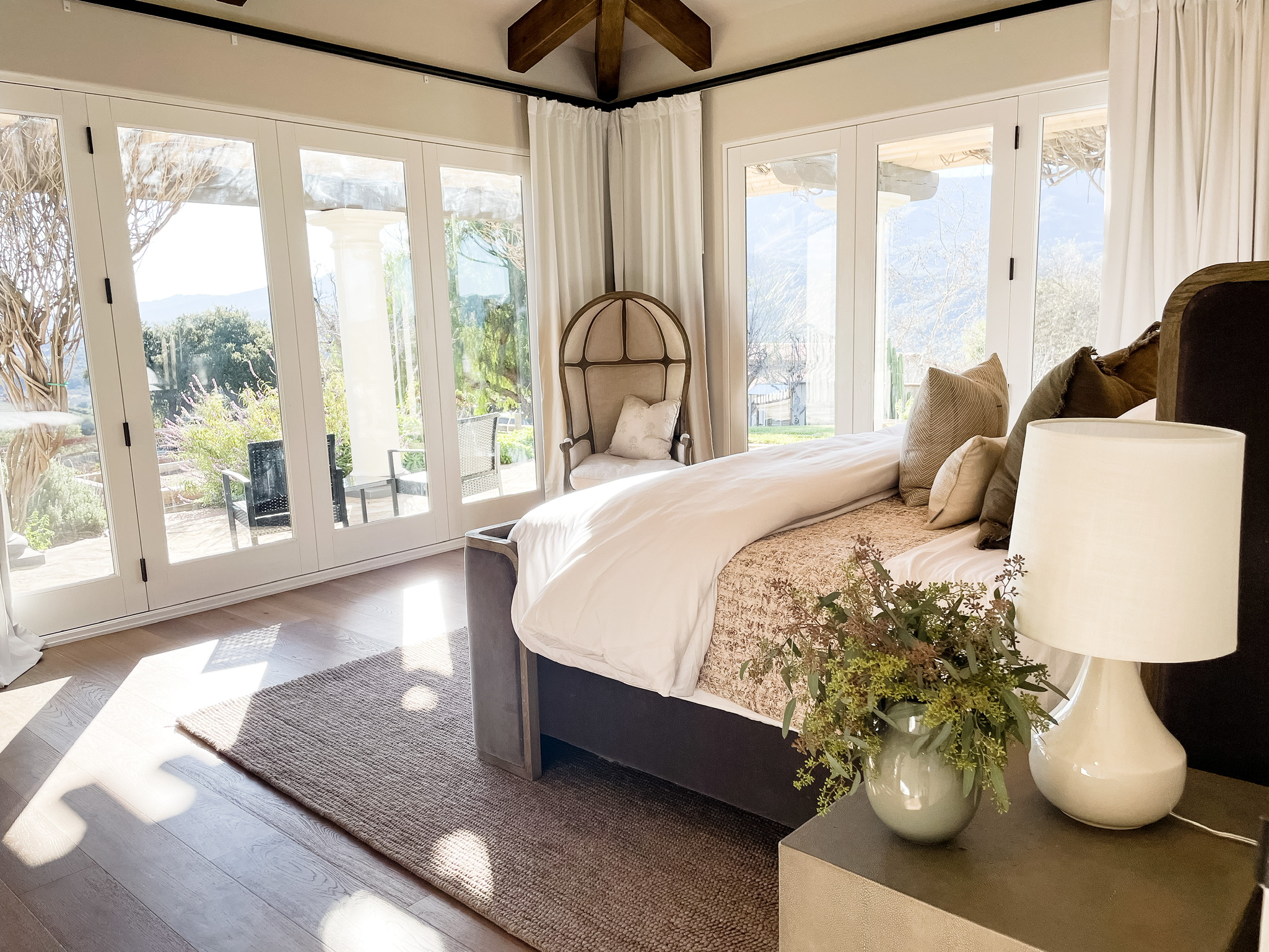
Now, let’s head over to the bedroom, where the magic of careful curation took center stage. Believe it or not, we kept the costs to a minimum while achieving maximum impact. The only new additions here are the bedding and lamps, which inject a fresh burst of style and sophistication. And get this—the captivating art above the bed? It’s an original piece created by the homeowner themselves! The only other investment in this space was the drapery. We got new panels from Amazon that were completely affordable and beautifully finished the space.
We know it can be intimidating to shop your own space, but trust me, the payoff can be enormous. These clients were blown away by what we accomplished using their existing pieces. With a keen eye for detail and thoughtful consideration, you can genuinely transform your surroundings.
So, are you ready to witness the power of a remarkable makeover? Buckle up and prepare to be wowed because our interior design studio is all about turning dreams into reality. Get in touch with us today, and let’s embark on an incredible journey of reinvention together!
I love comments, so leave me one below! I’m dying to know what you think of what we have accomplished so far.
Before And Afters
read more
Welcome back, dear readers! I hope you’re as excited as I am because today, we’re diving into the much-awaited kitchen of our #CoyoteHillsProject. This kitchen was a last-minute addition, and we faced the challenge of working within a limited budget and a tight timeline. But as they say, constraints often breed creativity! So, let’s embark on this delightful journey of transformation and explore how we turned limitations into opportunities.
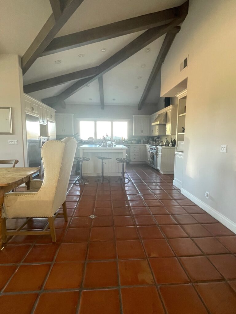
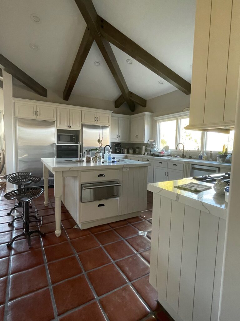
Let’s begin at our pre-demo starting point–the before photo. While saltillo tile is a personal favorite and would have matched the paint color we settled on for cabinetry, it didn’t align with the client’s taste and preference for zero grout. New flooring was already on the list for this space, so that was taken care of. This space has a good layout, and the cabinet boxes were in great shape. The kitchen “worked” with the design for the remodel, but as things were coming together, it just didn’t feel as fresh as the rest of the home. Some modifications could be made to make it better connect with the rest of the house. The client loves a modern farmhouse kitchen, and that was my direction for this space.

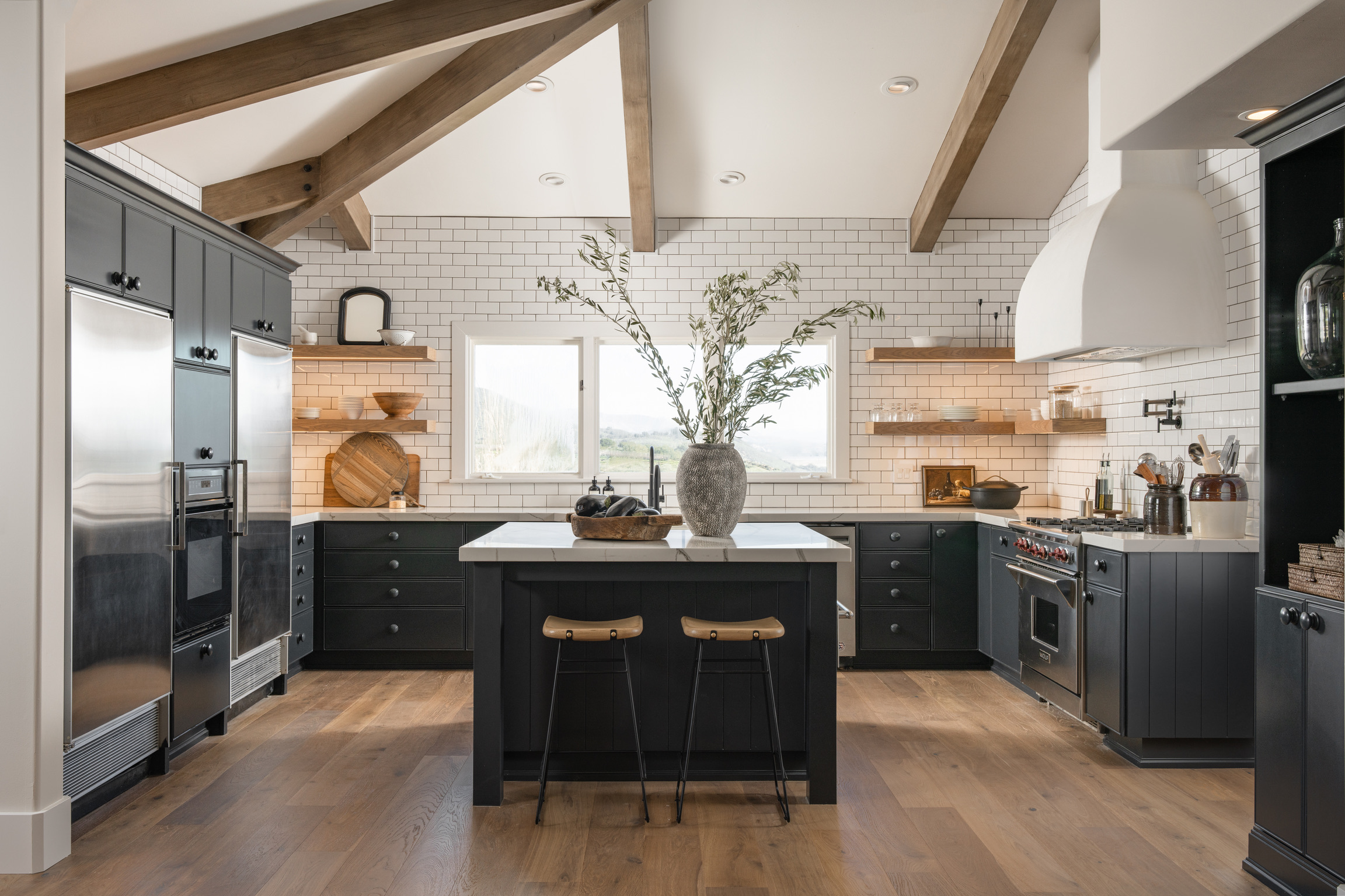
We took a couple of important steps to get the result we were after. First, we opted to revitalize the Cabinetry. To stay within budget and meet the timeline, we decided to reface and repaint the existing cabinetry. By doing so, we could breathe new life into the kitchen without the need for a complete overhaul. The selected paint color (Railings by Farrow & Ball) beautifully complements the desired modern farmhouse aesthetic, and the reface brings a fresh, updated look to the space.
To make this traditional space lean a little more farmhouse, we made strategic design choices throughout the kitchen. We focused on simplifying trim work and removing excess ornamentation, creating a clean and streamlined appearance. The window was reframed with a sleeker profile, the island legs were rebuilt for a cleaner look, and the cabinet faces were simplified.
Next, we utilized custom details for added Interest. In our pursuit of elevating the kitchen’s aesthetic, we opted for a full-overlay panel design to achieve a high-end look. Slab front cabinets can lack interest. To infuse a touch of charm, we added a delicate bead detail around the face perimeter. This detail is a simple and affordable way to get a designer look.
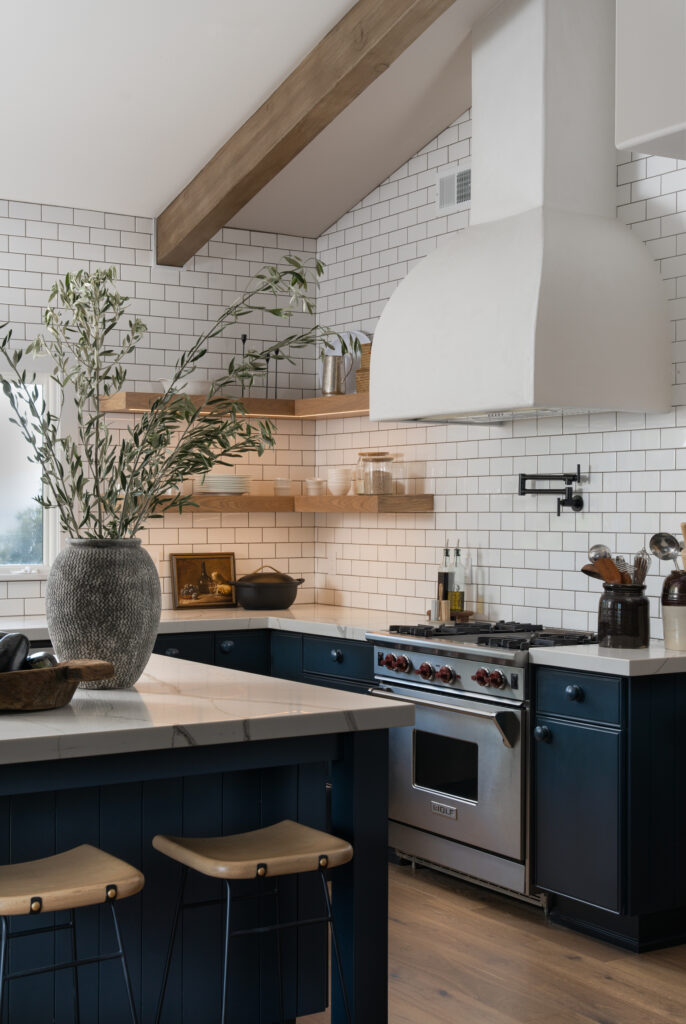
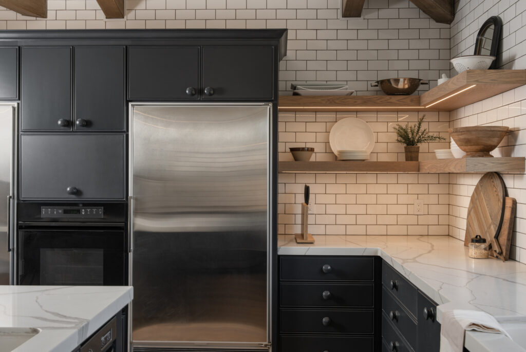
We leaned into the beauty of streamlined simplicity. For hardware, we painted wood knobs to match the cabinetry. This decision not only provides cost-effective benefits but also goes back to making everything streamlined. This approach beautifully balanced the traditional farmhouse elements with a modern twist while also resonating with the timeless allure of European cottage aesthetics. Perfection! 🤌
Speaking of streamlined simplicity, I can’t go on without mentioning the floating shelves! We removed the upper cabinets and replaced them with beautiful white oak floating shelves. The window that is the focal point of this space is actually asymmetric. To create symmetry, we had the carpenter build the shelves to symmetrically frame the window versus being of equal size. We utilized the same strategy for the shelf on the range wall. We ensured the shelf was sized to create symmetrical open space on each side of the hood.
This range wall is EVERYTHING to me. I can’t stop staring at the plaster range hood, and who doesn’t want a pot filler in their kitchen? We had this hood built on site from a quick drawing I threw on the wall, and I was giddy each and every day as I saw it coming together. It turned out exactly as I had imagined. A very “designer” thing to do is to take the backsplash all the way to the ceiling. Why? Because it keeps the eye moving upward. We typically see a backsplash terminate under the cabinetry. Because most kitchens have upper cabinets, windows, and other elements along the wall, terminating the tile before the ceiling usually creates an awkward angle somewhere. It looks more expensive (because it is) and gives a cleaner look to fill the open space on the walls with your backsplash material. In this kitchen, we want the eye to travel all the way to the vaulted ceiling with beautiful beams, so carrying the tile to the ceiling really benefits the space. The budget for this add-on space was tight, so we did a simple big-box store subway tile instead of a slab or designer tile. The client really loves the look of white subway tile with contrast grout. Typically, we see black or charcoal grout, but we used a dark brown that brings out some of the smaller brown veinings on the countertop. The result is a little more unique and feels really rich against the dark blue/black cabinetry.
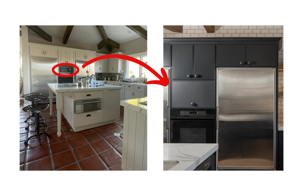
Whenever I design a kitchen, I like to make sure that focus stays on all the beautiful finishes we have poured our soul into selecting. Small appliances can sometimes be an eyesore and detract from the design. Every space is different, and concealing these appliances can have varying solutions. Because we did not go completely custom in the kitchen, we had to be creative about concealing the microwave in its existing location. We added a cabinet front and used a vertical swing lift-up hinge to open seamlessly over the cabinets above. If we had used a piano-style hinge, the door would have opened at about eye level right into the pathway, creating a hazard.
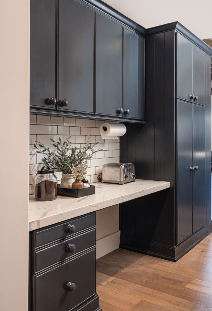
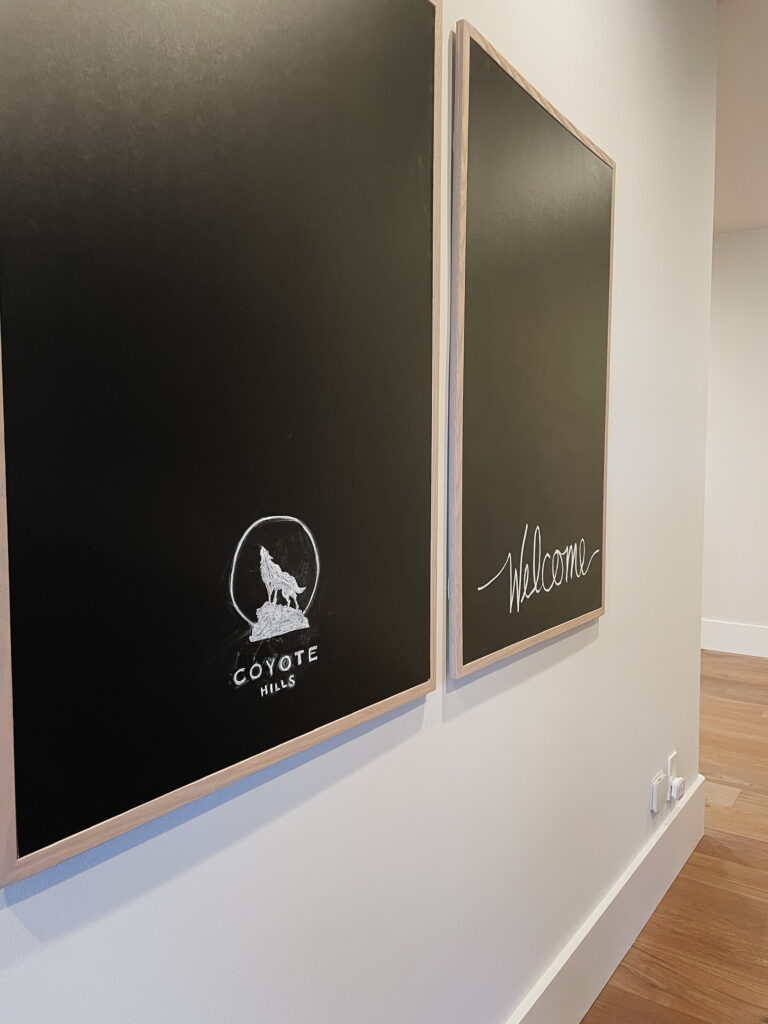
A desk area off the side of the kitchen leads to the butler’s pantry/bar area. The family didn’t utilize this as an office space, so we moved things around to make it a little more practical. We placed the coffee maker and toaster here to create a coffee bar. Because it is adjacent to the kitchen, it keeps these appliances out of immediate sight but still easily accessible. There is a large, blank wall directly across from here, so we added a couple of large-scale chalkboards that can be used to write recipes, a shopping list, or keep little ones busy while Mom or Dad is busy in the kitchen.
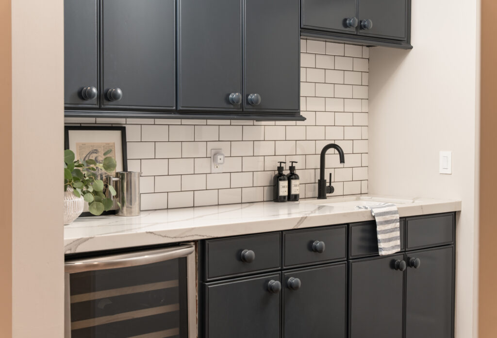
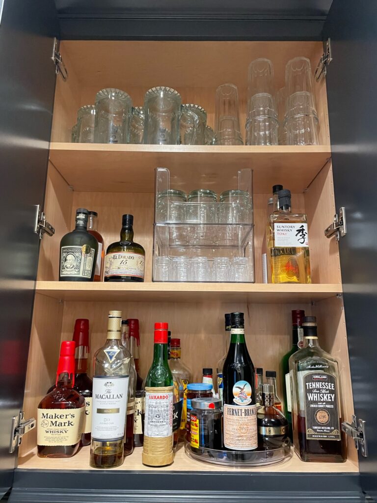
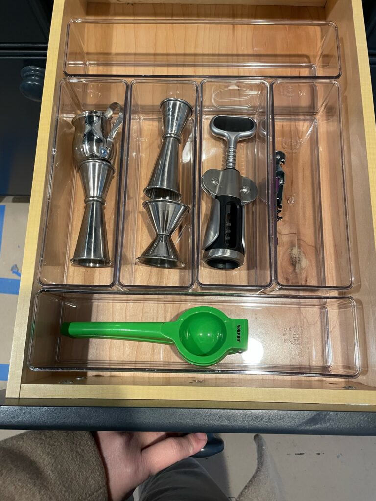
The butler’s pantry/bar area is basically my PSA for organization. We kept things clean and simple, falling in line with the rest of the kitchen, and made it a priority to ensure everything was properly organized. You can have a beautiful space, but it can quickly become cluttered if you’re not organized. Good design includes good organization. If you are not using custom cabinetry that allows you to implement custom organizational systems, invest in organizational products to help keep things tidy. Don’t let clutter take over. OK, I’ll step down from my soapbox.
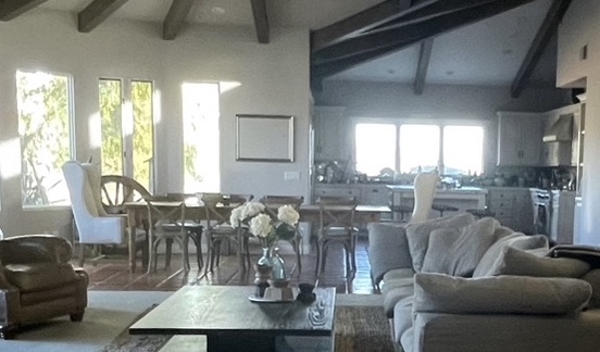
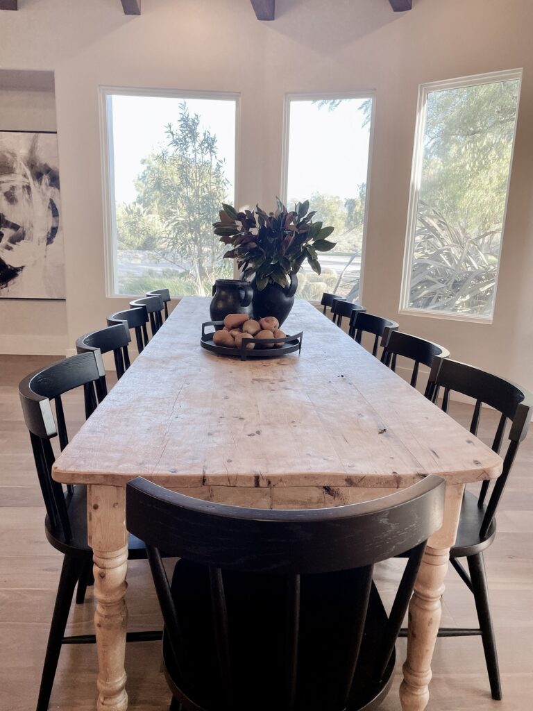
Before I go, I want to quickly touch on the dining area. While it still resides in the same general area as it was originally placed, we did shift the table over a bit to create better sight lines. What does that mean? In interior design, a “sight line” refers to an imaginary line that extends from a specific viewpoint or vantage point in a space. It is the path a person’s eye takes as they look across a room or move through it. In the “Before” photo you see above, the dining table is visually pushing into the kitchen area. You can see the table is protruding into the walking space around the island and the end chair is sitting about halfway across the island. When you walked the space, the pathways were still completely usable. However, visually it looks cramped and not completely functional. You’ll see below that we shifted everything toward the living space and closer to the wall on the left. It created a clear sight line into the kitchen and makes the space appear more organized and visually pleasing. Each space now how a clearly defined zone.
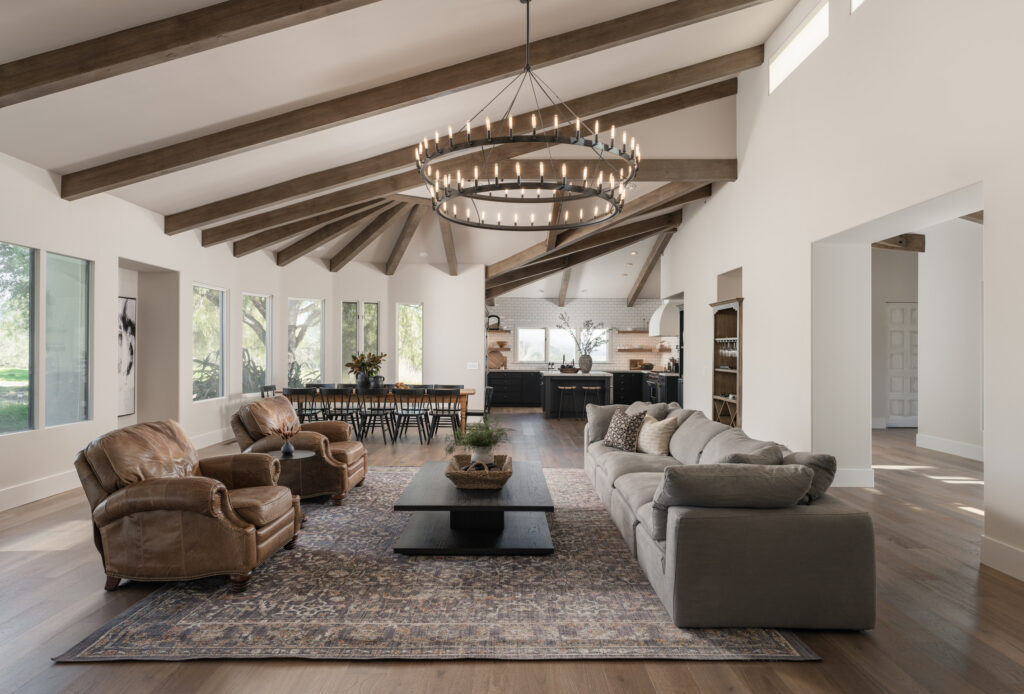
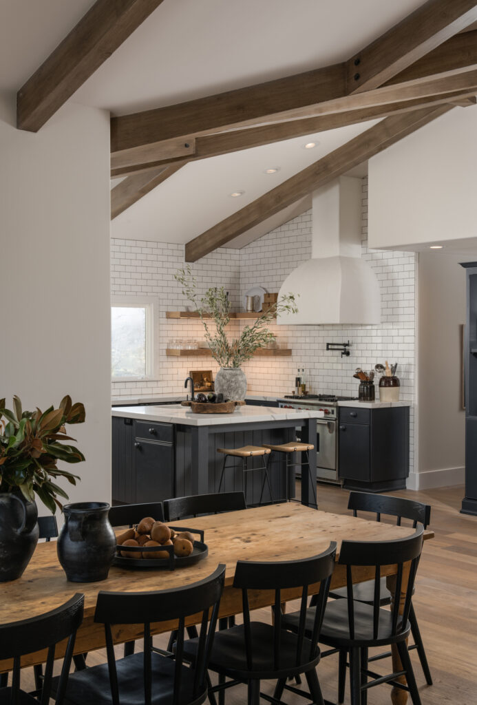
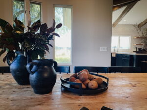
In the world of interior design, every project presents unique challenges and opportunities. The #CoyoteHillsProject’s kitchen transformation showcases the power of creativity, resourcefulness, and a deep understanding of the client’s preferences. By making strategic decisions to reface and repaint the cabinetry, embracing a modern farmhouse aesthetic, and selecting custom details for added interest, we successfully crafted a kitchen that exudes charm, functionality, and timeless elegance. Stay tuned for more captivating design journeys that inspire and ignite your imagination!
Before And Afters
read more
Welcome back! So remember I was contracted for flooring selection and some bathroom updates? Well…These living spaces have such a dramatic before and after! How did that happen? 🧐 Oh, that’s right, I can’t help myself. Most amazing? The vast majority of change happened through space planning. I edited out some of the furniture, but I didn’t purchase any new large pieces, just a few decor items. Hell, even most of the decor was existing, and I just curated what the clients already had. I was given a budget for new rugs. Rugs are super important, and MANY people find rug selection a struggle. I could write an entire novel on the anxieties people have shared with me in relation to scale and pattern when trying to select a rug. Don’t worry; it’s actually quite simple, and I’m going to walk you through it. One design challenge for this space is that the living and formal living rooms open up to each other. The clients already had matching couches for each space and complimentary coffee tables. Great! That gave me a jumping-off point with both spaces utilizing matching elements.
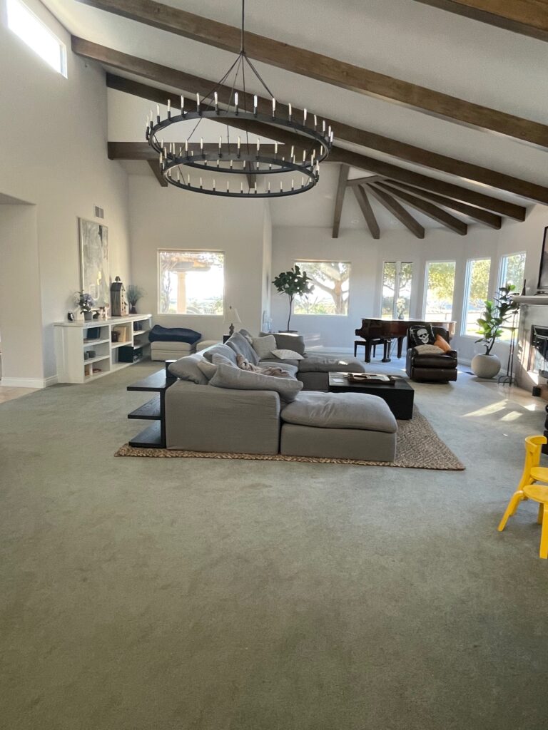
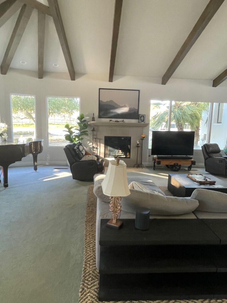
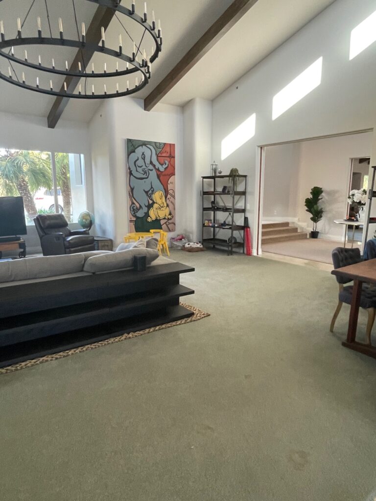
When you walk into the home, you’re greeted by the entry that was featured last week. If you missed that post, go back and check it out! To the right of the entry is what I’m going to call the formal living room. This space houses the television and a spacious sectional, which isn’t typically the case in a formal living room, but it also has the fireplace and baby grand piano, which definitely leans more formal. Also, the other living room acts as part of the great room because it opens to the kitchen and dining so I stand by my decision to call this the formal living room. But I digress…the furniture here is actually great. The couch was resting on a 10’x14’ rug. That is a large rug, but this room is massive. Do you see how small that baby grand piano looks in the corner in the before pictures? It’s a LARGE space. The rug is a tad too small, and having the couch and the console behind it resting fully on the rug makes it feel cramped. There’s built-in shelving toward the back of the room, two recliners, two bookcases, a desk, a cart that the television rests on, a kid’s table, and numerous toys. The amount of furniture feels a little cluttered, but the placement makes it simultaneously feel sparse. I realize that sounds like a contradiction, but check out the after.
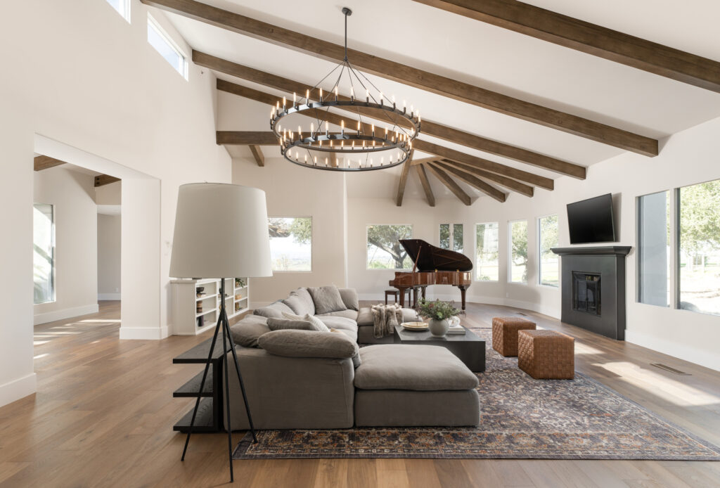
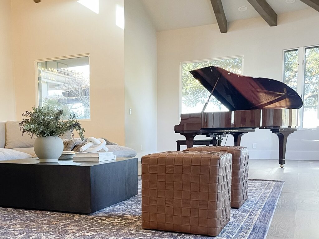
The space has a lot less furniture, but it feels full due to the magic of space planning. Remember how small the piano looked? I opened it to better fill the vertical space and give it more presence. The inside is beautiful, so why not show it off? For the rug, I went up to 11’6”x15’6” and placed only the first two legs of the sofa on the rug. This allowed the furniture layout to occupy a bigger footprint, which was desperately needed. One difference to notice with the rug in the before and after: in the before the width of the couch is teetering edge to edge on the rug. Everything is resting on the rug, but just barely. With the larger rug, we get a little more than 12” on either side of the couch, making things feel better grounded. The larger rug and new placement give everything space to breathe.
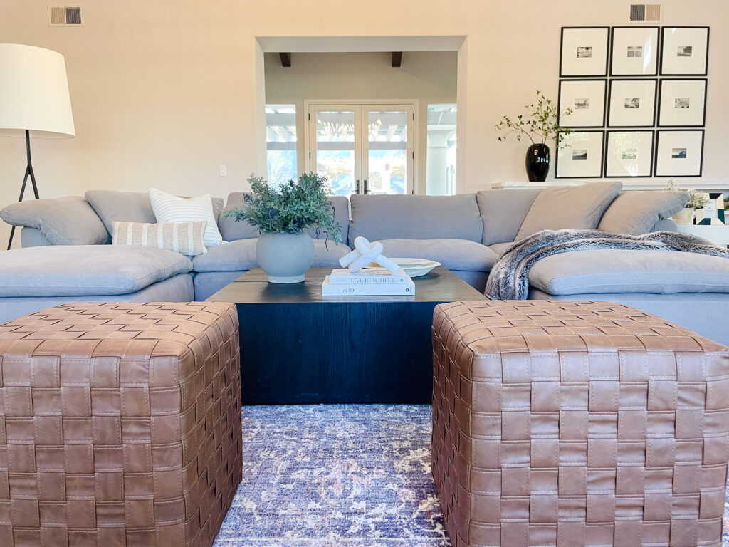
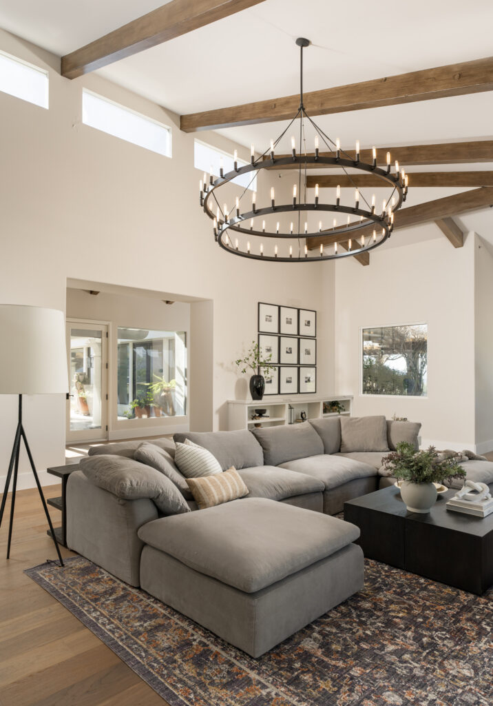
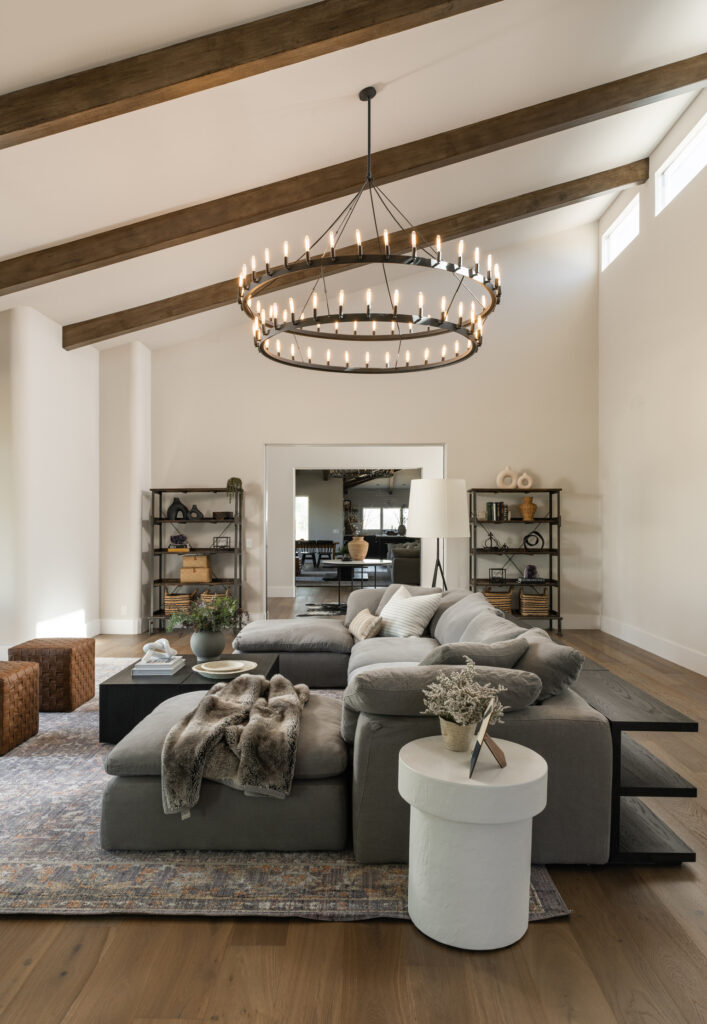
I’m not a huge fan of recliners, but some options are significantly better than others. The ones that were originally in the space just didn’t work. They were large and bulky, blocked the fireplace, and didn’t allow for proper pathways. Since the sectional is so large, it already seats a lot of people. To keep the view clear to the fireplace and keep efficient pathways, ottomans offered a great solution for additional seating. I found these affordable ottomans with a great cognac color that complements the leather in the neighboring living room, helping tie the spaces together. The other living room flows into the kitchen which has a beautiful custom plaster hood. The end table I placed in this formal living room carries that plaster material over, further connecting the spaces while keeping each space unique.
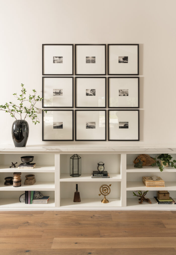
These clients are pretty laid back, but there are a few things we did to take this space to a dressier place. We have a more formal arrangement with the forged iron floor lamp. Curated styling on the bookshelves and built-in, the faux fur across the chaise, and the accessories on the coffee table all work together to read more formally than the other space. I have plans to dive into gallery walls and shelf styling later down the road, so for now, we’ll just admire this gallery wall.
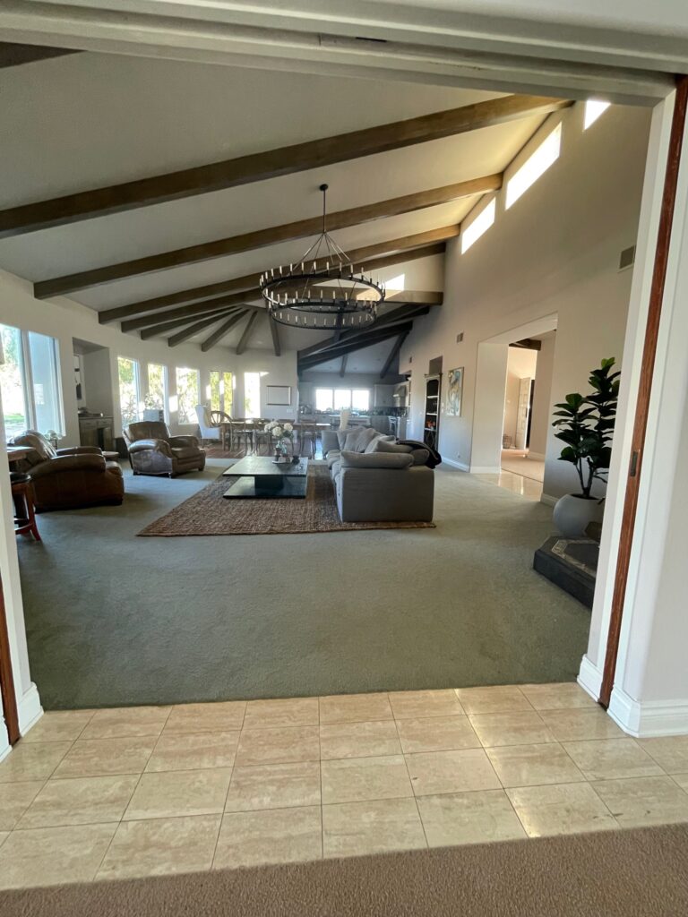

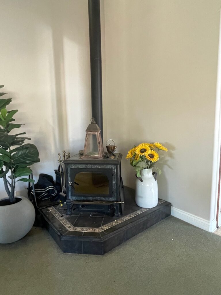
Moving into the living room/great room, we had some of the same issues. Originally, the space planning wasn’t terrible, but you’ll see that with just a few tweaks, there’s a major impact.
One of the more obvious changes is that we got rid of the wood-burning stove. It wasn’t adequately scaled for the space, and an existing chimney allows a fireplace to be added later in a better location. I kept the client’s club chairs (I think they actually came with the house from a previous owner #winning) that already have a great patina, and they’re recliners. See, I told you I use recliners! It has a refined look, but offers a greater level of comfort for this relaxed space. Using the same rug as the formal living further connects the spaces. The large size gives all the same benefits as in the other space and is generous enough to place the recliners so that everything feels properly connected.

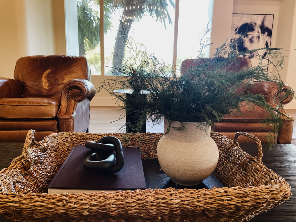
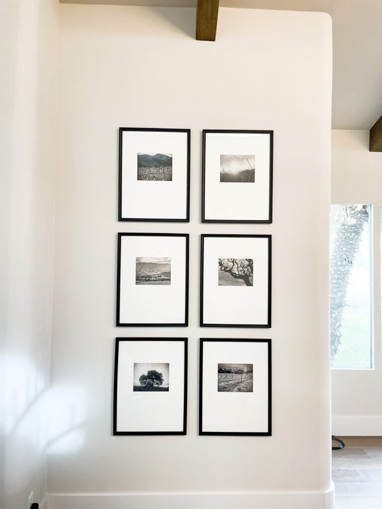
Since this is the living space that the family (that includes small children) uses most regularly, I styled the coffee table with a large tray full of accessories so everything can easily be moved for family game night. The woven texture of the tray speaks to some of the wood tones used in the kitchen. The living rooms are very similar but not styled identically, which helps create a sense of continuity without losing interest. I also utilized a gallery wall of a different shape in this space. The frames are filled with landscape photography from Coyote Hills that I took throughout the seasons during the remodel. These clients requested not to have family portraits displayed, and this offered a great alternative to make the space feel personal.
Have you subscribed to our email list yet? Please do so you don’t miss out on what’s ahead!
Drop me a comment below and let me know what you think of the living spaces at #coyotehillsproject. If you have a design question, ask me in the comments section!
Want more? Check out our YouTube channel to see the evolution of this space!
Before And Afters
read more
I’m so excited to finally start diving into our Coyote Hills Project! I’m starting today with the entry and what was originally a powder bathroom. Full disclosure, the entry wasn’t technically on the list of spaces for redesign, but after touching just about every inch of the house, I couldn’t help but refresh it. Forget that the entry has a fantastic view out to the mountains and pool that wholeheartedly deserves to be highlighted; the entry in any home really sets the tone for the entire house and should be given thoughtful consideration. For more on entries, check out our How to Style an Entry blog post!
Let’s start at the beginning. This house hadn’t had a real update since the 90s. You’ll see in the before pictures that there was carpet with a tile border that just didn’t do the house justice. It felt cumbersome and just brought your eye down to the floor.
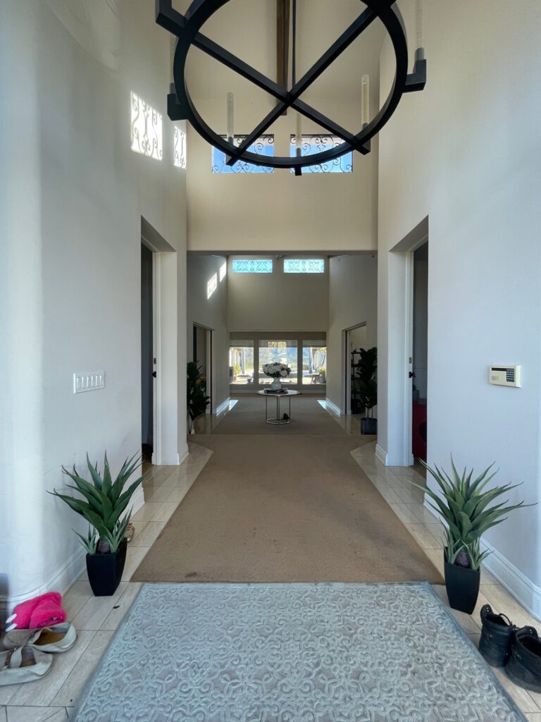
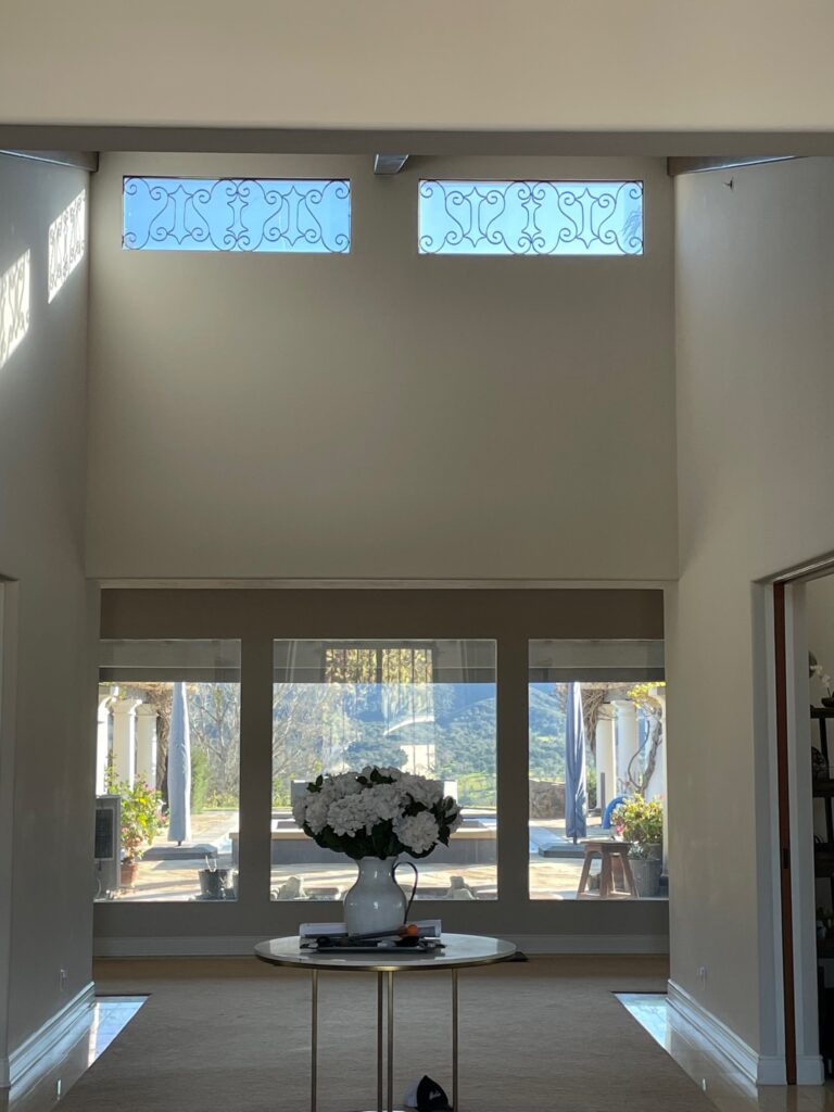
These particular clients have a true talent for finding amazing views. I checked every window in the house; they all looked out to something gorgeous: a lake, private vineyard, or mountains. Because the view is the star of the show, this space really didn’t need much. In fact, to do the space justice, I paired everything back just a little.

The first request with this redesign was new floors. Initially, there were several flooring changes that just broke up the home in an awkward way. Every space in the house is very open leading into the next, so it really called for the same flooring throughout all the main living spaces and bedrooms, reserving a flooring change only for the bathrooms. The flooring selection would only occupy about 7500+SF, so no pressure! Our clients love natural white oak, but we had some existing elements to work with, and with the style of the home, we decided to go a bit darker. The house already had beautifully finished beams, and I wanted to pick a finish that would complement those beams. By the way, this house has SO many windows! By using a darker floor, I was better able to ground the home. Installing a hybrid waterproof hardwood throughout (yes, you heard that right, waterproof hardwood!) allowed me to visually expand the space and bring a sense of continuity throughout the entire home. We have had some extreme weather this year (take the word “extreme” with a grain of salt, we’re Californians and are used to sunny 70-degree weather year-round). The floors were tested when we had a couple of instances of water backing into the house and pooling on the flooring due to high-volume rainfall. Much to my relief, the floors made it through without any damage! Luckily, the installers were talented in their craft and were able to install the flooring throughout the vast spans (not easy) and were careful to make sure everything was sealed properly, and boy, did it pay off!
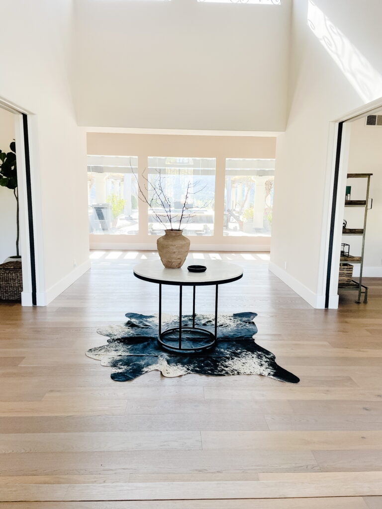
For this particular project, I was asked to do selected spaces. Furniture was not something that I was contracted to source. Luckily, the clients had great furniture throughout the house. In conjunction with some heavy editing, I kept all the large pieces and utilized some thoughtful shuffling of the furniture throughout to make more sense of each space. I gave the marble entry table a simple update by giving the frame a quick coat of paint to match the other finishes throughout the home. I switched out the vase from the before to something vintage-inspired. In every space I design, I pay careful attention to the push and pull of new and old, traditional and modern, light and dark, masculine and feminine. Thoughtful design keeps the relationship of these elements in mind throughout the entire process. The vase has a rough texture and works in juxtaposition to the smooth finish of the marble. The aged look works beautifully against the clean lines of the table. Add a small dish to drop your keys, and you have the essentials! I opted to use branches instead of a dense arrangement so that it would feel more airy and allow you to look through to the view with minimal interruption. Let’s be real, branches are never a mistake; they’re beautiful and they last so long. The addition of the cowhide rug works to ground the table, so it no longer feels like it’s just floating through the space. You will see in my next post that the two openings you see above lead to the formal and informal living spaces. Each of these spaces has a rug, and when using rugs in spaces that open up to each other, you need to be very conscious of your choices. By being very intentional, you can avoid having the rugs compete with one another. A cowhide rug is never a bad choice because of its organic shape, and the pattern of the hide brings a lot of interest and texture. These rugs work in so many different spaces, from very traditional to very modern. It’s all in how you use it!
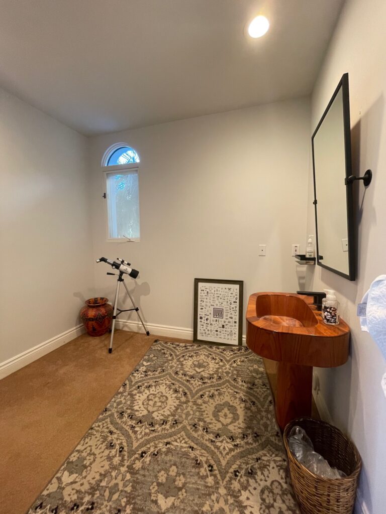
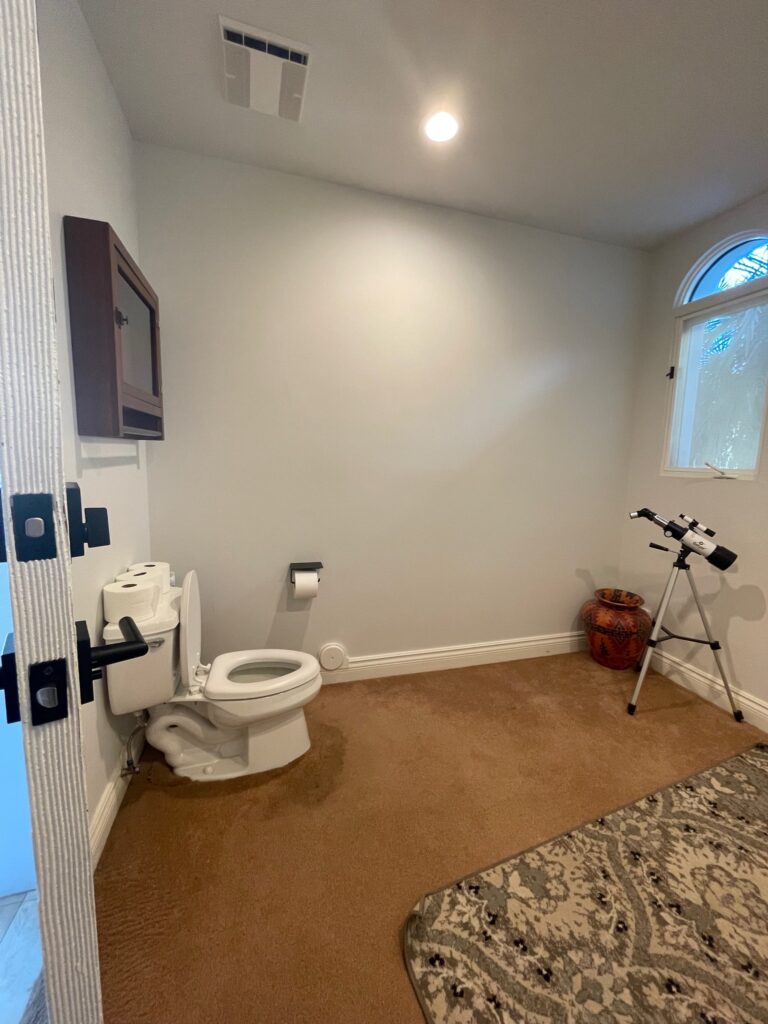
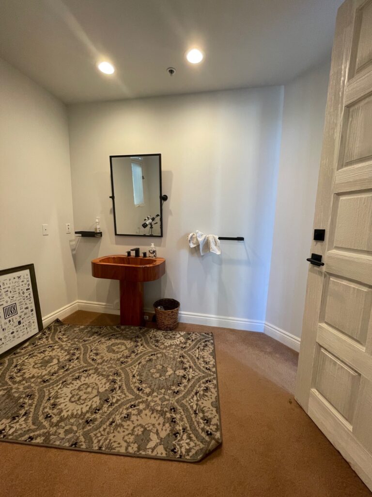
To the left of this entry is a powder bathroom. I could say a lot of things, but I think I’ll leave it at…carpet in the bathroom. Here’s the thing, life happens, and sometimes things will wind up on the floor. You get the picture. Carpet is not the most sanitary option for this application. Additionally, this space is quite large for a powder bath, and originally, the layout was just not scaled properly. The vanity felt small in such a large space. For this bathroom, the client requested the addition of a shower and the use of 3D tile for visual impact. The client wanted the tile work to be unique so that people would be “wowed” when entering. I mean, who doesn’t? So I got to work designing and went through a few iterations before the clients and I landed on the final design.
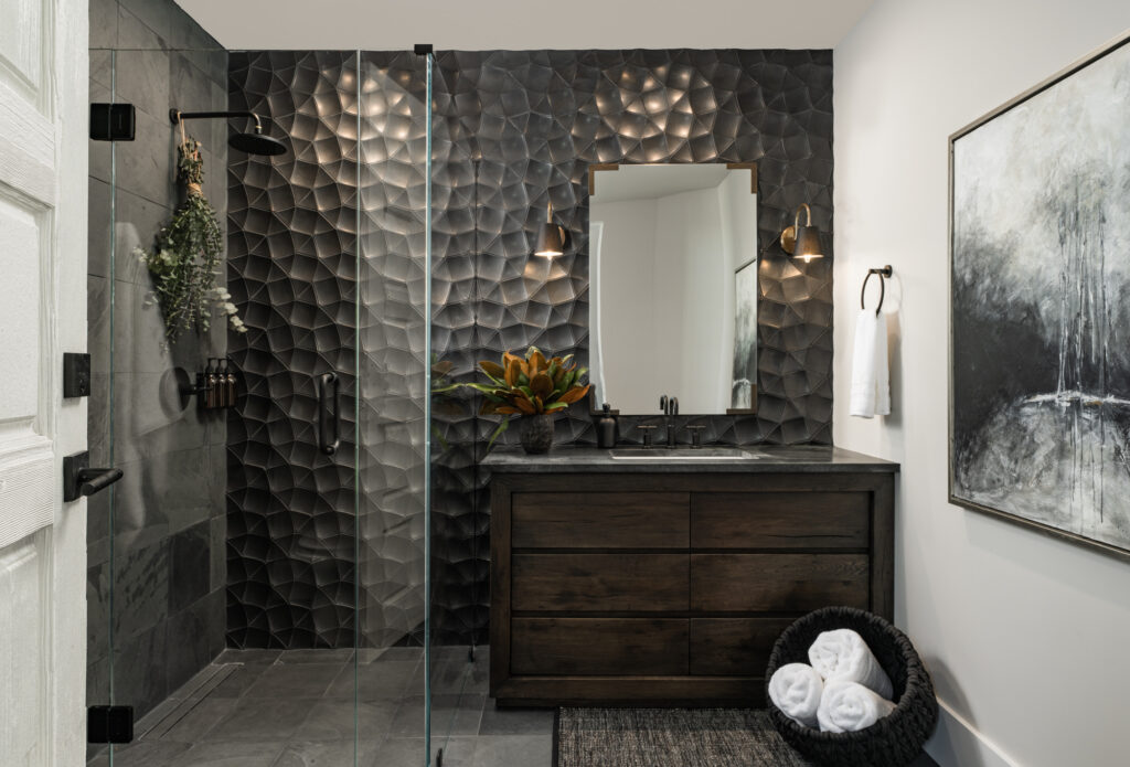
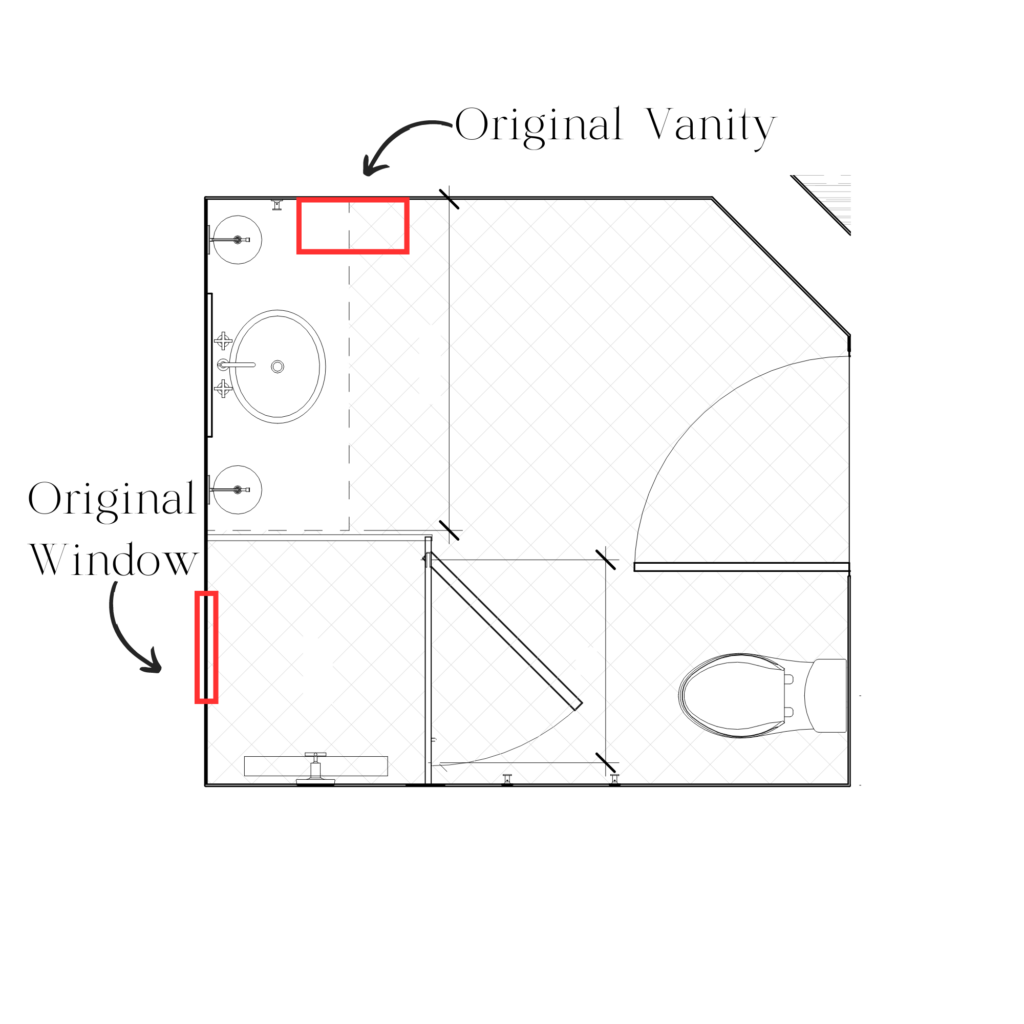
What an after, right? I know what you’re thinking, and yes, it is the same space! So first things first, as far as space planning is concerned, I moved the vanity to the wall adjacent to its original location. This allowed me to keep the focal point front and center without any competing elements, therefore, maximizing its impact. So let’s talk tile! This is a glorious handmade tile with a custom glaze that deserves all the attention. I mean, look at the way the light undulates off the surface 🤤. Because of the nature of the 3D tile, I chose to close off the existing window. I RARELY recommend losing a window, but it was the best decision for this particular space. By closing off the window, the pattern of the tile is uninterrupted. Had I left the window, it simply would not have achieved the same impact as an entire wall of tile, which is such a strong focal point for this space.
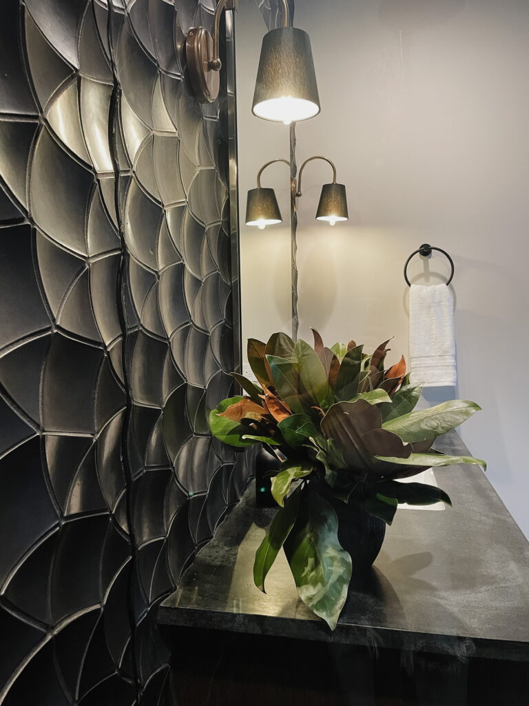
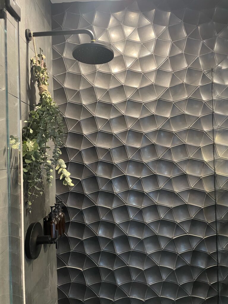
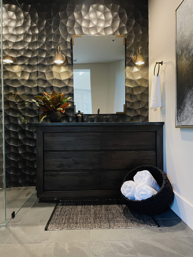
We mixed our metals here, which is something that I love to do. All of the plumbing fixtures are matte black, but by adding a hint of antique brass on the mirror brackets and sconces, the whole look feels very balanced while also feeling interesting and layered. Speaking of mixing, this space is an excellent example of mixing styles. I used a very modern tile, but I paired it with a rustic vanity and antiqued metal. It’s that push and pull again, but you can see it offers a lot to a design. Another important decision I utilized was keeping all of the finishes in the space dark. By keeping everything dark—using a dark stain on the vanity and a soapstone countertop—everything feels tone-on-tone instead of starkly contrasting, so the focus stays directed to the tile .
Have you subscribed to our email list yet? Please do so you don’t miss out on what’s ahead.
Drop me a comment down below and let me know what you think of the entry and bath at Coyote Hills. If you have a design question, ask me in the comments section!
Want more? Check out our YouTube channel to see the evolution of this space!
