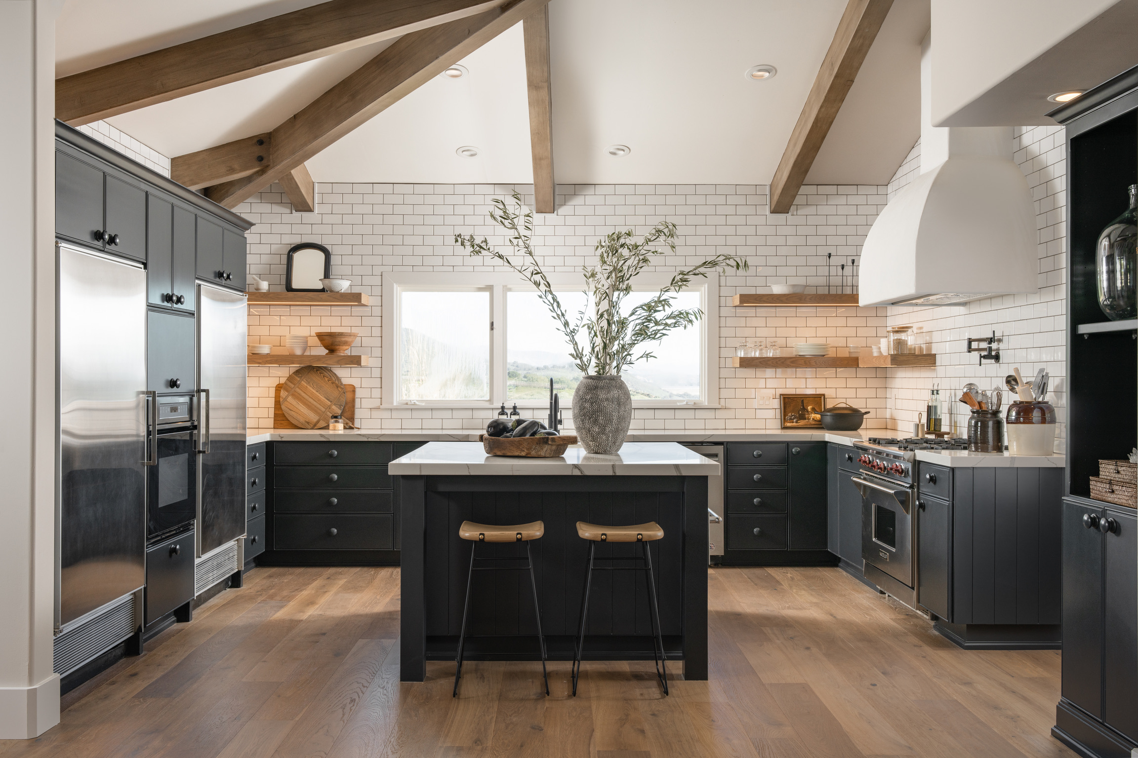
Welcome back, dear readers! I hope you’re as excited as I am because today, we’re diving into the much-awaited kitchen of our #CoyoteHillsProject. This kitchen was a last-minute addition, and we faced the challenge of working within a limited budget and a tight timeline. But as they say, constraints often breed creativity! So, let’s embark on this delightful journey of transformation and explore how we turned limitations into opportunities.
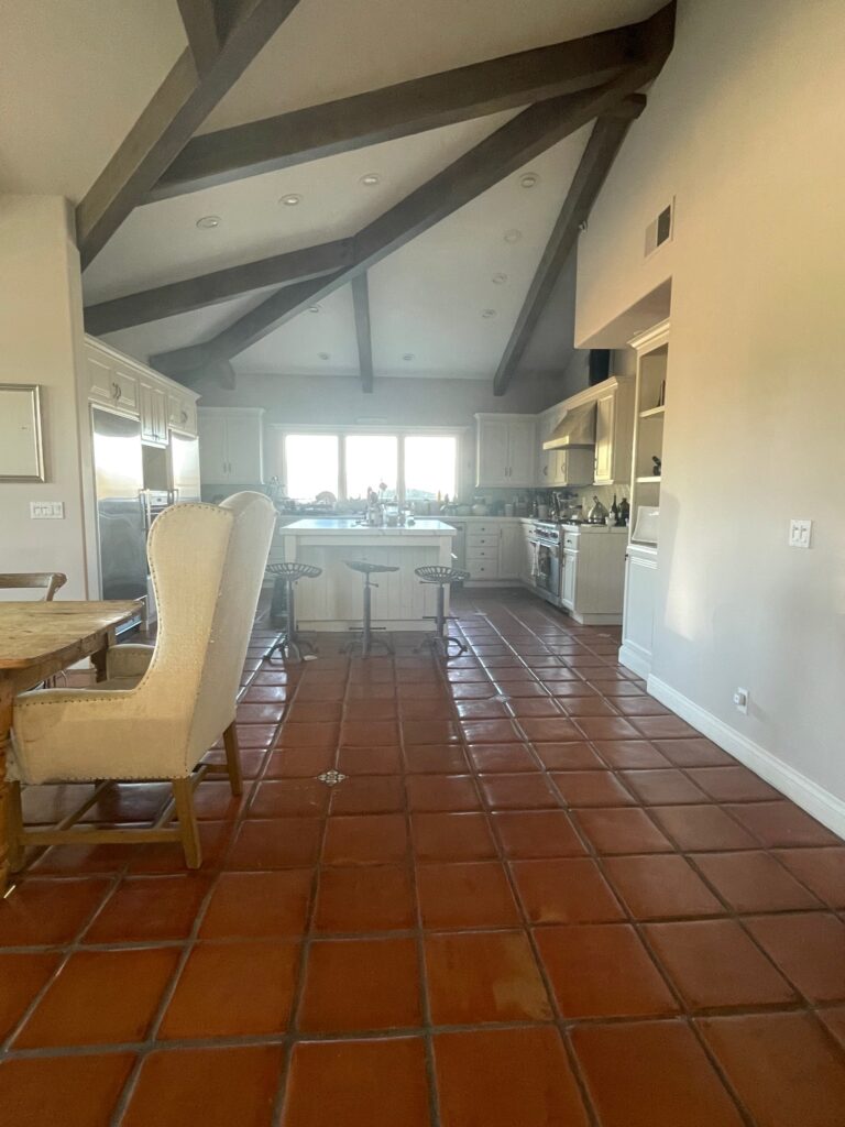
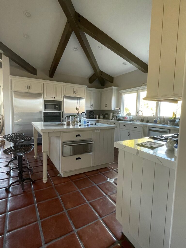
Let’s begin at our pre-demo starting point–the before photo. While saltillo tile is a personal favorite and would have matched the paint color we settled on for cabinetry, it didn’t align with the client’s taste and preference for zero grout. New flooring was already on the list for this space, so that was taken care of. This space has a good layout, and the cabinet boxes were in great shape. The kitchen “worked” with the design for the remodel, but as things were coming together, it just didn’t feel as fresh as the rest of the home. Some modifications could be made to make it better connect with the rest of the house. The client loves a modern farmhouse kitchen, and that was my direction for this space.

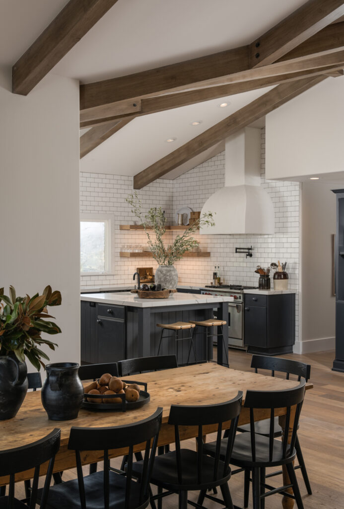
We took a couple of important steps to get the result we were after. First, we opted to revitalize the Cabinetry. To stay within budget and meet the timeline, we decided to reface and repaint the existing cabinetry. By doing so, we could breathe new life into the kitchen without the need for a complete overhaul. The selected paint color (Railings by Farrow & Ball) beautifully complements the desired modern farmhouse aesthetic, and the reface brings a fresh, updated look to the space.
To make this traditional space lean a little more farmhouse, we made strategic design choices throughout the kitchen. We focused on simplifying trim work and removing excess ornamentation, creating a clean and streamlined appearance. The window was reframed with a sleeker profile, the island legs were rebuilt for a cleaner look, and the cabinet faces were simplified.
Next, we utilized custom details for added Interest. In our pursuit of elevating the kitchen’s aesthetic, we opted for a full-overlay panel design to achieve a high-end look. Slab front cabinets can lack interest. To infuse a touch of charm, we added a delicate bead detail around the face perimeter. This detail is a simple and affordable way to get a designer look.
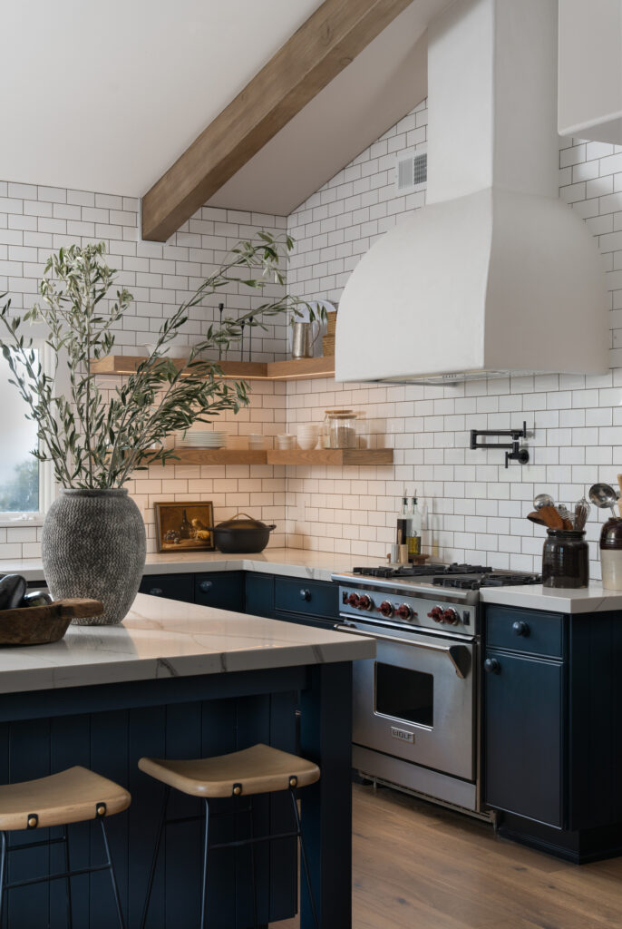
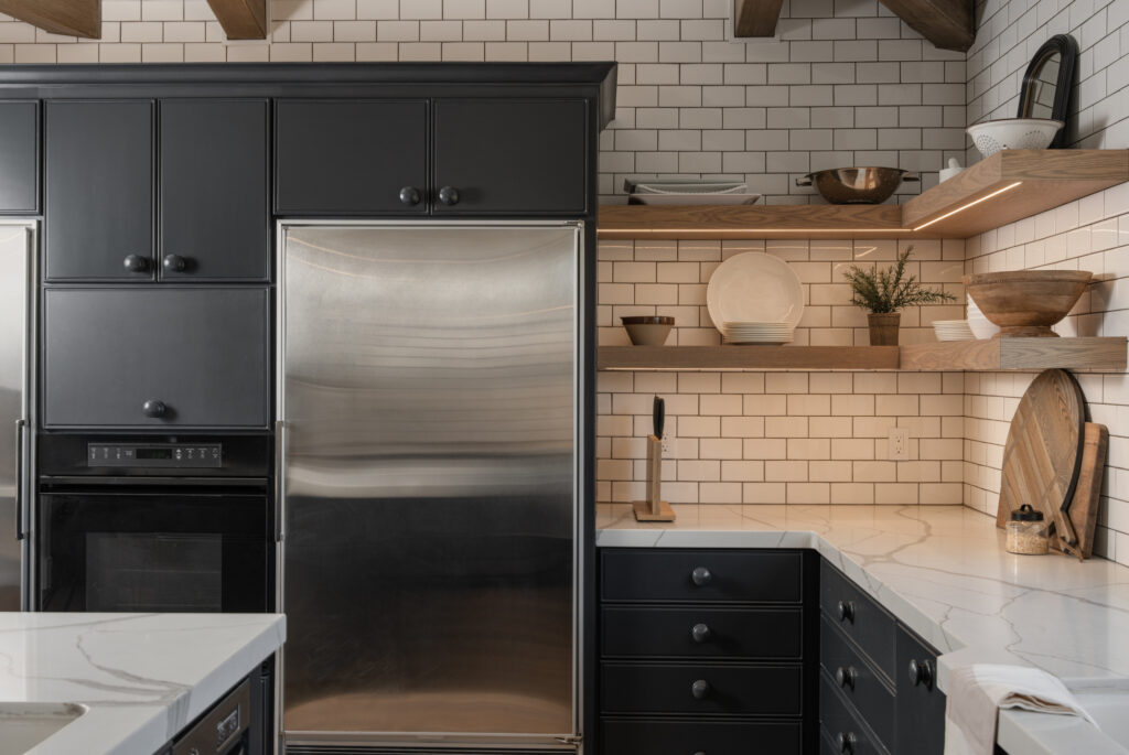
We leaned into the beauty of streamlined simplicity. For hardware, we painted wood knobs to match the cabinetry. This decision not only provides cost-effective benefits but also goes back to making everything streamlined. This approach beautifully balanced the traditional farmhouse elements with a modern twist while also resonating with the timeless allure of European cottage aesthetics. Perfection! 🤌
Speaking of streamlined simplicity, I can’t go on without mentioning the floating shelves! We removed the upper cabinets and replaced them with beautiful white oak floating shelves. The window that is the focal point of this space is actually asymmetric. To create symmetry, we had the carpenter build the shelves to symmetrically frame the window versus being of equal size. We utilized the same strategy for the shelf on the range wall. We ensured the shelf was sized to create symmetrical open space on each side of the hood.
This range wall is EVERYTHING to me. I can’t stop staring at the plaster range hood, and who doesn’t want a pot filler in their kitchen? We had this hood built on site from a quick drawing I threw on the wall, and I was giddy each and every day as I saw it coming together. It turned out exactly as I had imagined. A very “designer” thing to do is to take the backsplash all the way to the ceiling. Why? Because it keeps the eye moving upward. We typically see a backsplash terminate under the cabinetry. Because most kitchens have upper cabinets, windows, and other elements along the wall, terminating the tile before the ceiling usually creates an awkward angle somewhere. It looks more expensive (because it is) and gives a cleaner look to fill the open space on the walls with your backsplash material. In this kitchen, we want the eye to travel all the way to the vaulted ceiling with beautiful beams, so carrying the tile to the ceiling really benefits the space. The budget for this add-on space was tight, so we did a simple big-box store subway tile instead of a slab or designer tile. The client really loves the look of white subway tile with contrast grout. Typically, we see black or charcoal grout, but we used a dark brown that brings out some of the smaller brown veinings on the countertop. The result is a little more unique and feels really rich against the dark blue/black cabinetry.
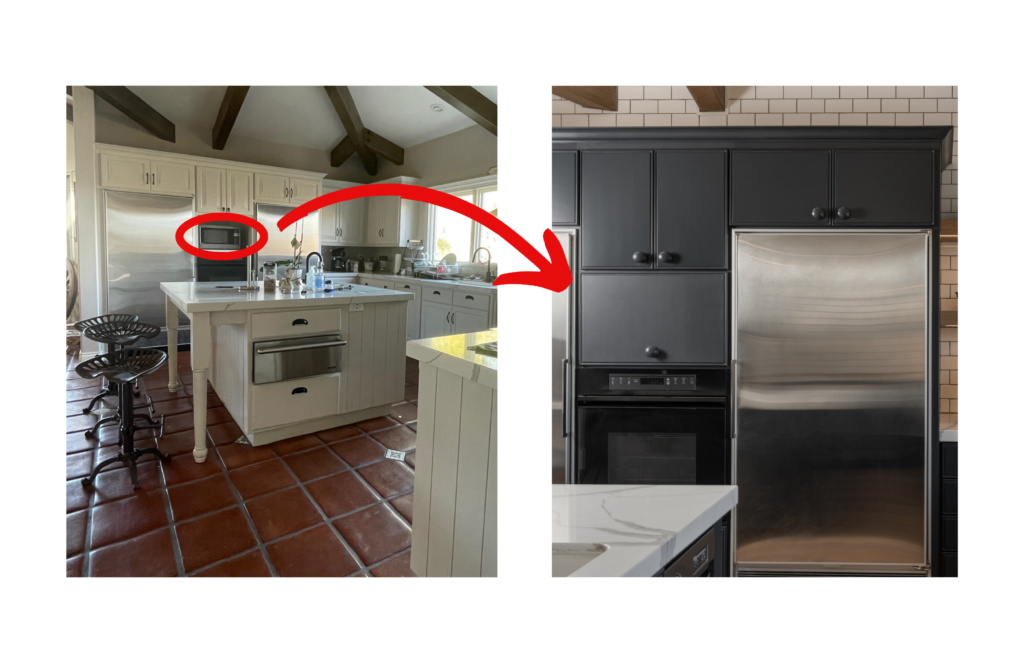
Whenever I design a kitchen, I like to make sure that focus stays on all the beautiful finishes we have poured our soul into selecting. Small appliances can sometimes be an eyesore and detract from the design. Every space is different, and concealing these appliances can have varying solutions. Because we did not go completely custom in the kitchen, we had to be creative about concealing the microwave in its existing location. We added a cabinet front and used a vertical swing lift-up hinge to open seamlessly over the cabinets above. If we had used a piano-style hinge, the door would have opened at about eye level right into the pathway, creating a hazard.
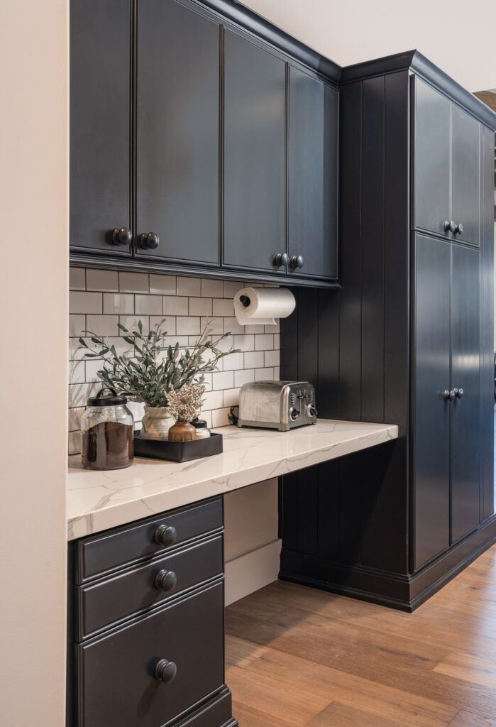
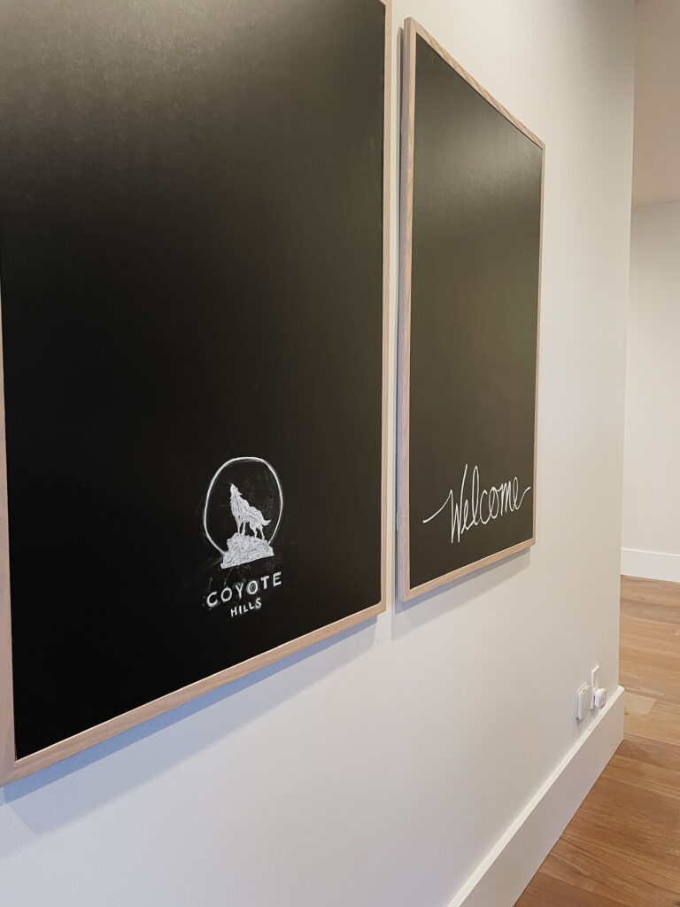
A desk area off the side of the kitchen leads to the butler’s pantry/bar area. The family didn’t utilize this as an office space, so we moved things around to make it a little more practical. We placed the coffee maker and toaster here to create a coffee bar. Because it is adjacent to the kitchen, it keeps these appliances out of immediate sight but still easily accessible. There is a large, blank wall directly across from here, so we added a couple of large-scale chalkboards that can be used to write recipes, a shopping list, or keep little ones busy while Mom or Dad is busy in the kitchen.
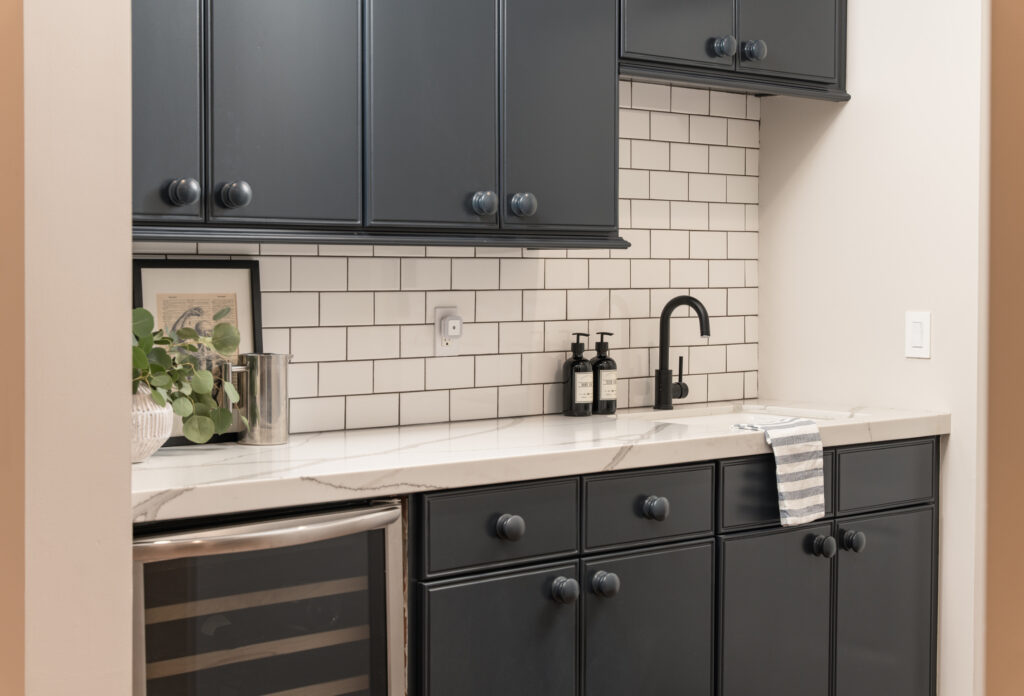
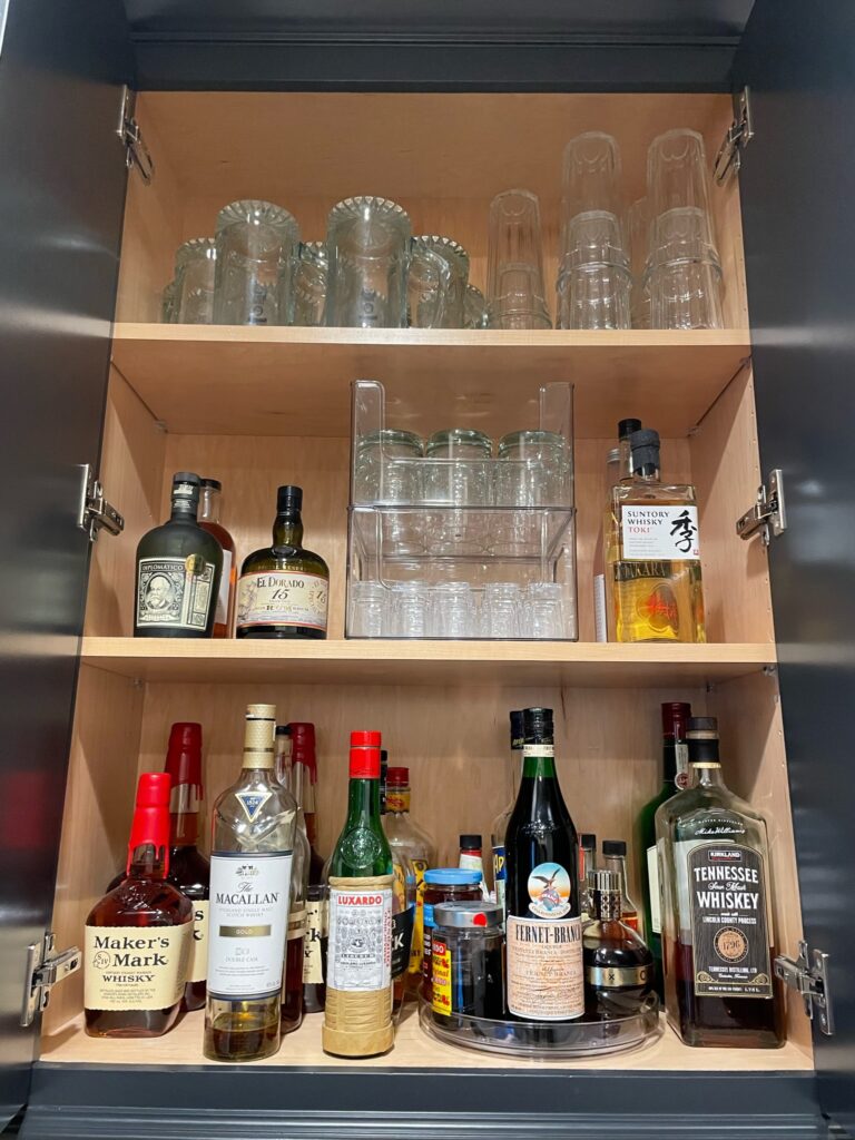
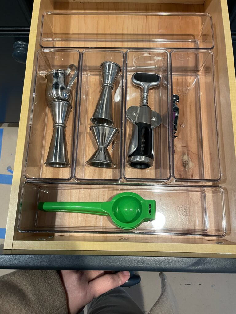
The butler’s pantry/bar area is basically my PSA for organization. We kept things clean and simple, falling in line with the rest of the kitchen, and made it a priority to ensure everything was properly organized. You can have a beautiful space, but it can quickly become cluttered if you’re not organized. Good design includes good organization. If you are not using custom cabinetry that allows you to implement custom organizational systems, invest in organizational products to help keep things tidy. Don’t let clutter take over. OK, I’ll step down from my soapbox.
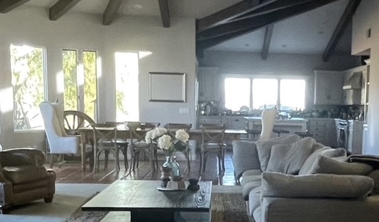
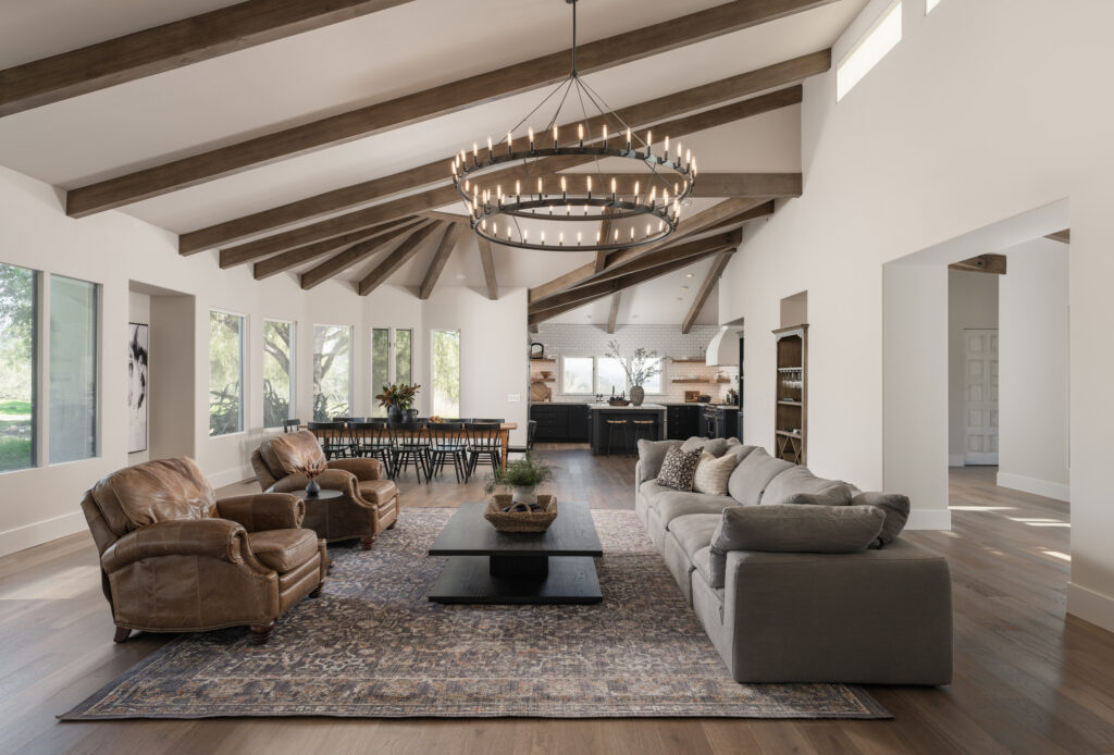
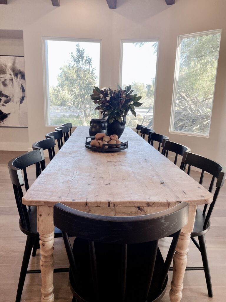
Before I go, I want to quickly touch on the dining area. While it still resides in the same general area as it was originally placed, we did shift the table over a bit to create better sight lines. What does that mean? In interior design, a “sight line” refers to an imaginary line that extends from a specific viewpoint or vantage point in a space. It is the path a person’s eye takes as they look across a room or move through it. In the “Before” photo you see above, the dining table is visually pushing into the kitchen area. You can see the table is protruding into the walking space around the island and the end chair is sitting about halfway across the island. When you walked the space, the pathways were still completely usable. However, visually it looks cramped and not completely functional. You’ll see below that we shifted everything toward the living space and closer to the wall on the left. It created a clear sight line into the kitchen and makes the space appear more organized and visually pleasing. Each space now how a clearly defined zone.
In the world of interior design, every project presents unique challenges and opportunities. The #CoyoteHillsProject’s kitchen transformation showcases the power of creativity, resourcefulness, and a deep understanding of the client’s preferences. By making strategic decisions to reface and repaint the cabinetry, embracing a modern farmhouse aesthetic, and selecting custom details for added interest, we successfully crafted a kitchen that exudes charm, functionality, and timeless elegance. Stay tuned for more captivating design journeys that inspire and ignite your imagination!
