Welcome to the world of elevated secondary spaces! We’re back at Coyote Hills. If you’re ready to transform your bathroom into a showstopper, this blog post is for you. Picture this: a harmonious blend of stone and a touch of the timeless elegance of a herringbone tile floor. Intrigued? Let’s dive into the details!
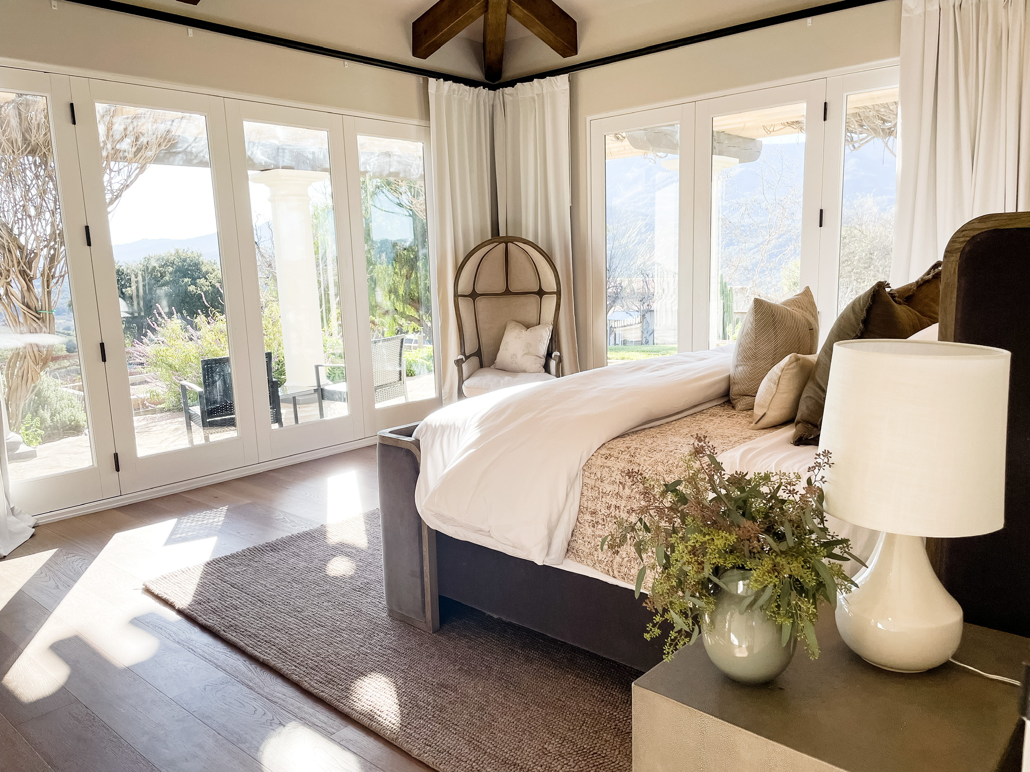
This project has an ensuite bathroom for every bedroom. This particular ensuite bedroom and bath is not the primary, but it has always been the client’s favorite room in the house. The light that comes in through the large windows and the view looking out to the lake are just so beautiful; you cannot help but love this space.
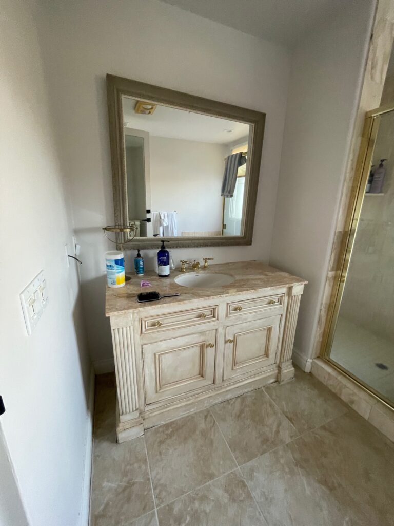
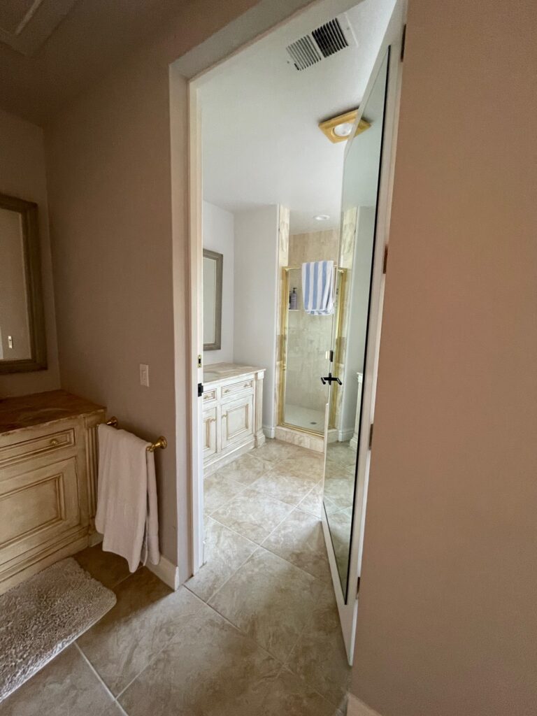
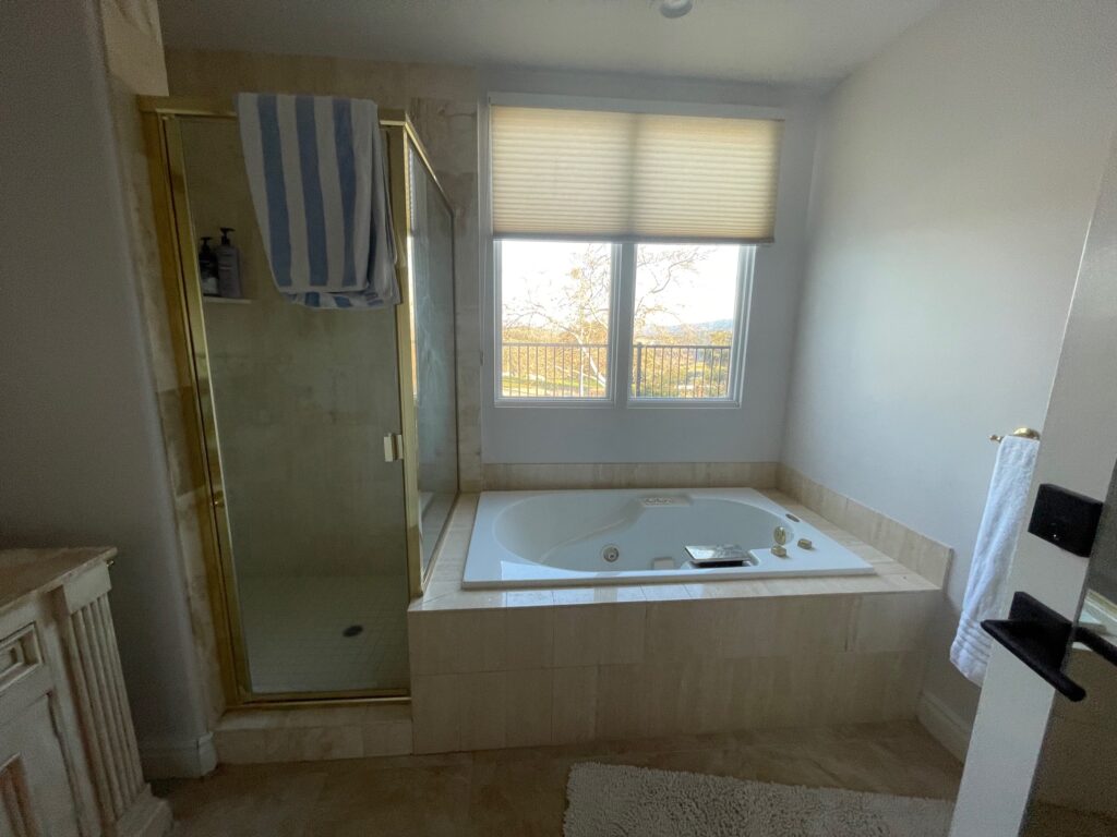
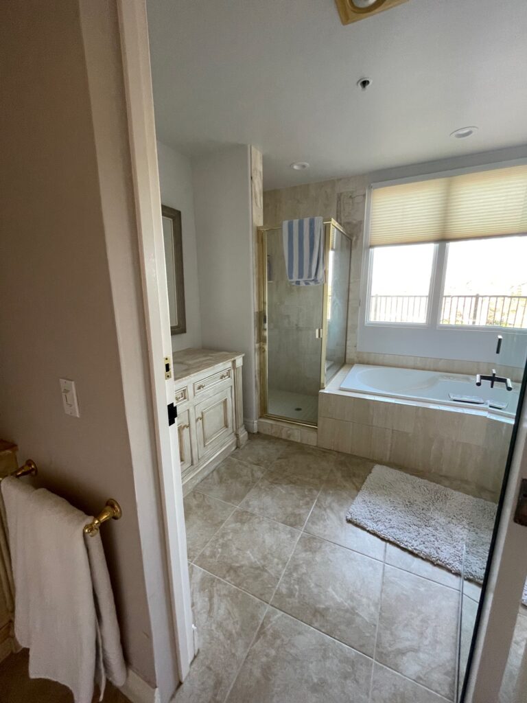
I’ve definitely seen a worse before picture, but this bathroom, and another, had some plumbing issues that needed to be fixed. It’s the Tuscan style we saw throughout the 90s with the shiny gold hardware and faux travertine. We kept the same general footprint and made some small but mighty changes. I keep saying it, but scale and proportion were an issue in this house before we came in for the renovation. The smaller hotel-style vanity and the larger vanity in the wet room were awkwardly sized for the space. Ironically, we kept that same size but incorporated a wall on either side to properly encase the vanity and added full radial arches to go with the style of the home. The shower in the “Before” was generously sized but had a tiny door (20 inches wide), and the way it was walled off made it feel smaller than it really was. To remedy that, we cut the wall back when we were adding the arch and incorporated glass panels for the shower allowing the space to feel bigger and get much-needed natural light.
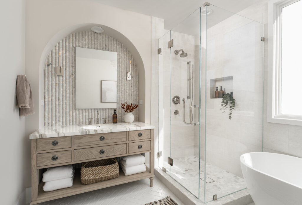
This is such an elevated secondary bath. The finishes are simply breathtaking. When I handed all the material to the tile contractor, he thought I was absolutely crazy. He pulled me aside and said, “I don’t think you realize that you have 4 different types of stone here and a white subway tile, which of these goes here”. Uh yeah, I do realize; it all goes here; it’s one of my many shades of crazy, it’s going to look phenomenal, and I’d like it installed, pretty please. In his defense, it is a little unbelievable, but the payoff is SO GOOD! When mixing materials, always, I repeat, ALWAYS get samples. Scratch that; always get samples even if you aren’t mixing materials. After you have your samples, take them to the space where they are going to live and double, triple check your samples to make sure everything works. Check them in the morning, midday, and at night. Natural light can have a very powerful hand in manipulating what your finishes will look like. Always check in the space, and do it multiple times a day.
Photos: Blake Bronstad Photography
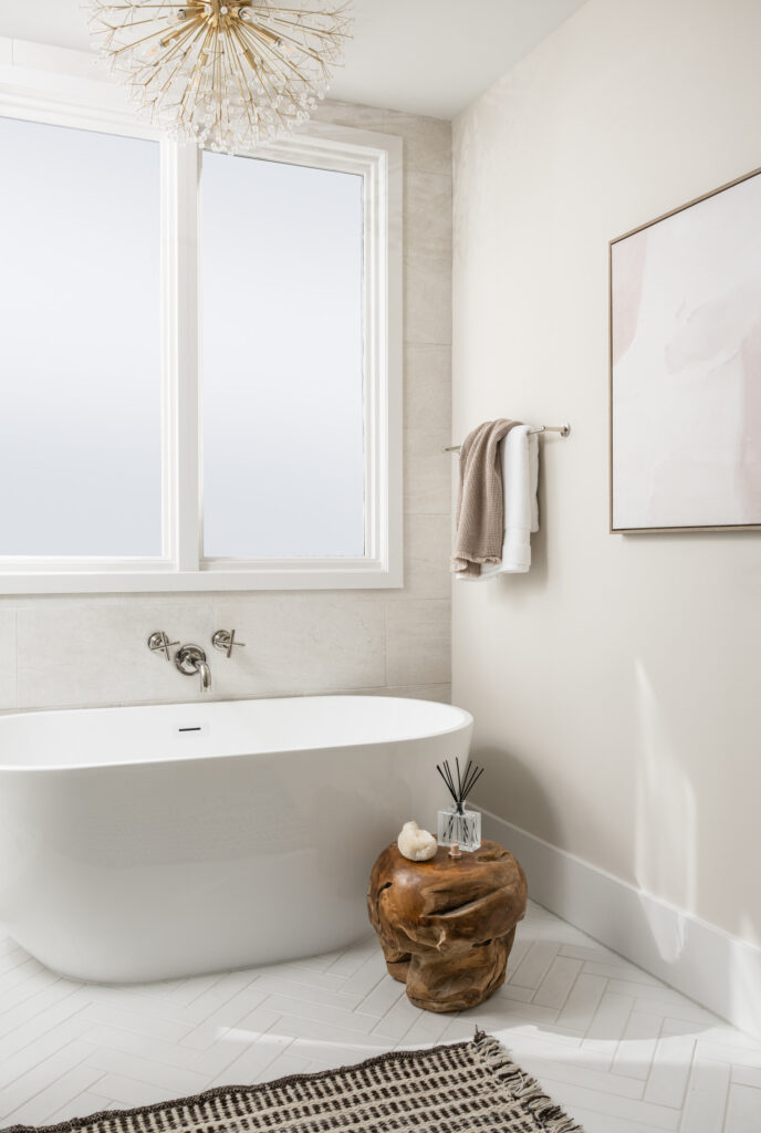
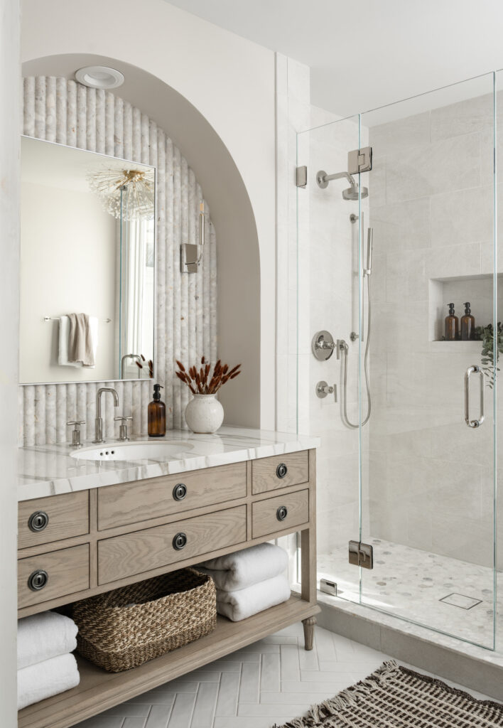
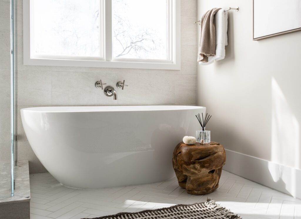
To help make the space feel larger, we got rid of the tile tub surround and replaced it with a streamlined, freestanding tub. Spoiler alert: it’s a Home Depot find and SUPER affordable. This wall-mounted tubfiller from the Kohler Purist line is one of my absolute favorites. It’s great for spacesaving and just looks so stunning. The color palette is calm and subdued to maintain a sense of relaxation. We did use some moodier colors throughout the rest of the house, so we incorporated some deep browns in the bathroom to bring in some saturation. In addition, the bedroom has some darker tones to tie everything in with the rest of the home. The backsplash at the vanity area is a beautiful tile from Ann Sacks. It’s part of the Terrazzo Renata line and is the fluted tile in Brulee. The Terrazzo tile is an excellent connecting piece because it has some deep gray running throughout but also connects to the light beige, gray, and gold tones in the Calcutta Gold porcelain slab that was used for the countertop. Something you might start to notice is our use of curves. Here, we used these beautiful arches and the gentle undulation of the fluted tile. Arches and fluting are repeated throughout the home in other spaces, and even the sensuous curve of the range hood we featured last week ties in with the curve of the arch. There are a lot of ways to make a home feel cohesive. Here we used repeated curves, and repeated materials (used in different ways), so watch out for those elements as we continue on our tour in the coming weeks.
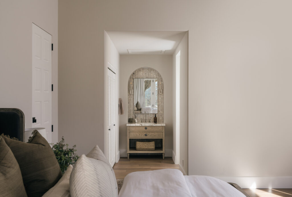
I don’t know if you noticed in the “Before” photos, but I briefly mentioned that this particular bathroom has a hotel-style vanity that is open to the bedroom and one that is inside the wet room. The bedroom was originally carpeted, and the area with the vanity had the same tile that was used in the rest of the bathroom. We decided to switch that up a bit and carried the same hardwood flooring used in the bedroom into the vanity area. We then made the switch to tile at the threshold to the wet room. You know I always like to start with the “Before” so that you have a proper starting point, but this post is ever so SLIGHTLY out of order…
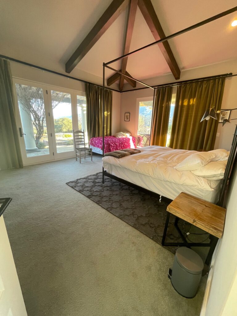
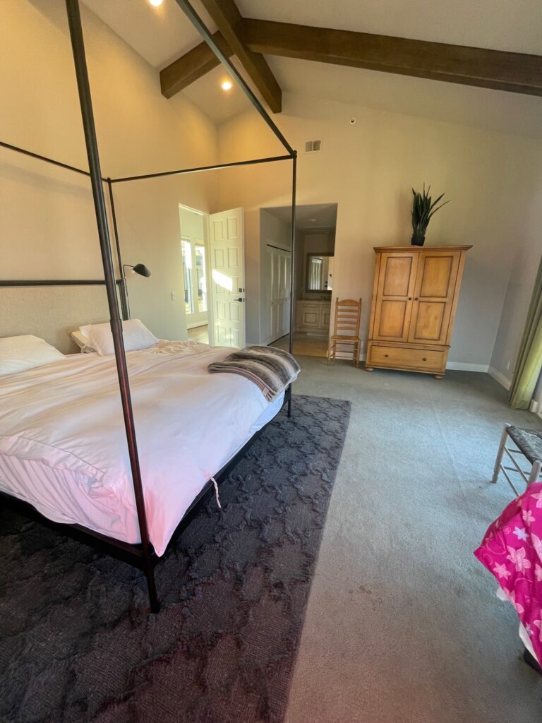
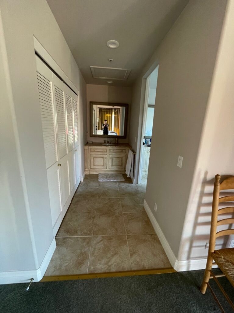
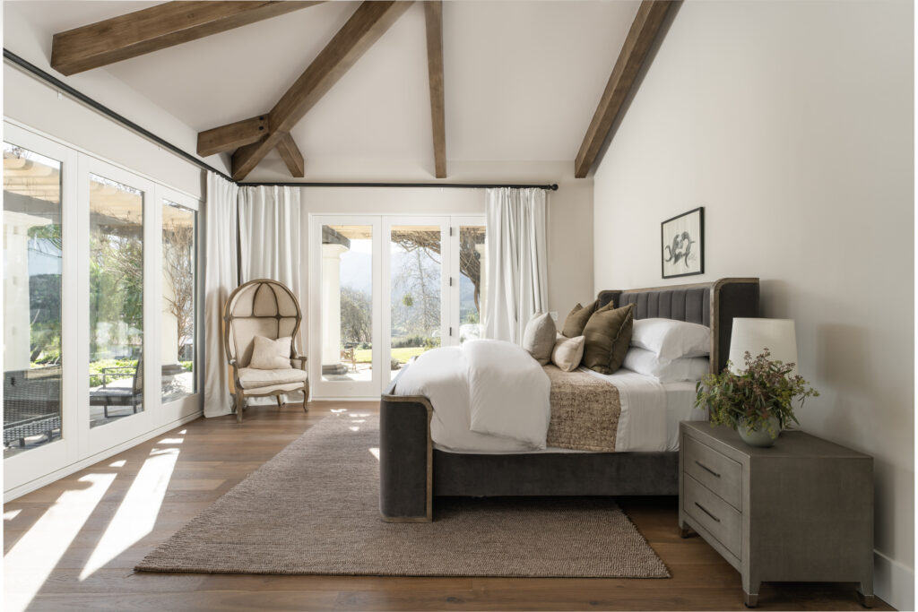
While showing you the vanity, I gave you a little sneaky, sneaky peek, but this before and after is CRAZY! Even looking back at the before photos has me completely floored. I almost can’t believe it’s the same space! Even better? We really didn’t do that much. We’ve talked about how new flooring throughout was one of the client’s top requests, so of course, that is something that got switched out. Because the flooring was replaced, baseboards had to be removed, and it was a good opportunity to replace the existing base with something a little more appropriately sized. This home has high ceilings, the lowest being at 10 feet. Originally, the base was 3-1/2″. Something people don’t realize is that baseboard really does need to be sized differently based on your ceiling height–I sound like a broken record, but it all goes back to scale and proportion. Because we were working with beautiful high ceilings, we went up to an 8″ baseboard. We also scaled back on the ornamentation and went for something very streamlined. If all we had done was flooring and base, it would have made an enormous difference. The furniture is different, but it was part of the furniture shuffle that we performed and was already owned by the client; it was just living in a different space before we came in.

Photos: Blake Bronstad Photography
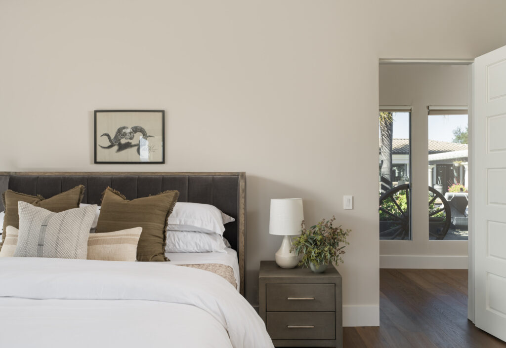
Now, let’s head over to the bedroom, where the magic of careful curation took center stage. Believe it or not, we kept the costs to a minimum while achieving maximum impact. The only new additions here are the bedding and lamps, which inject a fresh burst of style and sophistication. And get this—the captivating art above the bed? It’s an original piece created by the homeowner themselves! The only other investment in this space was the drapery. We got new panels from Amazon that were completely affordable and beautifully finished the space.
We know it can be intimidating to shop your own space, but trust me, the payoff can be enormous. These clients were blown away by what we accomplished using their existing pieces. With a keen eye for detail and thoughtful consideration, you can genuinely transform your surroundings.
So, are you ready to witness the power of a remarkable makeover? Buckle up and prepare to be wowed because our interior design studio is all about turning dreams into reality. Get in touch with us today, and let’s embark on an incredible journey of reinvention together!
I love comments, so leave me one below! I’m dying to know what you think of what we have accomplished so far.
