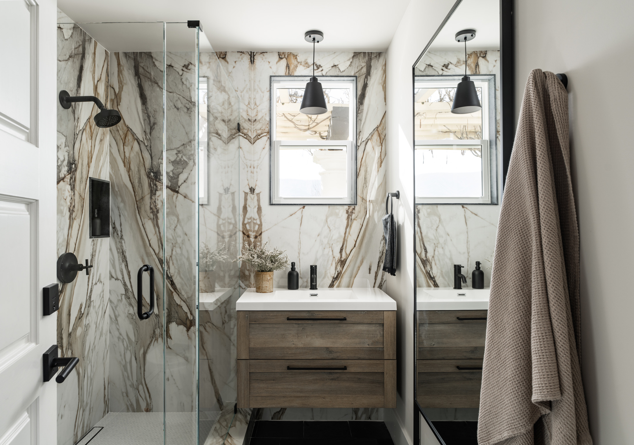
Welcome, I’m so glad to see you in my little corner of the internet! Today we’re back at Coyote Hills. You have already seen a few bathrooms featured here and here; if you have yet to see those spaces go back and check it out, it’s definitely worth the read. Since we’re in full swing of summer, I wanted to share this bathroom next to the bedroom we featured last time. This space is primarily used by guests that are utilizing the pool. It isn’t attached to a bedroom, and it’s ideally located for easy access from the backyard. Let’s dive in (pun intended)!
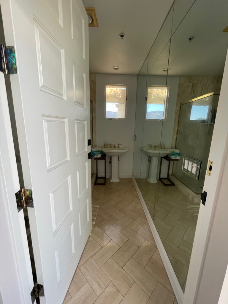
Before
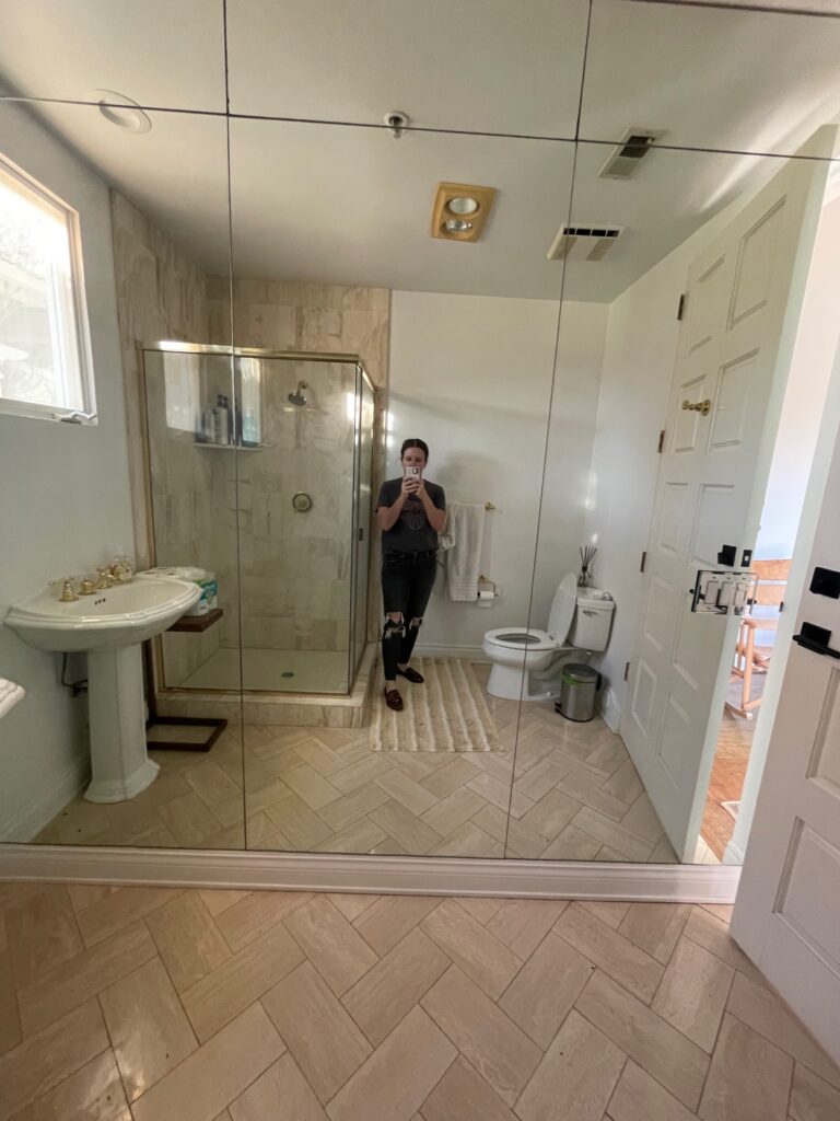
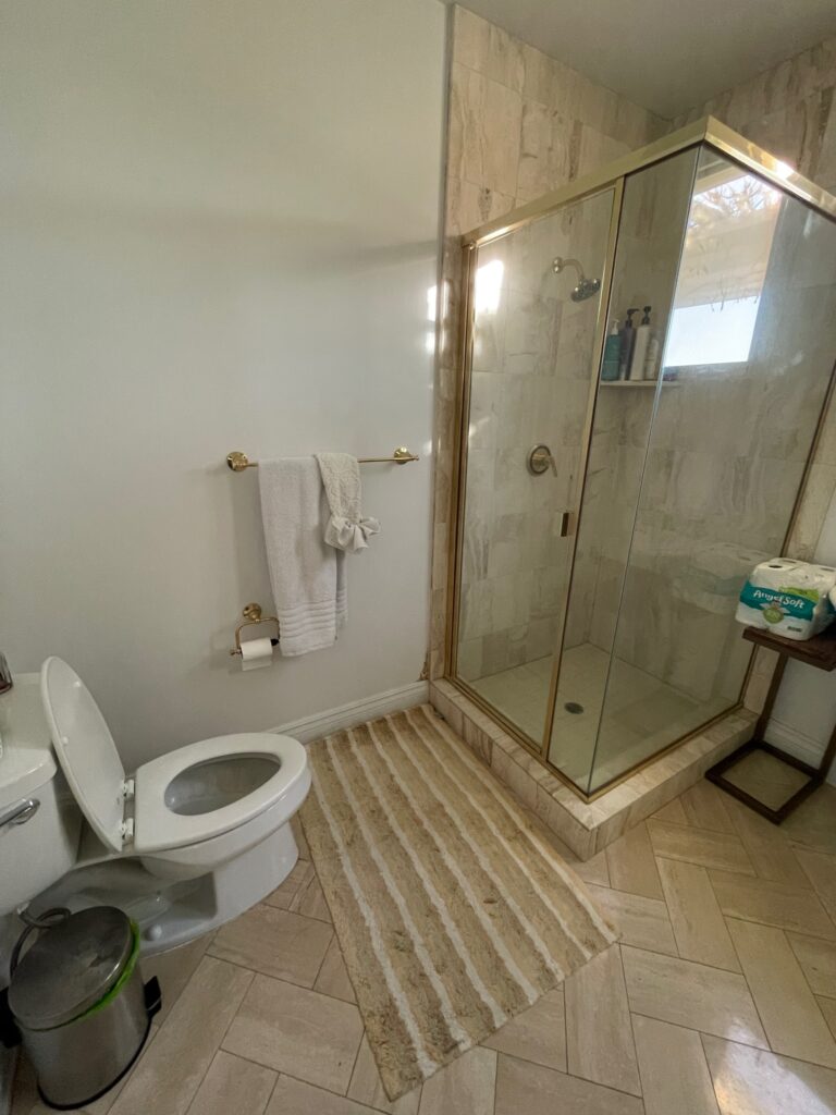
Before
In my last post, Ensuite Bed and Bath, I talked about some bathrooms having plumbing issues that needed to be resolved. This was another of those bathrooms. The shower had a leak, and after demo, we discovered that the leak must have persisted longer than realized because it had eroded much of the earth below the shower. Let this be a humble reminder to always budget more than you plan for your contingency budget because you never know what is lurking beneath the surface.
So let’s take a look at the space before renovation. Functionally, it’s alright. As a designer, I typically only use a pedestal sink for a powder bath. If you have a shower, someone is probably using this bathroom to prepare for their day. A pedestal sink simply doesn’t offer the storage needed in this space. Initial thoughts just walking into the before I knew we needed a small vanity that would offer some storage. After all, the clients had placed a small table in this space to aid with what the current situation was lacking. Aesthetically, this bathroom is similar to the rest of the house with a very 1990s design style, so we needed to do a bit of a makeover and make things a little more current. My designer brain could get into the details of what’s happening on the ceiling, toilet paper and towel bar placement, etc., that are missing the mark, but that would be a whole post in of itself. There’s an entire wall of mirrors that actually serve a couple of purposes. First and foremost, the window placement in this space does not allow for a mirror over the vanity, and the entire wall of mirrors solves that problem. This is also a modestly sized bathroom; mirrors make the space feel larger and reflect light.
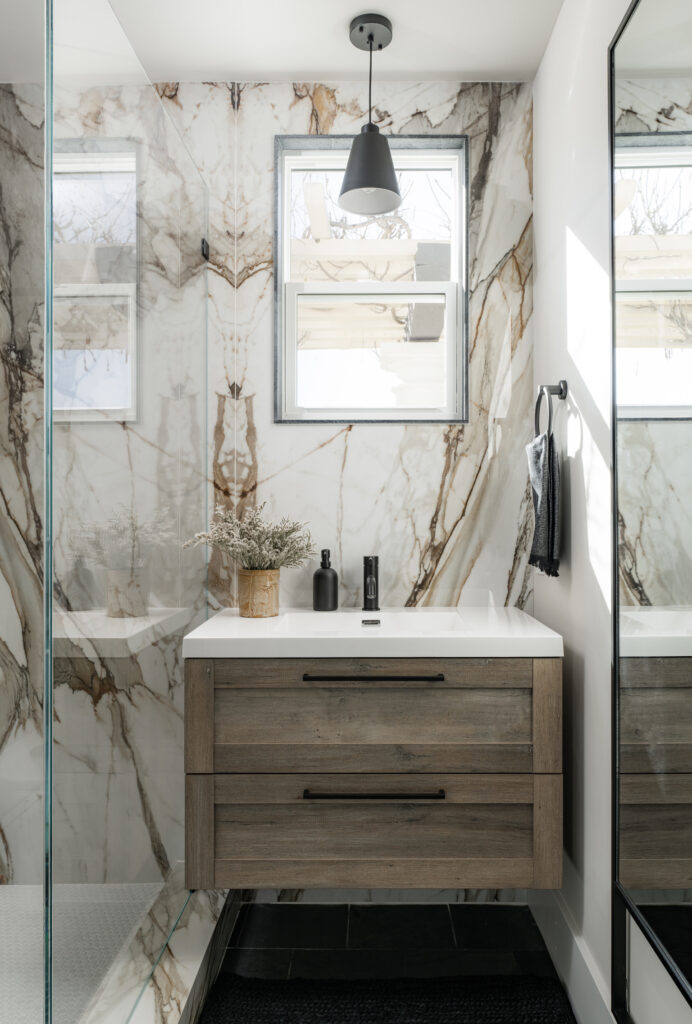
Photo: Blake Bronstad Photography
During the build process, I love to ask the clients which are their favorite and least favorite spaces after a walkthrough. It’s a risky little game that I play, but I love to hear how their opinion changes throughout the process. This space was low on the list during the process, and it wasn’t until it was fully styled that the clients fell in love. In fact, what was one of their least favorite spaces quickly became one of their favorites once everything was complete. This space started with the vanity. The client had it left over from another project and asked me to find a place for it in this project. Because it is floating, I knew it would be perfect for this bathroom because it would give me more spacial freedom without the shower curb getting in the way. It offered the allowance to capitalize on maximum surface area. One of the things that felt “off” in the before was the sink and window. I added a matte black pendant light to better anchor the vanity so everything felt intentional. The original design solved some pretty big problems this space faced but stopped short of full resolution. The vanity and light fixture are both so simple but pack a big punch functionally and aesthetically. The area now feels like it’s supposed to be there and wasn’t just thrown in to solve a functional problem.
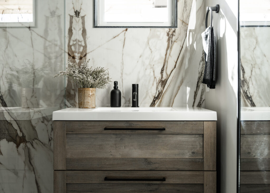
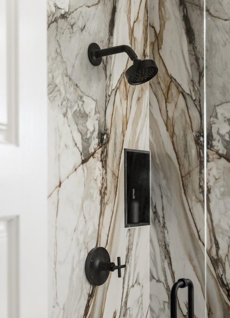
Photo: Blake Bronstad Photography
The wet walls are entirely clad in porcelain marble slabs that are both beautiful and durable. Porcelain is not porous like marble, so you don’t have to worry about staining, etching, or someone using the wrong cleaning product and ruining your beautiful stone. A downside to porcelain slab is that you get a raw edge. While the fabricator was templating and we were discussing exactly how I wanted things to be completed, I asked the fabricator how much soapstone we had left from the other spaces in the house. He got very nervous. I think it’s safe to say that the various contractors I work with know me well enough to cringe and fight the urge to run when I say, “before you say no, just listen. Can we…” because I’m about to ask them to do something unconventional. If you could be remanded to a psychiatric treatment facility based solely on the facial expressions you receive from others, I’d be long gone. Just sayin’. Anyway, we were lucky to have enough material to finish the edges of the porcelain slab. The soapstone was 3cm (1-1/4″) and just too large to make the niche and the window functional so it would have to be trimmed down. It’s always risky to go thin, but it worked! The fabricator VERY carefully, and nervously, cut the soapstone to a thinner profile, only 1/2″, and created pieces for the shower niche and the trim around the window. A simpler solution would have been to use a Schluter or pencil trim to finish the edge, but neither solution resonated with me. The black of the soapstone would help further connect the floor and the pendant light. I knew that if we could find a way to use the soapstone, it would help tie this space into the rest of the home making everything feel cohesive.

Photo: Blake Bronstad Photography
Speaking of cohesion, I used the same flooring material in this space as I did in the Entry Bath. I’ve said it before, and I’ll keep saying it: reusing the same material in different spaces helps create a cohesive home. In the entry, we did a straight lay, and here, we did a broken joint tile pattern of the same material. This creates some variety while maintaining continuity. The Kohler Purist line was used for the plumbing fixtures throughout the home, further connecting each space. I wanted a frameless shower to get as much visual real estate as possible. With all the beautiful book matching happening with the stone, I wanted to avoid any interruption. It also helps give the illusion of space in a modestly sized room.
Lastly, I spent a few site visits sitting in the middle of the floor, staring at the window and adjacent wall, contemplating how I wanted to incorporate a mirror in this space. The wall of mirrors in the before photo functionally fulfilled a purpose, but I was afraid it wouldn’t give the touch contemporary edge we were after. I considered using a mounted mirror that was on a swivel that could be adjusted by the user. I sat, and I pondered. I decided the best road forward was an oversized floor mirror mounted to the wall. This mirror accomplished all of the same benefits as the entire wall of mirrors but in a simple and beautiful way. It also had the added benefit of leaving room for a towel ring and towel hooks to be installed on the wall. It creates light, the illusion of space, and provides utility for guests to get ready and check themselves before heading out.
This guest bathroom next to the pool at Coyote Hills has been a journey filled with functional and aesthetic improvements. From the initial plumbing issues and lack of storage space, we embarked on a mission to create a more contemporary and inviting atmosphere. Through careful design choices and collaboration with the clients, we were able to turn this space into a beloved gem in their home. The floating vanity and matte black pendant light brought intentionality and style. At the same time, the porcelain marble slab offered both beauty and durability. Incorporating soapstone edges and repeating flooring materials from another space helped establish a cohesive flow throughout the home. The frameless shower and oversized floor mirror added visual spaciousness and a touch of modernity. This bathroom now stands as a testament to the transformative power of thoughtful design, turning a functional necessity into a delightful retreat for guests enjoying the pool and the summer season.
